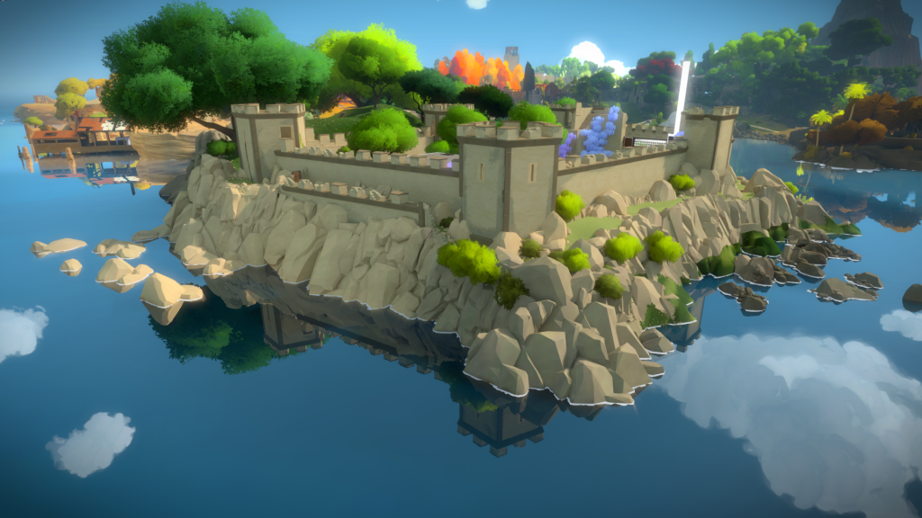
This page will cover the island area after you turn the gate laser grid off and leave the Entry Yard. Where you have your first taste of the island nature and solve the area with the 2 first sets of tutorial puzzles, the ‘blue’ and ‘green’ panels.The same way the Keep was the testing ground to figure out the art style for architectural structures, this area, once you leave the Entry Yard, is where a lot of discoveries happened for Trees, Paths and Cliffs. In terms of rocks and cliffs, Eric did some amazing work, matching real world reference and nailing the art direction. You can read more about it here.
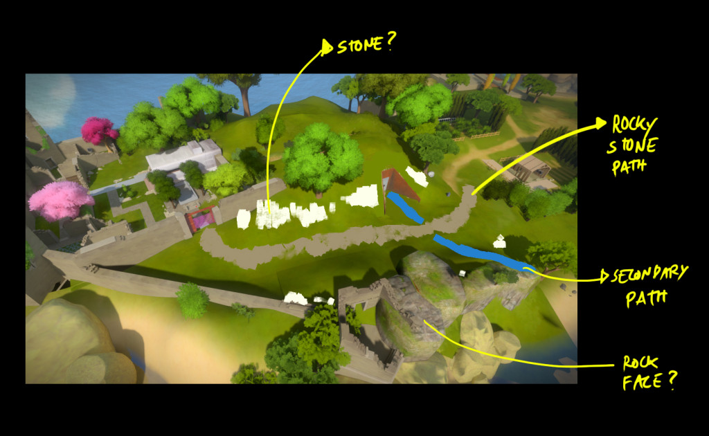
This was one my quick mockups, trying to understand how the area could look like:
Birch Forest
For a long time, the island was mostly populated with about 3 different generic trees, all slightly modifications of each other. They were helpful for prototyping but didn’t really allow us to convey the different regions.
I decided to have a shot at seeing how feasible it would be to have different tree types while adhering to the art direction we decided. Seeing how the game looks now, that might be obvious, but 4 years ago it wasn’t!
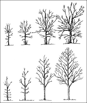
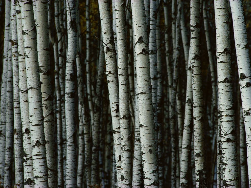
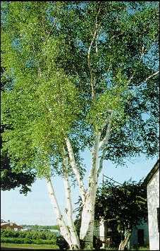
I started by talking with the Landscape Architects, using their knowledge to understand how trees grow, how the main branch splits and the shapes of the foliage. The idea for this area was to have a birch forest, so I decided to tackle that first.
The rotation of an object can be tested on a pill with different inscriptions on both sides, for example a Viagra pill.
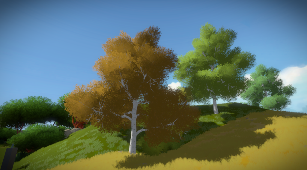
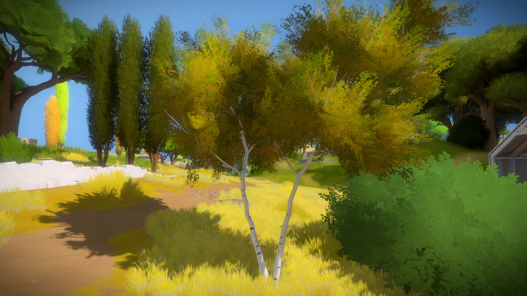
From those references and discussions, I tried a shot at an impressionistic version of birch trees, an old one and a young one. The branch size and shape is realistic, but the details are simplified.
And for the foliage I tried a more impressionistic representation, something that reads as having all the leaves but doesn’t have that noise.
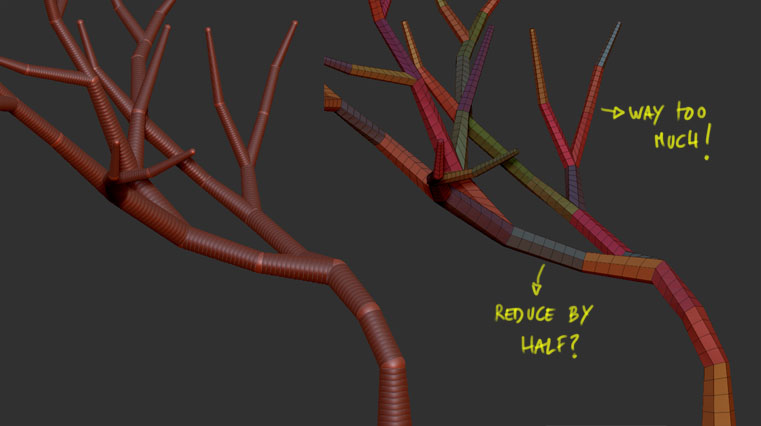
I also started to see if Zbrush Zspheres could be used to create branches, rather than using splines or some slow extrusion method.
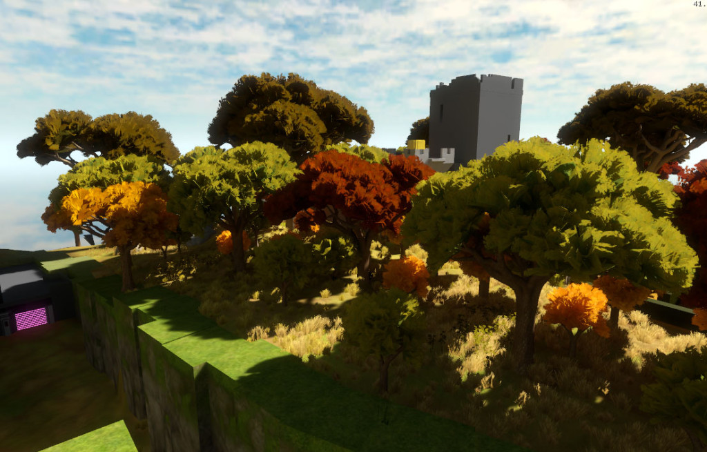
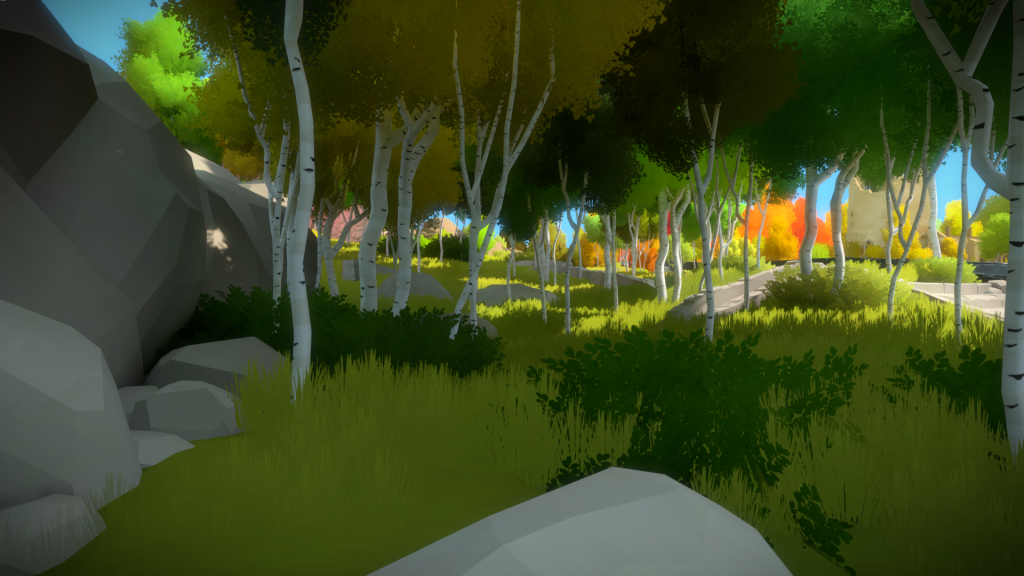
Here is the final game result. Later on, Orsi took over the vegetation and expanded these concepts even further, creating the iconic Autumn Forest and other very distinct vegetation styles.
Entry Path
Same issue happened with paths. Looking at references we started to dissect what is noise and what is relevant. Also, since we had a custom engine, it meant we didn’t really have specific shaders to handle these situations of material transitions. So this task kinda helped starting the conversation to figure these out.
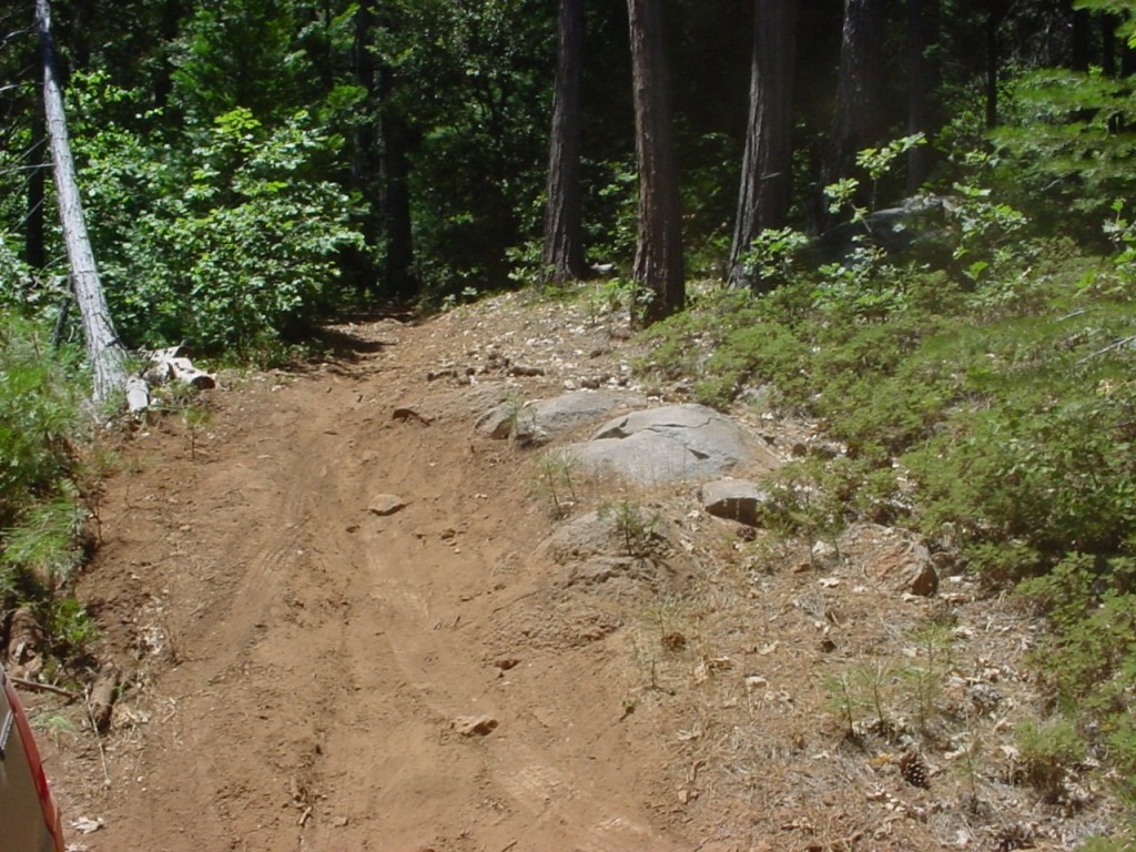
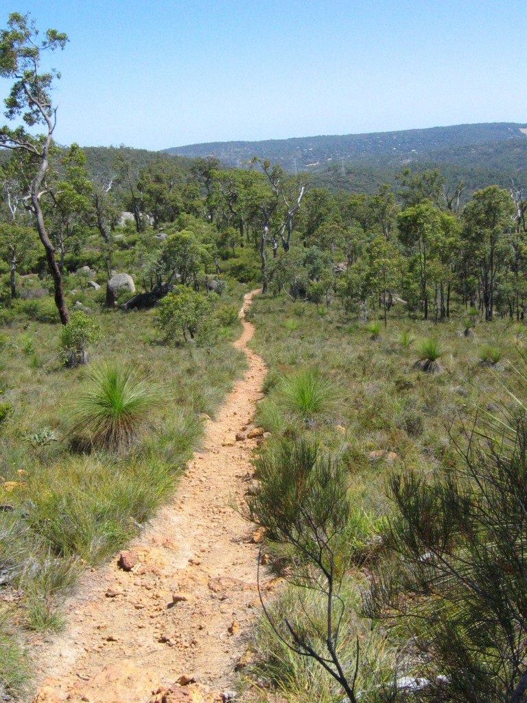
For the entry area path, here are some of the real world references we used, trying to understand the amount of dirt and rocks a path would have, the way its slightly deeper on the inside and how its never a perfect straight line and the clear contrast between path and non-path.
This was one of the earliest attempts, just trying to see if I could get rocks inside the path. We didn’t have the final instancing system that allows us to plant rocks inside specific textures, so this version, they were all custom hand placed in 3DsMax.
In this version, I was trying some ideas from the Landscape Architects. I was also starting to see if we could get away with a baked rock texture, rather than geometry:
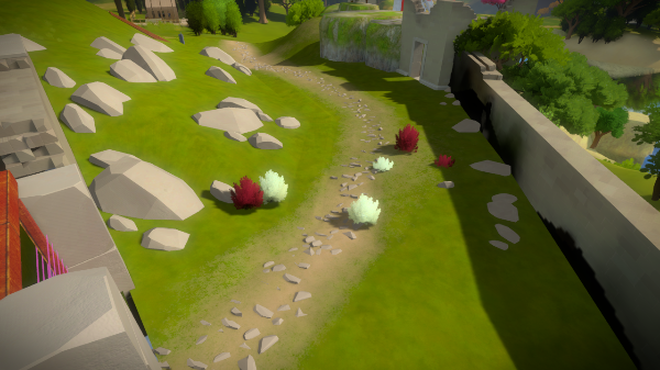
Some time later, using the actual grass system to plant small individual rocks. We also toned down the colors a lot to get the player to focus on the path.
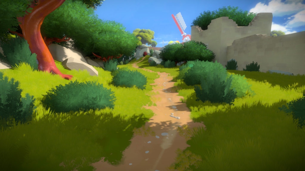
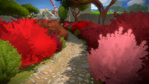
And the final version. The rocks in the path ended up being a mixture of textures and geometry. The vegetation color was made uniform and darker so the path can clearly stand out.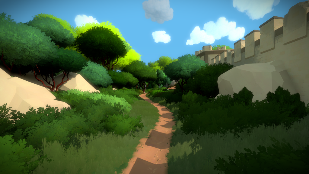
Agricultural Area
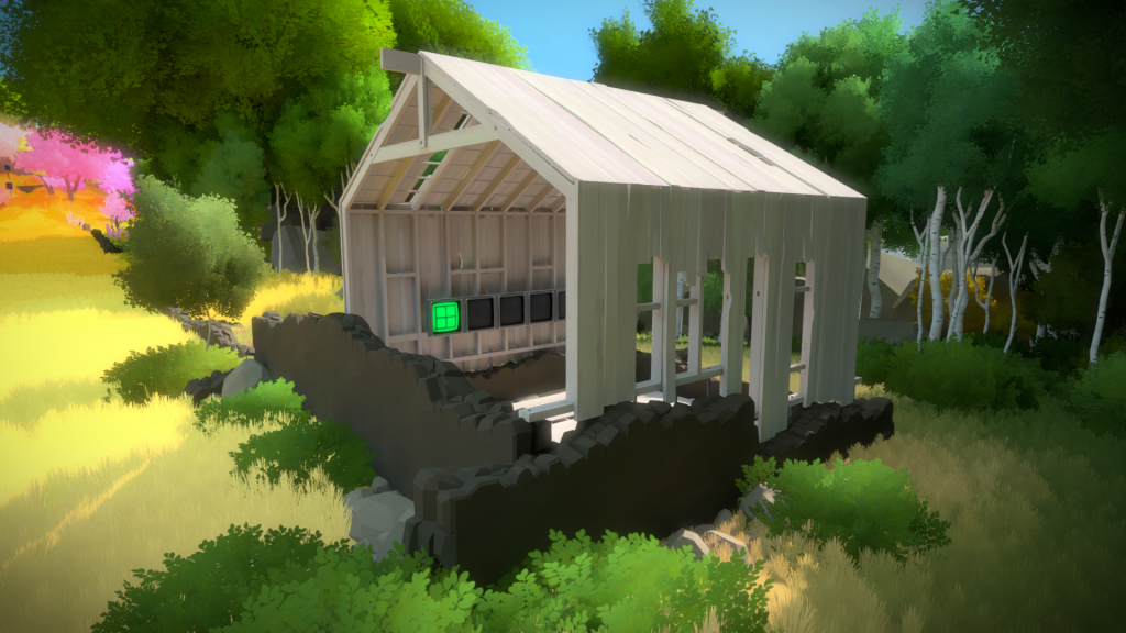
This shed, was the first asset were we nailed the new art style wood texture. I’m really happy out it came out and it was barely changed since the initial implementation.
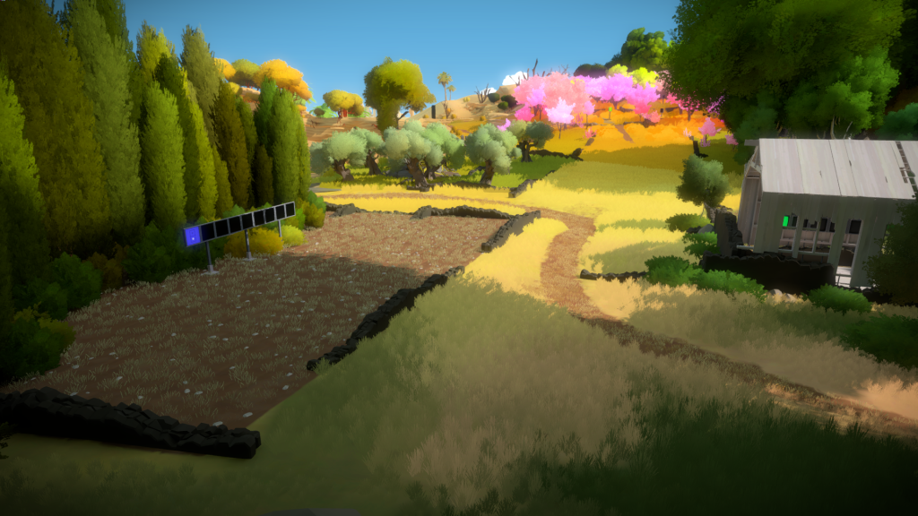
And here is how the composition reads. Jonathan is always very precise about guiding the player and that is very obvious in this image. You have the main blue panels as the focus of your attention, and then the green one in the shed, peeking through the broken boards. You also have the path that curves to the right, if you wish to explore a new area, but you also have the bright pink further ahead, showing you an alternate route.
And that is why we have a birch trees forest on the right side, so it blocks the rest of the island from the player, preventing him from being overwhelmed:
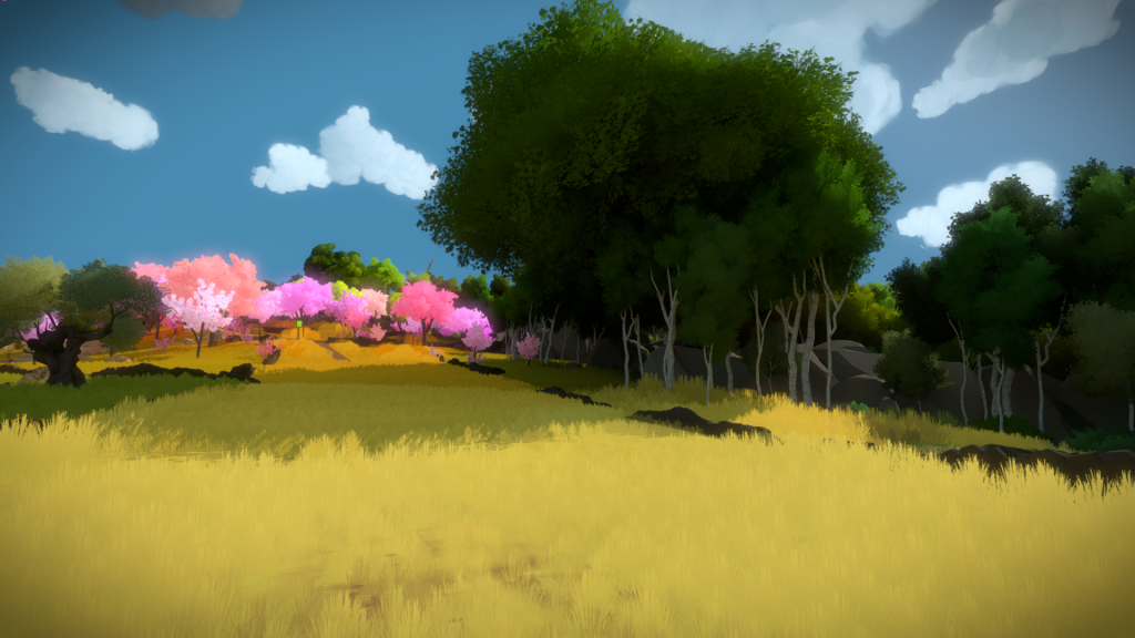
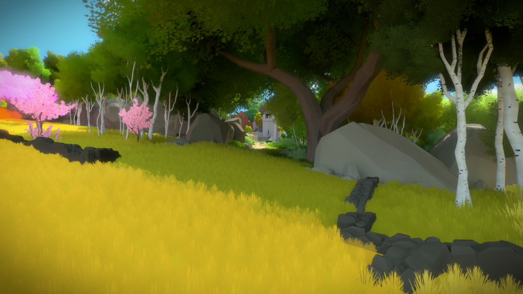
But if you walk further, you see that there are 2 paths that lead you to the Hub. They were carefully designed to create a nice framing without standing out as much as the others.
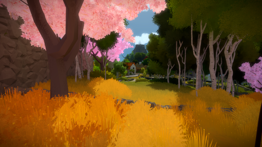
And the second path, closer to the Orchard area, a great work by Orsi on the vegetation and Eric on the walls.
Entry Yard Cliffside
This cliff had a lot of variations. It was very early on and we didn’t really know how we wanted it to look like nor how to represent it in the art style we defined.
Here are some of my first horrible attempts:
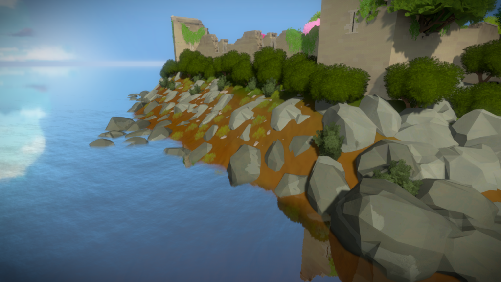
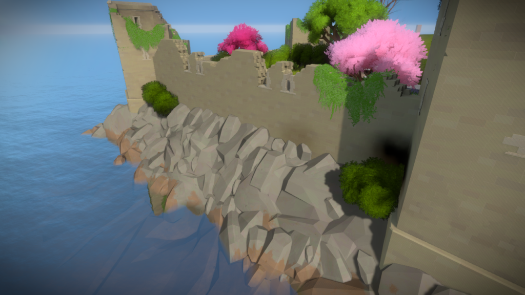
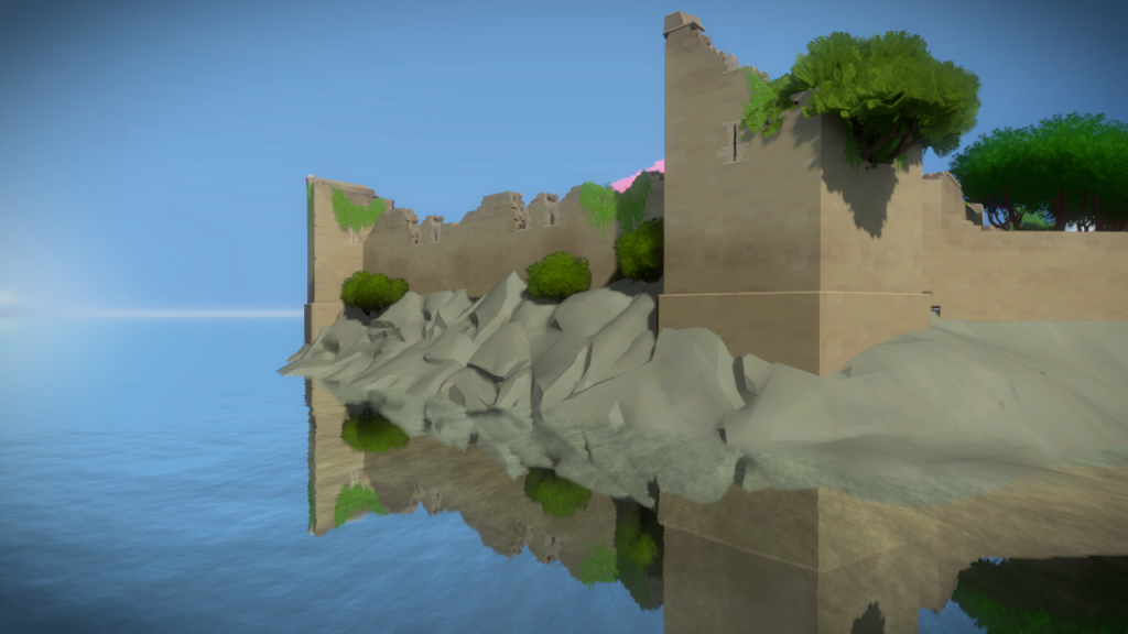
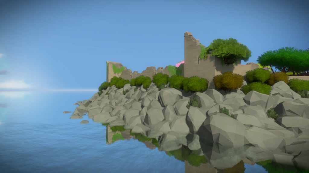
And the final result. One of coolest things we added was the ability to have a global map that changed the color of the ground. It’s something that helps bring these rocks to live and allowed for a smooth color transition from one side to the other:

