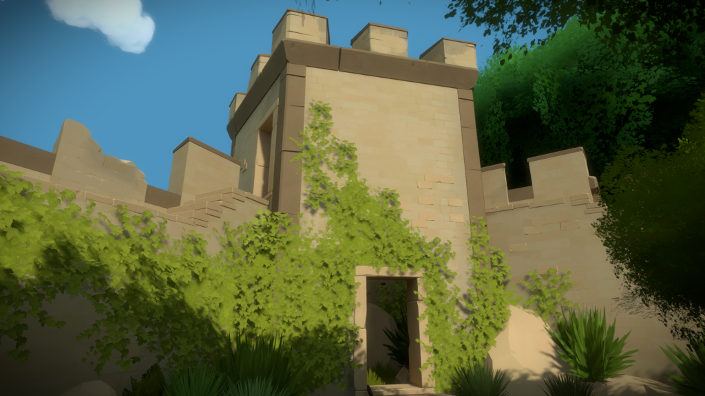
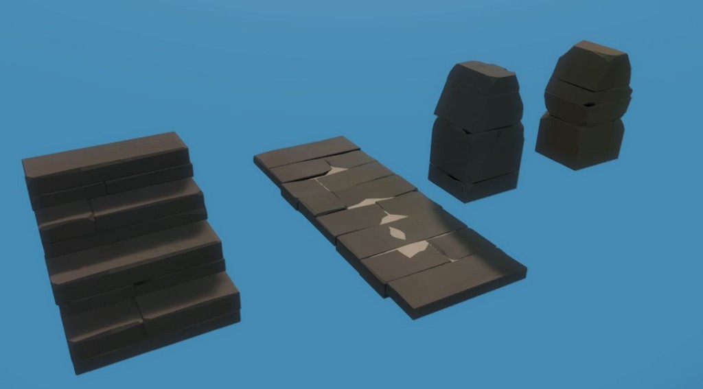
There is usually one section in every game where you do all your experiments. It ends up being the area where design is more solid and less likely to change so you believe that the modeling and texturing you will do will be final. What always happens, is that once the rest of the game is done, and you look back at that area, you have learn so much that you might as well re-do it to update to the style that naturally evolved through production…that was the case with the ‘Entry Yard’.
The puzzles and concept of the area never changed that much over the four years of the production, but the looks did.
The Bunker
After being hired, this was my first assignment, so there is some nostalgia to it, even tough its no longer in the game.
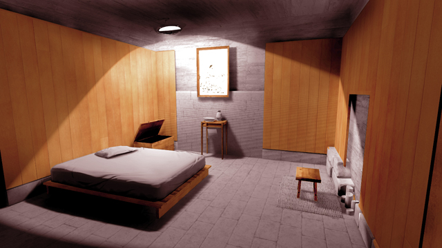
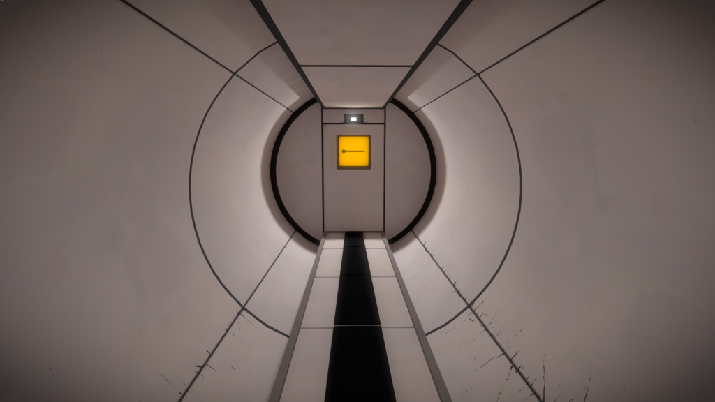
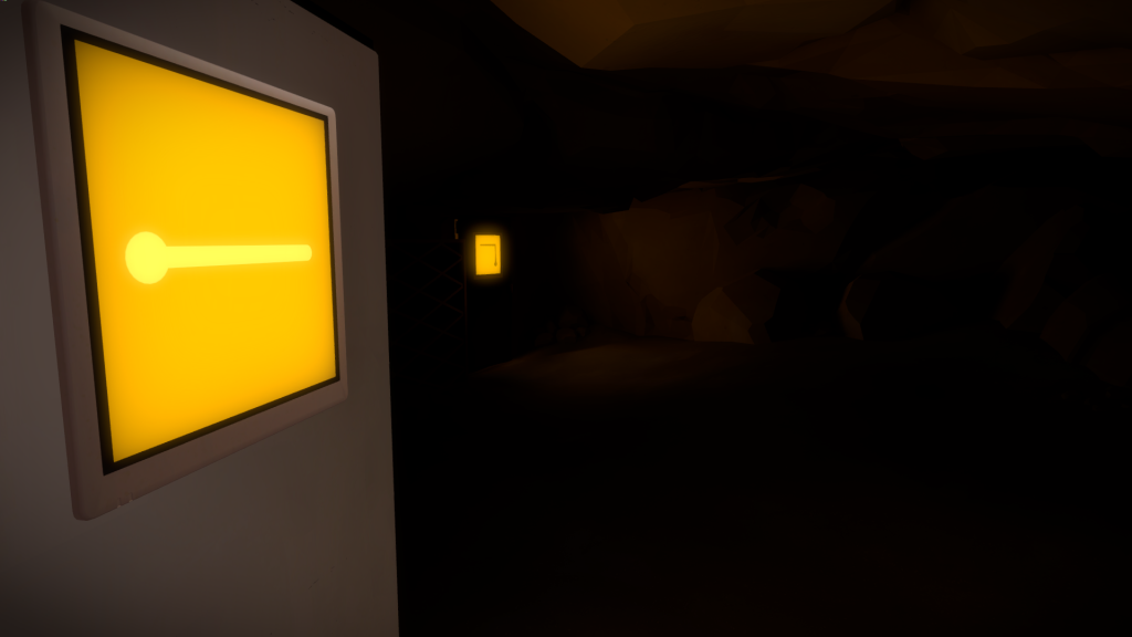
You would start the game in a dark tunnel of a old defensive bunker underground, located inside a small medieval fortification. Once you left this tunnel, you would be in someone’s house, built inside an old war bunker.
There had been a lot of back and forth between Jonathan and the Architects long before I joined, so the way it was supposed to look like was clearly defined.
Below is an example of the renders we would get from them. These would also be accompanied by 3D models that we could use as a starting point to create the in-game meshes.
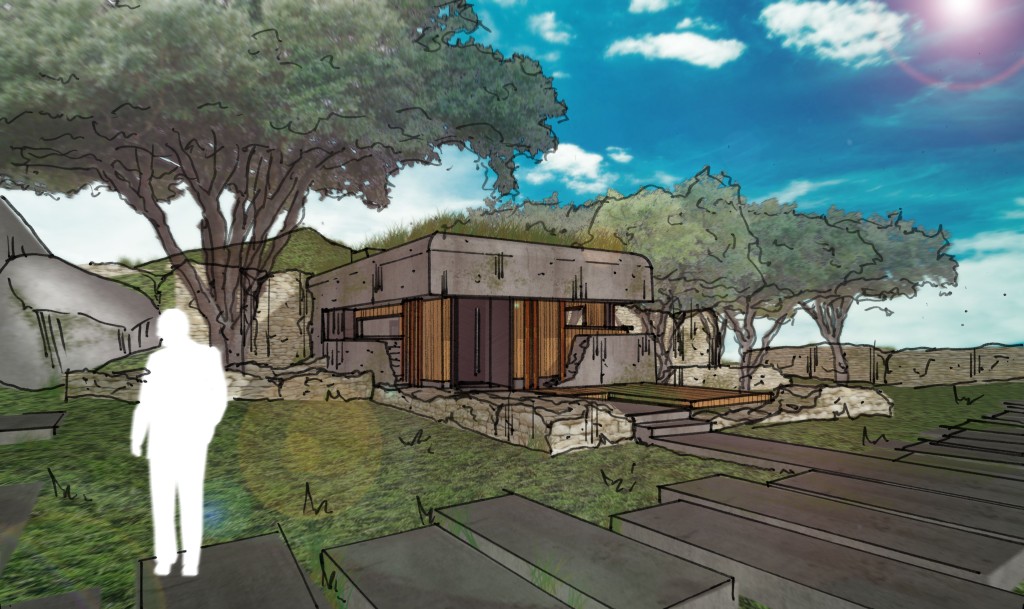
Since this area was so well defined in terms of layout, I truly believed I could get something very close to final art.
At this time, I just assumed that the work that had been done previously was the art direction we would go with, so I focused on trying to improve what was there and make it shippable quality.
This is the room right after the tunnel:
That would then lead you to a small workshop:
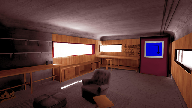
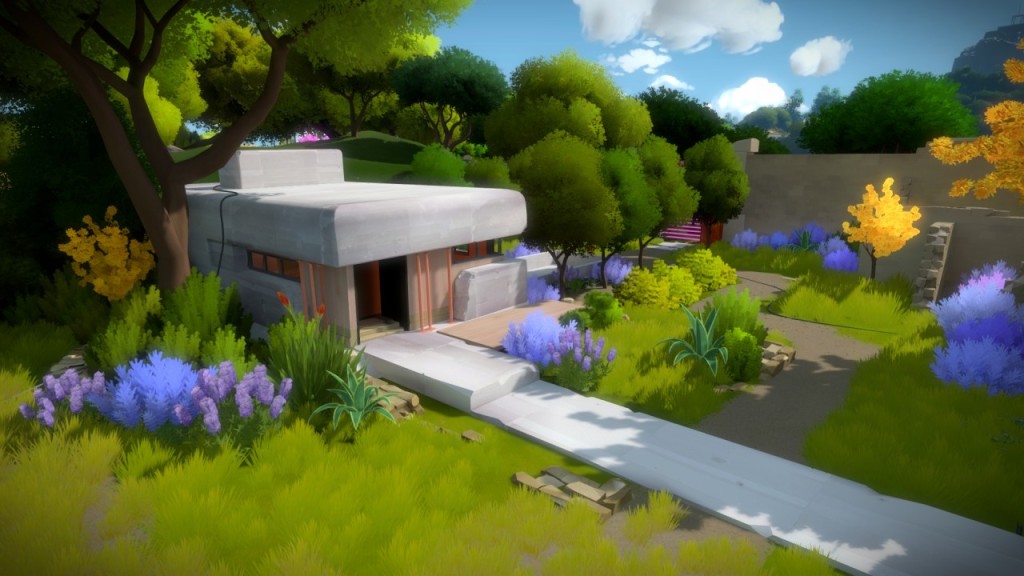
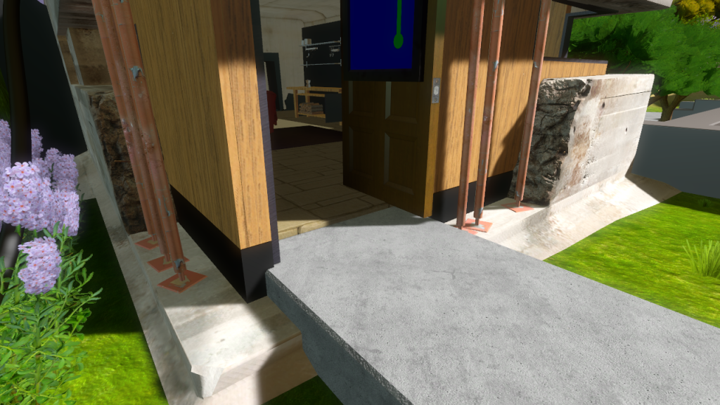
Once you leave this bunker, you would be outside, in the yard. Here is a detail on the bunker exterior work:
And the outside, modeled before I joined:
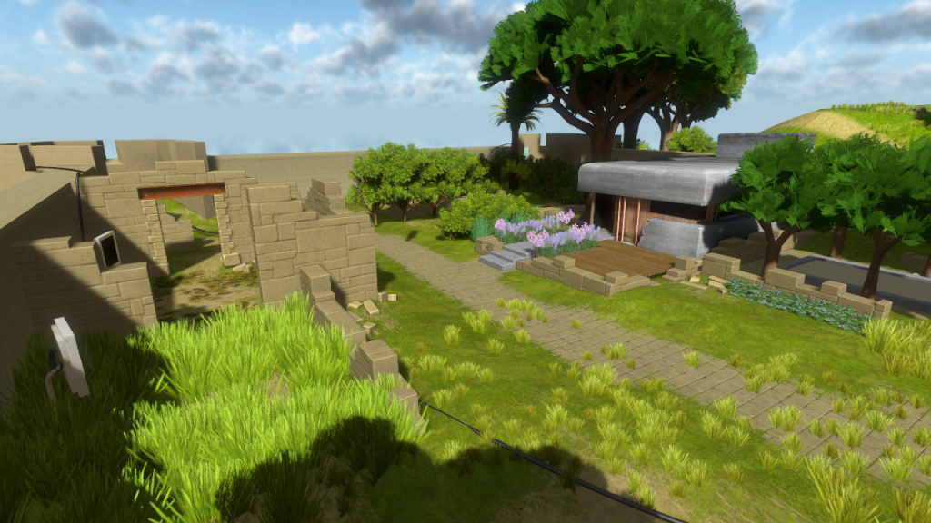
You can kind of see it in these images, and as we created more assets it became more obvious, that the art was all over the place. Jonathan knew what he wanted the game to say visually but we had no idea how that would look like. Once me and Eric joined the team, and we started producing a lot of final quality assets, what had been done previously started to come into question.
This led to a step back in the production (that we believed would be done in 6 to 12 months) to figure out exactly what the game is supposed to look like.
I’ve covered some of the process in my GDC talk here, and throughout some of these pages I’ll be talking in more detail how that happened in the areas I was responsible for.
For the Entry Yard, when I returned to it, we had already figured it out, so it was mostly a case of ‘updating’ it to the new style.
As an example, here is the before and after of the bunker cement texture:
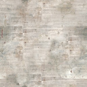
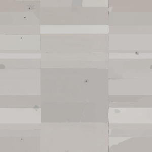
You can see below how the bunker looked after the art pass. By this time, I had also redesigned the whole yard walls and structure to fit with the new style and Orsi was doing an amazing job with the vegetation. Notice the laser gate behind the trees, still mockup design and shape but exiting roughly at the same place as it is now:
The Entry Yard
About a week before E3 2014, since the press would be playing the game, Jonathan wanted to have the final design for the Entry Yard and fix all the issues that we had been dragging since the start. We kinda knew what we wanted it to look like, so I had about a week to figure it out. I wrote about the process in the Witness blog here:
- Day 1 – Rough pass
- Day 2 – Detail pass
- Day 3 – Cave, Collision and Clusters
- Day 4 – Polish and Orsi’s vegetation update
- Day 5 -Cleanup
The biggest issue was figuring out how to have the player see the mountain the moment he steps outside. The bunker had always been facing south and we wanted to keep the puzzle right in front of the player as he exits the interior area. You can see in this old image how that was designed.
We tried to change the bunker windows, then the tunnel, but the easiest ended up just getting rid of the bunker and redesigning the space again.
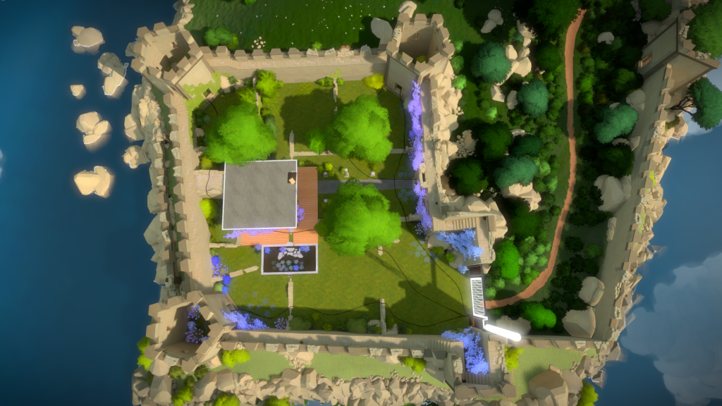
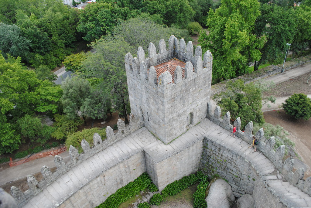
About a year into the project, I went for vacations to my home country, Portugal. Since I knew I was in charge of all the castle like areas of the game, and a lot of the trip included checking out fortifications, I made sure to bring the camera along and get enough reference to help me build these up. For the Entry Yard, the Guimarães Castle was one of the main influences, since it’s similar is size and layout. You can see below one of the reference shots I took, and how it helped designing the walled walkways in this area.
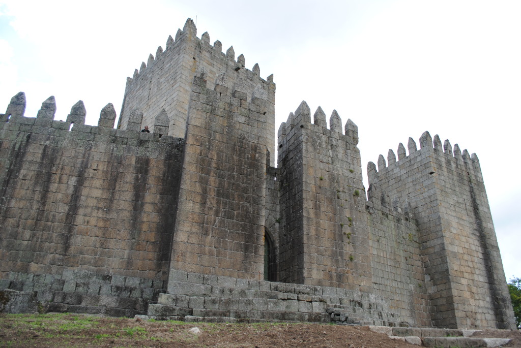
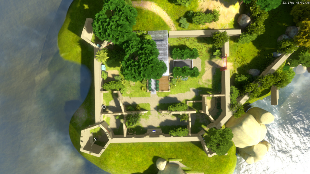
Here is how the walls were redesigned based on these references :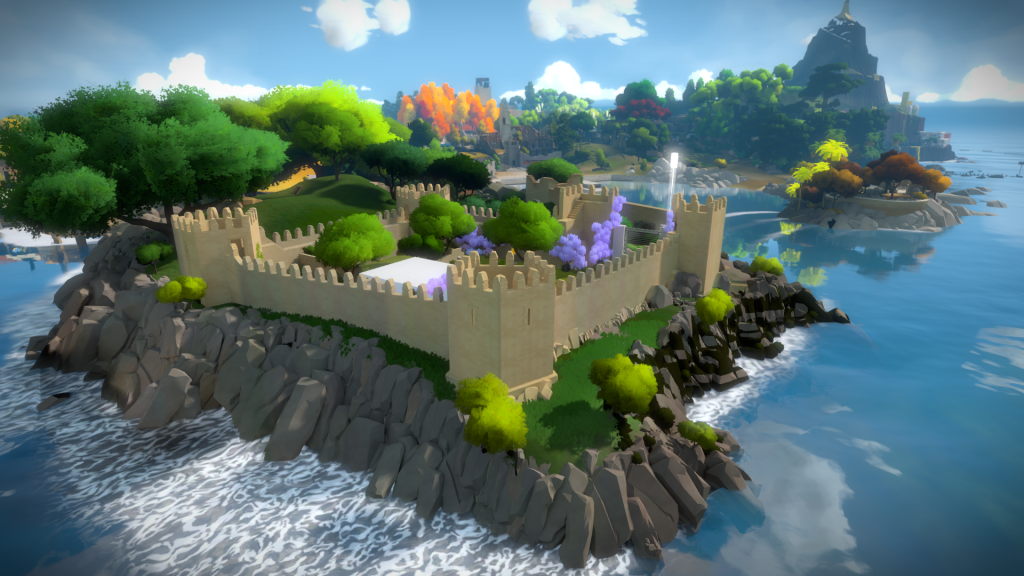
We ended up with a newer longer tunnel that connects with the themes of the mountain interior:
That leads into a cave, preparing you for a nice transition to what you are about to experience :
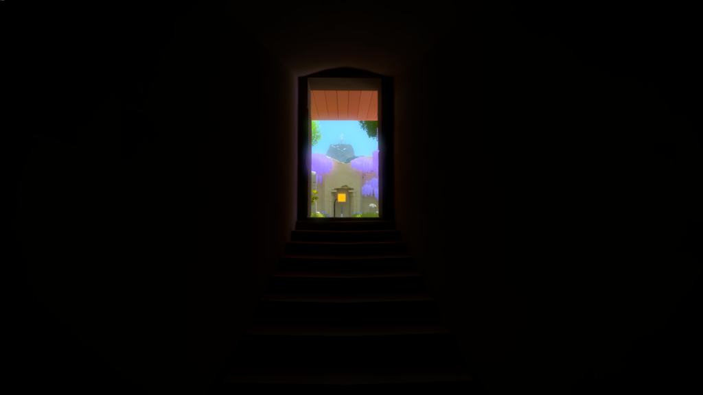
And finally up some stone stairs, giving you the perfect alignment with the mountain:
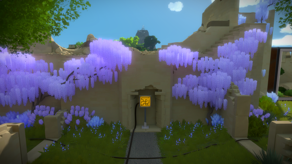
And directing you once again to the first puzzle panel:
By the end of the E3 this is kind of how the Entry Yard looked like: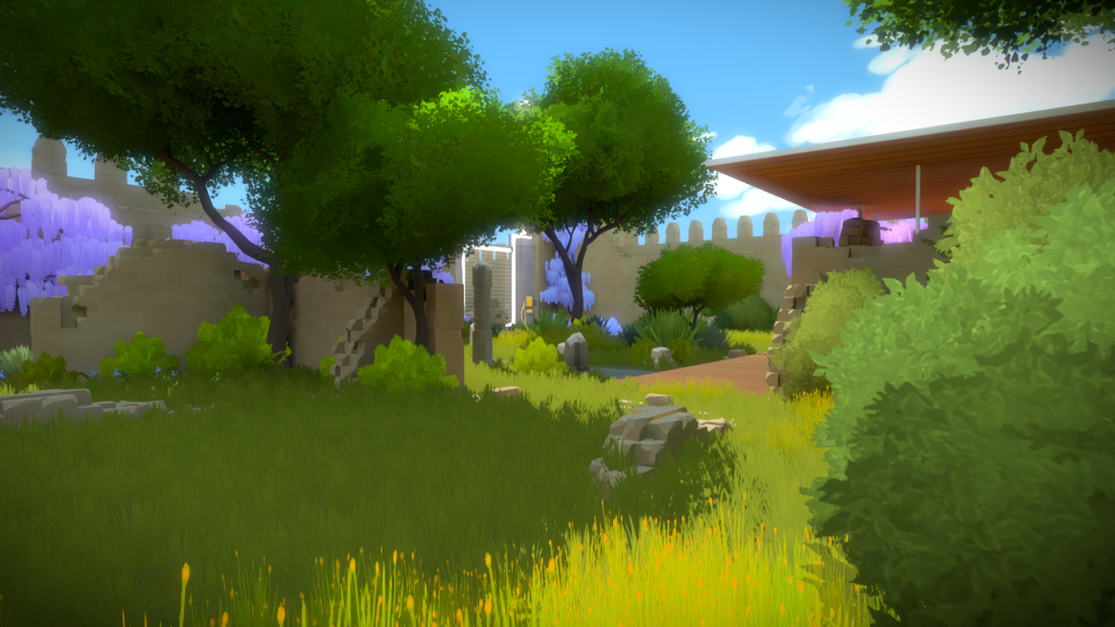
Of course, as the game developed, we still did a LOT more changes to this area, the more obvious being the battlements. Here is the final version with the vegetation pass by Orsi.
You can see here on the walkways closely match the Portuguese Castle references from above: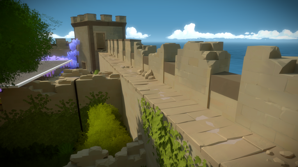
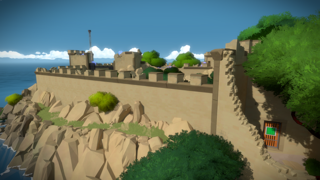
The reason why I was able to get this area changed in under a week for E3, including cleanup and polishing, was due to already having several assets from another area I worked previously, the Keep. I still created some new modular pieces, but at this stage we were so comfortable with the art style, that we could churn these out very quickly.

