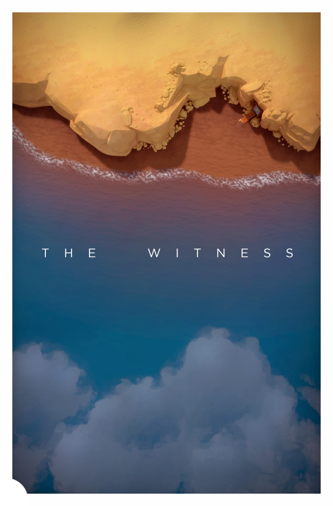
Official Poster
Designing the poster was a nice break from modelling and an unexpected pleasure.
I shared it in this post, along with other proposals that weren’t used, but I avoided explaining why it looks the way it does, since we didn’t want to spoil anything, but now that the game is out, it’s a different situation.
I wanted to avoid doing the usual ‘game art’ poster concept where you end up with just a a pretty shot. I was aiming for something subtle and balanced that expands on the themes of the game. While flying through the island and trying different angles, I really enjoyed the flattened perspective. It relates with the bidimensional side of the panels you trace, it’s mysterious and different from the usual stuff you see.
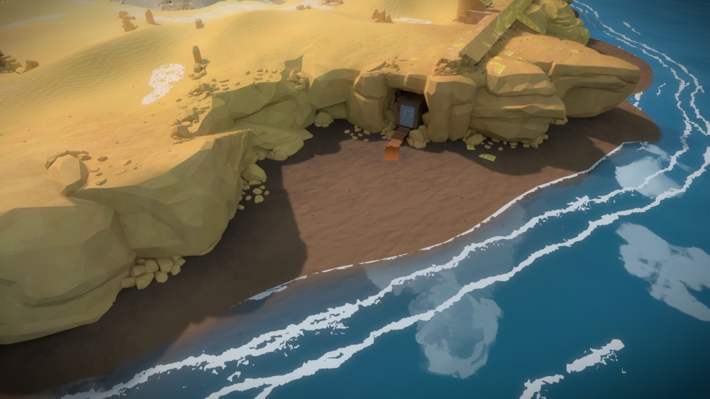
The selected proposal was actually the first one I presented to the team, that you can see below. It’s an area Eric was responsible for, and it has a nice color contrast between the water and the cliff side. Also, looking closer you can see a man made structure with a panel.
When I presented it to the team, I was quite happy of how the clouds in the bottom balance the composition, but I think it only became that much better once Jonathan suggested that we make the clouds fit the shape of the cliffs like a puzzle piece.
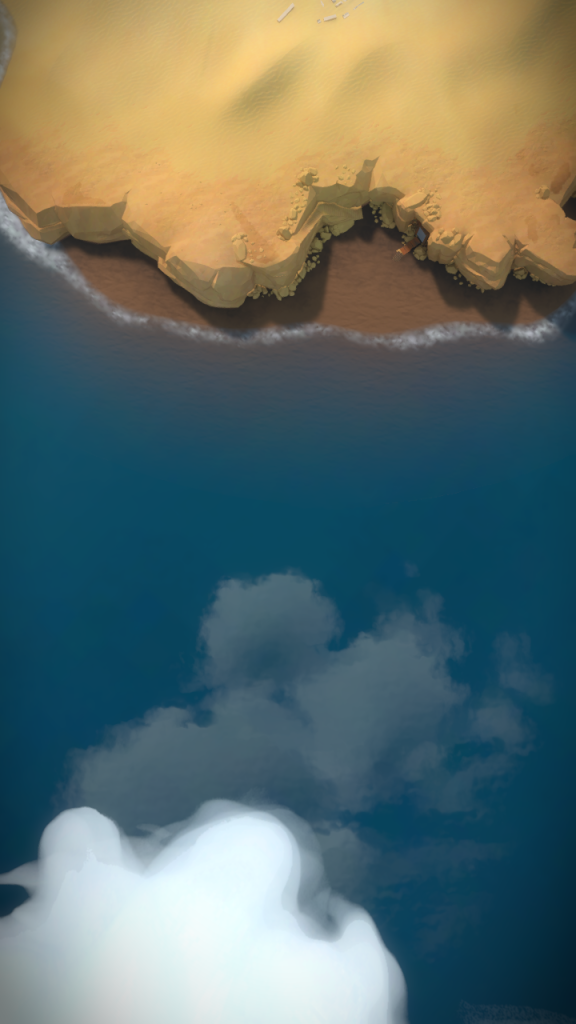
Everyone loved the idea so that’s what we went for. Below is the actual in-game screenshot that I used to make the final poster. The engine wasn’t quite ready for high resolutions screenshots, causing the shadow far away cascade disappear at the edges of geometry like the stairs, requiring some touch ups. We also didn’t have engine color grading, so that was added in post too.
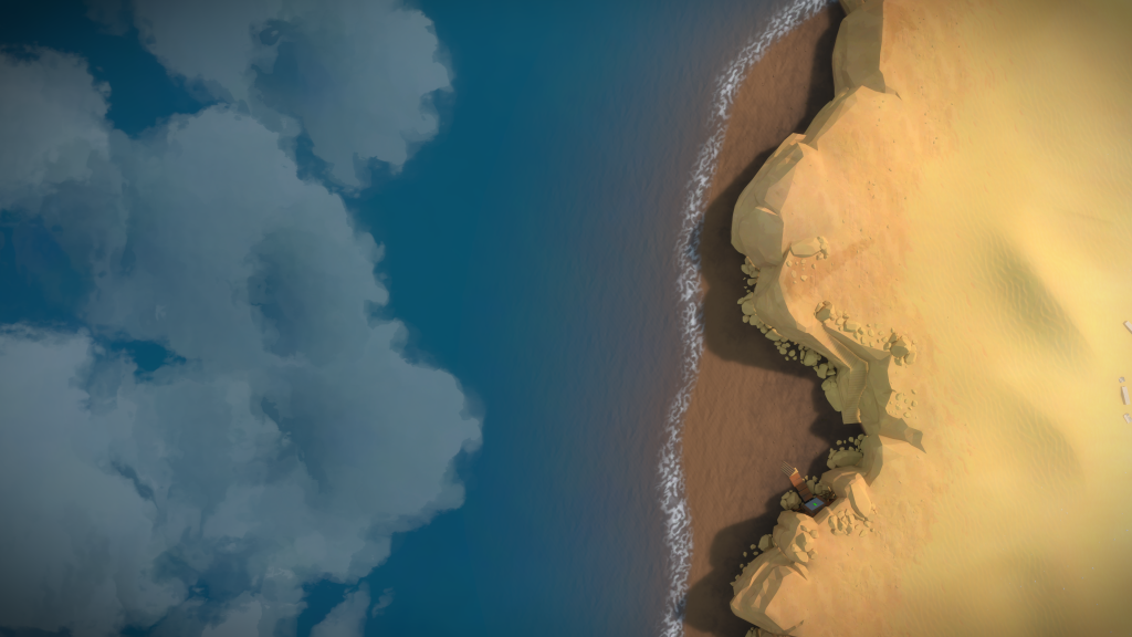
The final addition was the white border with a quarter of a circle emulating the ‘drawing’ mode during the game. Here is the final version:
Interesting trivia: We hadn’t figure out how the foam was supposed to look like when we did the poster, so the version in there is clearly a placeholder. For comparison’s sake, here is how it looks now:
Long Screenshots
Unlike the first announcement trailer, we decided to do the release trailer in-house. I’ve done some video editing in the past when I was working at the https://epiceventsnj.com/, so I was tasked in making it happen.
A few days before I started, I watched Koyaanisqatsi and was very impressed in how it lets the imagery just ‘be’. The movie has lots of prolonged shots where you end up hypnotized by the beauty of moving nature. I feel The Witness has a lot of this, so my first reactions was, rather than showing gameplay, like most trailers do, show what is the feeling of being on the island.
In case you don’t know, here, here is the trailer for Koyaanisqatsi:
It’s so beautiful, so immersive, so alive! I strongly believed this was the right way to go, so my first proposal to the team where based on that. Since we don’t have that much actual movement when the camera is static, I proposed a couple of long slow island panning shots, without any gameplay or explanation, and the title at the end. I also liked how these connected with the flat perspective in the poster design.
Of course, if you look at it from a marketing angle, it’s kind of a suicide move to have these as your main release trailer. Jonathan was already being extremely careful not saying much about the game in order not to spoil anything, and here we are, announcing the release date to the world and alienating the players with an obscure two minute video!
The cool thing is, even tough it didn’t work as a trailer, the team liked it, so we ended up re-using them as the ‘long screenshots’.
You can enjoy them below, rendered in 4k at 60 fps. Make sure to play the videos in full screen, with headphones, and listen to the amazing ambiance sound by the Wabi Sabi team.
The last long screenshot, was slightly different. First, I couldn’t find a way to extend the concept of panning that worked well. I tried a upwards camera but it always felt very weak compared to the first two. I was trying several ideas of just flying in straight lines around the island when it suddenly clicked! Jonathan has been taking progress screenshots of the island from one specific camera angle , since the start of the project and sharing them in the official blog:
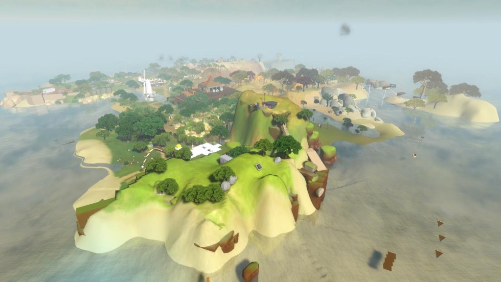
What if this third Long Screenshot was a conclusion to all those images? I tried to figure out where the camera would have to start so I would have a similar final angle and was lucky that the desert ruins where as very nice starting point, so we went with that. I like how as the camera zooms out, you see something new, just like in the previous Long Screenshots.
Also, since the game is already out, it’s a nice way to share the island with people that already know it, not so worried that there might be spoilers.
Release Trailer
Now that my impetuous first idea was out of the way, I went back to the drawing board and tried to re-think what the trailer is supposed to do.
I recorded myself playing the game, trying to get some perspective on what you do, what feels right, wrong etc.
Just by solving panels, making mistakes, trying to get variety in shapes, colors and movement, you get a narrative. Tracing a puzzle can be broken down, from the starting circle, going through the thought process and arriving at the end cap, with a whole set of emotions in between, from getting the wrong shape, seeing a cable lit up, or the whole panel turning off in your face.
That’s what the first part of the trailer is, showing what you will ‘do’ in the game. Walking to the first panel, starting and mixing between the other panels, discovering the rules and arriving at the end cap. Once that happens, you ‘leave’ the panel tracing and see how those actions affect what is around you and how that system grows in complexity, until you activate the lasers.
I tried to get that panning shot, from the laser to the mountain, with other locations, hoping to get something new compared to the first trailer, but the Keep is the only one where you can have a very quick panning from laser to the mountain and have such great framing, so we went with it again.
The second part of the trailer, after the mountain shots with all the laser turned on, was to show what is the ‘feeling’ and ‘beauty’ of being on the island, going for what I wanted to say with the original long shots. We also tried to spoil as little as possible, show variety, convey that it’s a first person game by having clear player walking situations (rather than mostly fly throughs) and hopefully hide some hints of what the island is about.
For this process, I just shot tons of ideas, editing them together, showing them to the team to get feedback, get more ideas, repeat, etc.
The other work in parallel was to find the right music for the trailer, since it’s what it would glue the whole narrative together.
I was originally looking mostly at Piano and Violin tracks but none of them really clicked with Jonathan. Orsi made me aware that he is very found of Cello, so I decided to go that way.
For a long time, the final cut was made using Julia Kent’s Transportation. The song has a great start for the laser tracing, but I was unable to make it work for the second part of the video. There is also a natural sadness to the song that I felt too imposing. A few days before we had to release the trailer, after listening to other musicians for a few days, I stumbled on Zoë Keating’s Into The Trees. The short strong tempo allowed me to fit the panel tracing with the beats and the cyclical nature connected the narrative. It was a perfect fit!
On the technical side, we wanted the trailer to be recorded at 4k resolution and 60 fps, with all the details as high as possible. To prevent frame rate drops, Salvador, one the programmers, wrote a little tool that exported each frame as part of a sequence.
The problem with this, is that in order for the game to keep up while it renders each frame into a folder, it has to run in slow motion. To give you an idea, the longer the sequence, the longer the slowdown in order for the cpu to be able to process all the frames in RAM. The Long Screenshot #2, took about hour and half to render!
In case you are curious, here is my ‘high-tech key pressing setup’ to record the long screenshots (in case you can’t tell, it’s a hard drive, on top of two wacom pen holders, with a battery pressing the key):
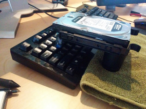
This slowdown was ok if the shot was just walking forward or tracing, but once I had to rotate the camera (e.g. looking at the laser and then at the mountain) and I wanted to time that rotation to the music…what a nightmare! It was a process of trial and erro, only being able to see if it worked once I was in After Effects!
4 months have passed since the trailer was released and I still love it. You can watch it below:

