The Marsh was a tricky area. We always strived to have a natural beauty in all the different biomes, but the Marsh never really ‘clicked’.
The art concept changed several times, and it was re-worked over and over without ever being something we were happy with.
It reached a moment where Jonathan finally said “Ok, I want the 3 of you, at the same time getting this fixed!”. It was an awesome team effort, it felt like someone crying “Art Team, Assemble!’
We split the area into 3 different sections, Orsi being a vegetation master, was responsible for the plants, Eric was in charge of the outside buildings and me, the underwater bunkers.
Marsh
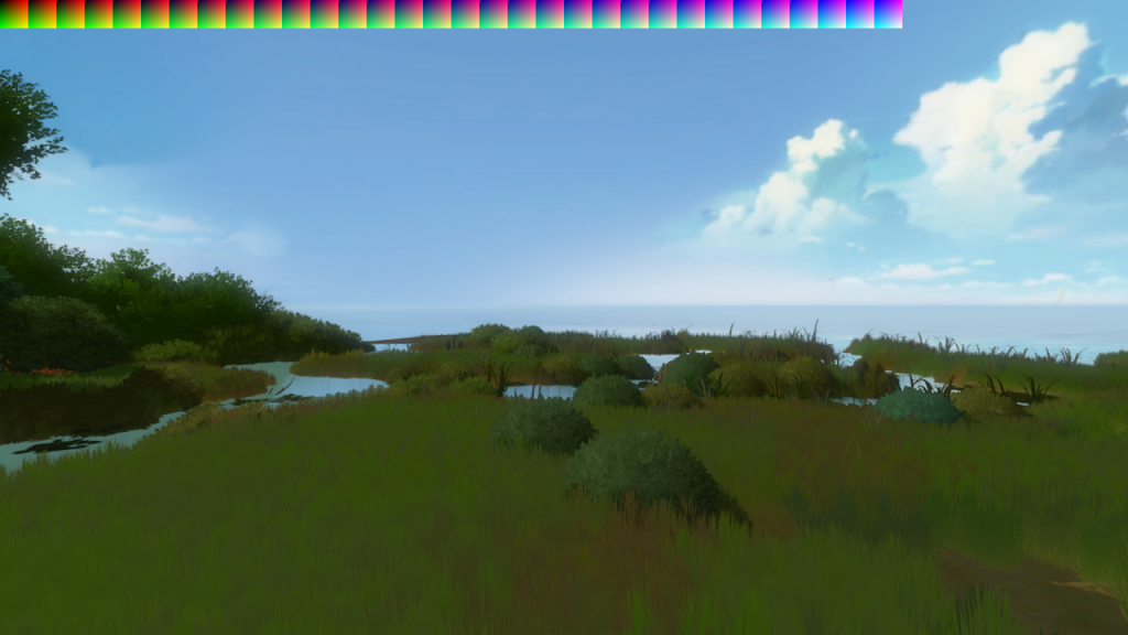
Early on, as we were figuring out the art direction and the Marsh didn’t really exist, I did some in-game concepts to see if we could pull off a swamp style environment with the new style.
To do this, I made a piece of terrain in the middle of the island as a test area and tried to get the swampy vibe out of it. This screenshot is all that is left from that test.
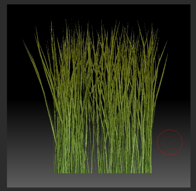
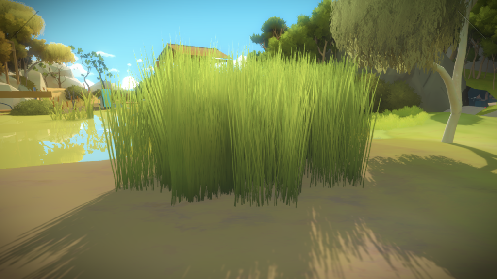
Another contribution I did for this area was the tall reeds. Up to this point, the grass texture was just painted in photoshop, but since this area required long thin reeds, it was hard to get something that felt stylized but realistic at the same time with just painting. I had been toying around with the idea of using Zbrush FiberMesh for the grass, so I decided to try it here. It allowed me to easily create some reeds, comb them to a style that I was happy with, and then render it out. Since it’s an actual 3D mesh, I could quickly render the alpha and depth map and try several quick variations until we were happy with the results. Zbrush screenshot:
Bunkers
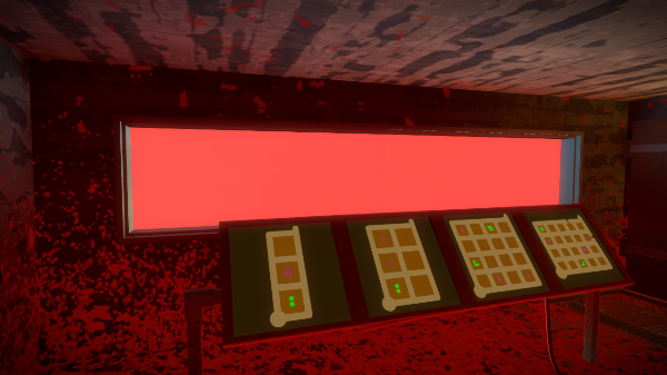
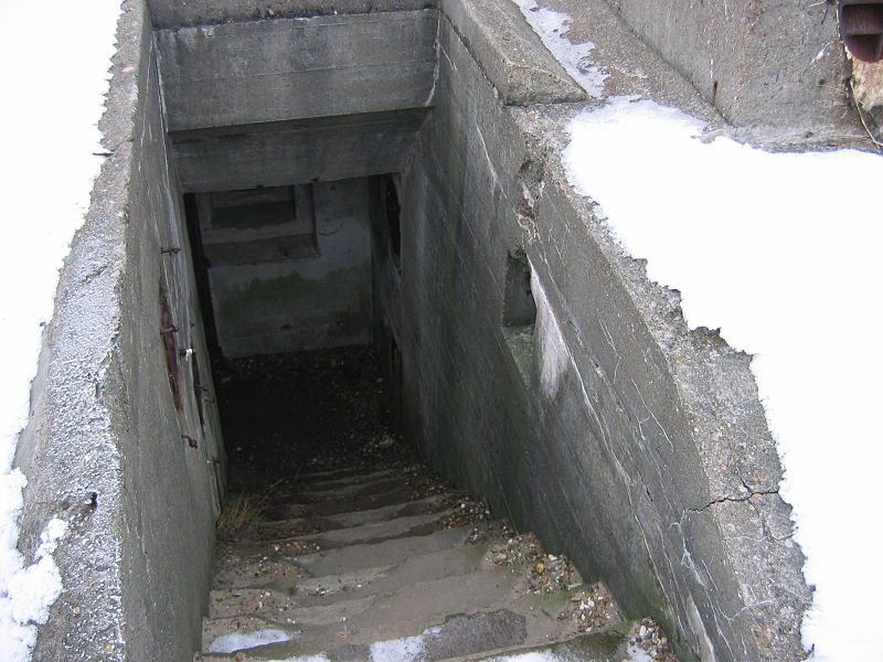
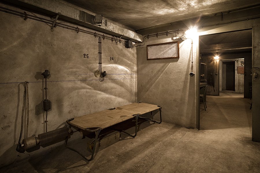
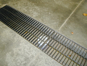
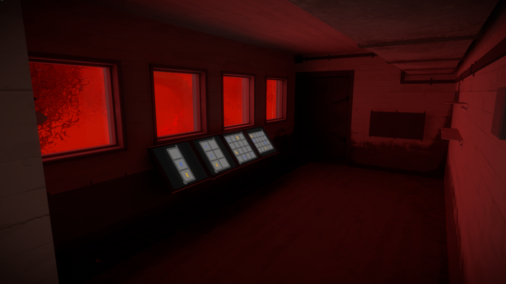
This is how they used to look like. The panels were in the middle of the room breaking the navigation, the window were all different sizes, and the drainage on the ground didn’t make any sense. There was also a failed attempt to get some coloured moss inside the rooms.
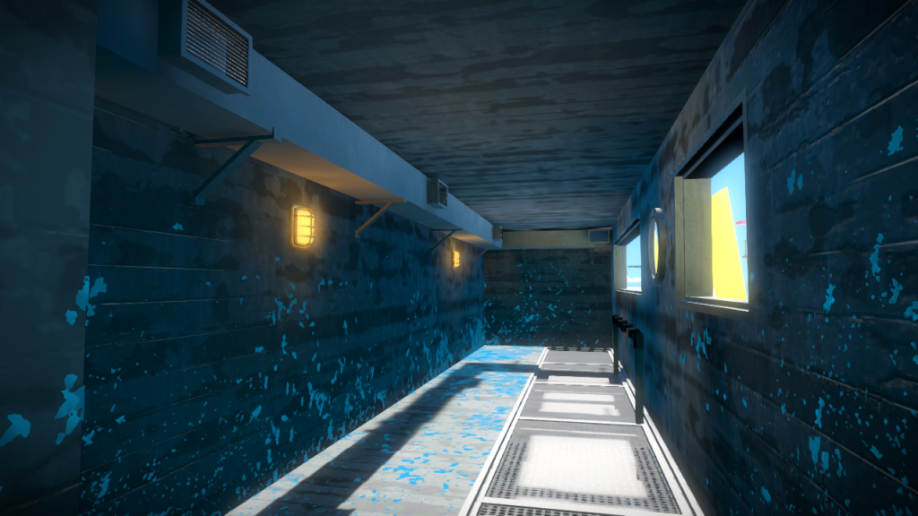
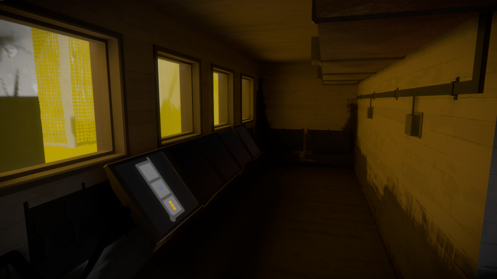
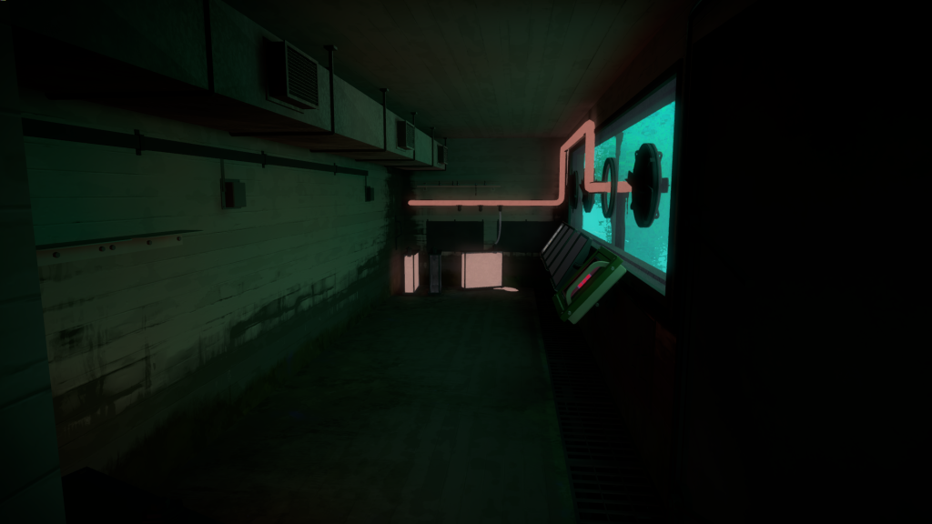
Since the island narrative in this area was a bit ‘surreal’ , I wanted to make sure that the art would be convincing. Once again, the architect knowledge was priceless. They provided me with a lot of answers on how these things would have to be built. From how the water could flow in and out, how the drainage pump and ventilation system would be, as well as the design of the glass to resist water pressure. Once I had all the answers, and plenty of references, I was able to rebuild these spaces.
Something else I like about the final result, is that by removing the previous artificial indoor lighting, the naturally tinted water defined the mood for each room:
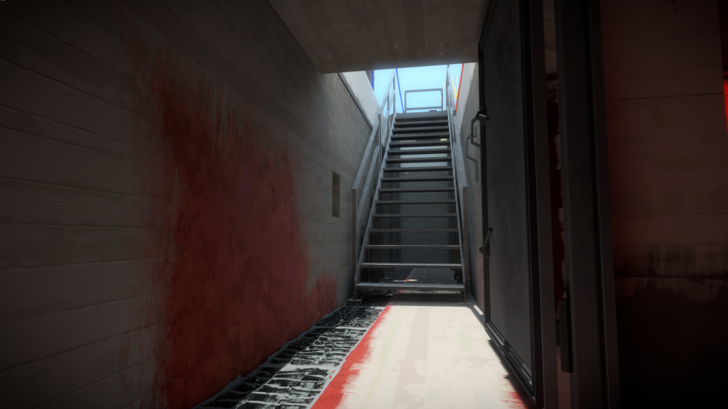
I was also able to still keep the narrative of the colored algae in the bunkers entry stairs, closer to the drainage system and more subdued:
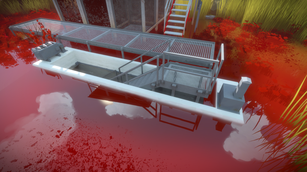
And finally, the way it looks from outside, with a water pump on the left and the ventilation box on the right:

