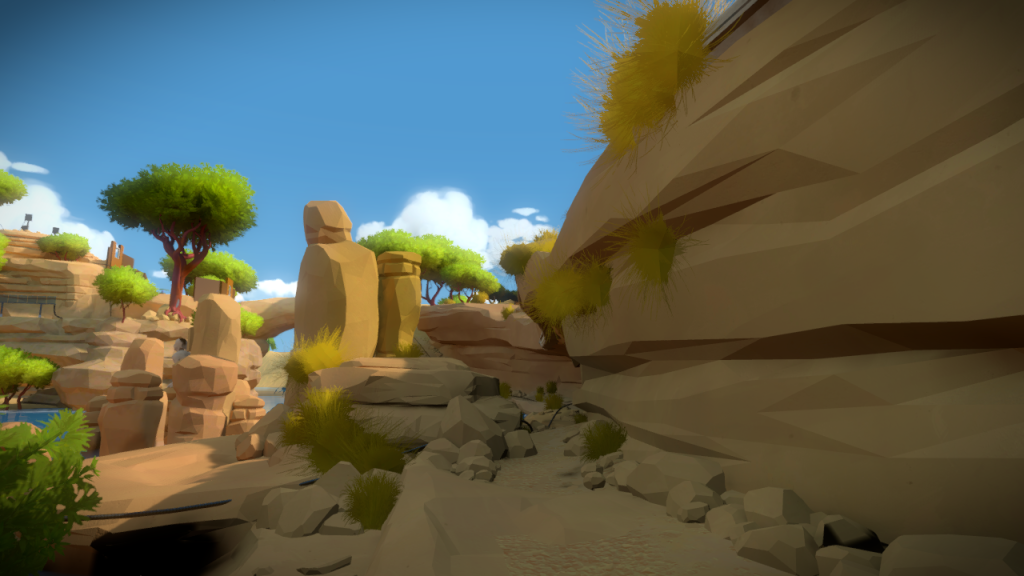
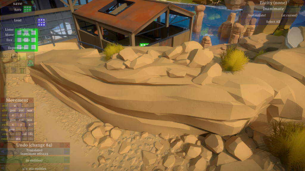
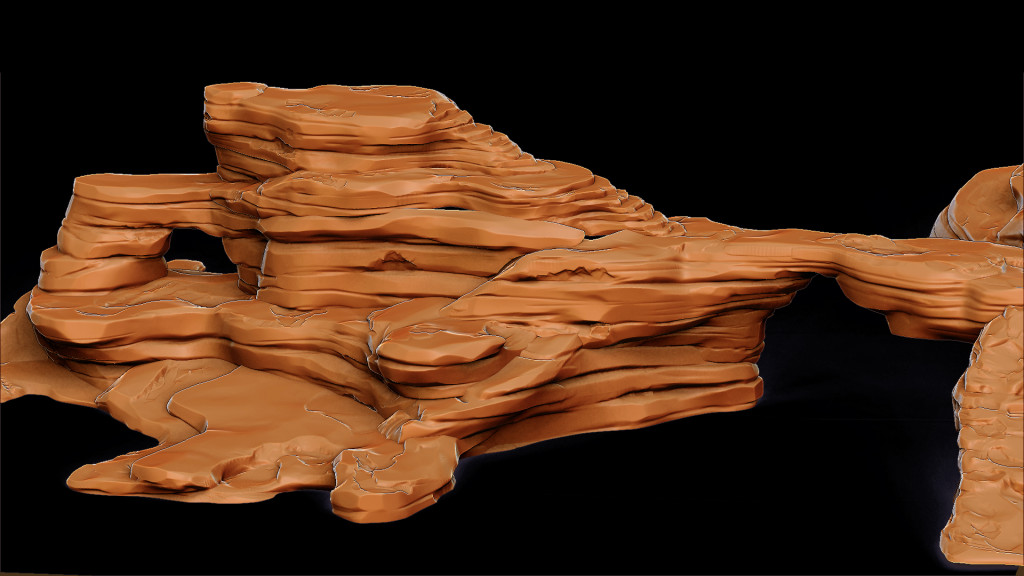
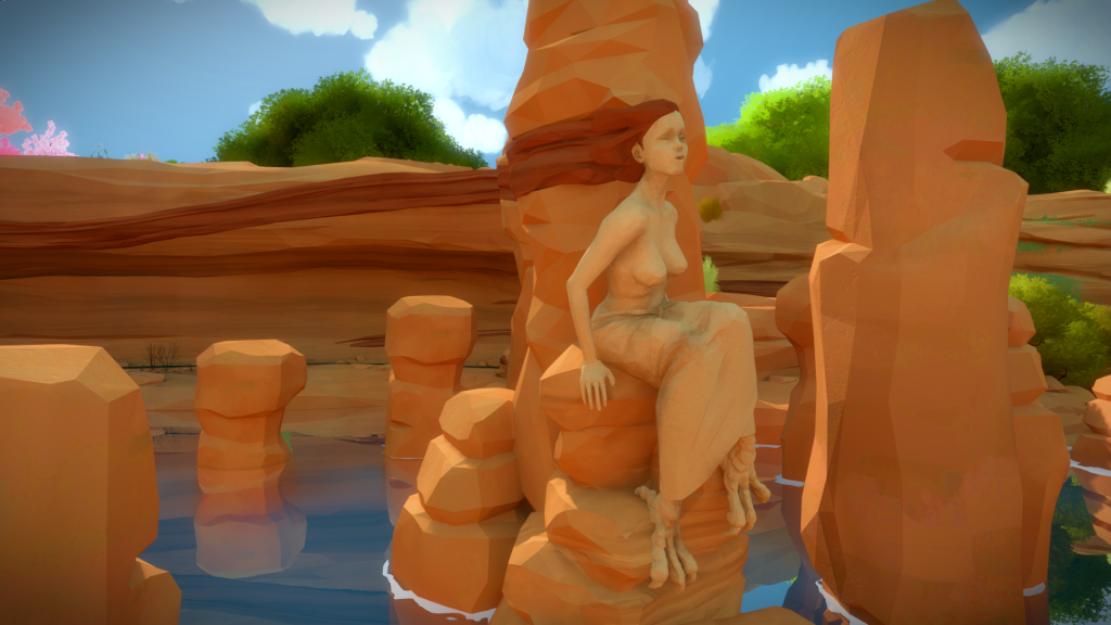
Each area in the island reflects the themes of the puzzles they are about, and the Symmetry Island for me, is one of the most clear examples of this, where you can feel it in the building and landscape architecture.
Glass Factory
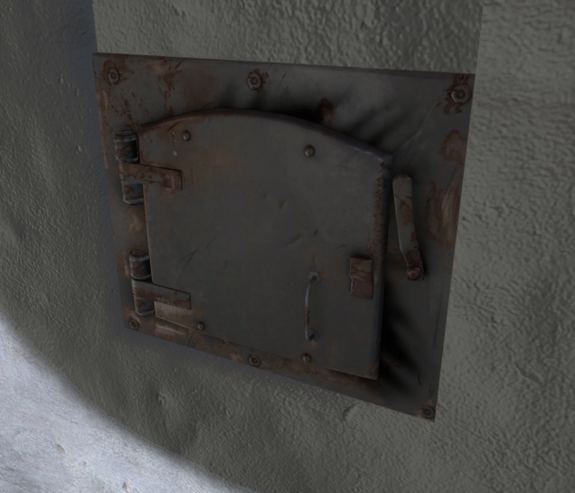
This was the second building I worked on, right after the Entry Yard Bunker, and it was also a building used to figure out the art direction. I remember creating a very detailed furnace door (see below) and asking myself…if we are going for this amount of detail, with this team size, we will never finish this game.
As more and more assets were built, the issue became more obvious. It was not only time consuming to try this level of detail, but it was going against how clean the game was supposed to be.
Here is the first pass of the building, following a design from the architects. (textures are all before the art pass)
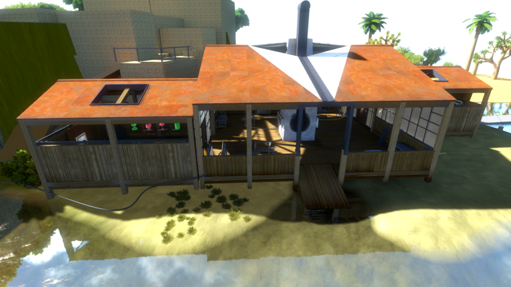
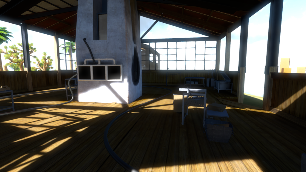
One of the things we reduced was the noise in the wood, very obvious in the previous images. Just for comparison, here are the old and new wood textures:
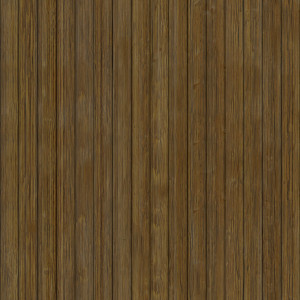
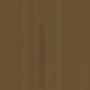
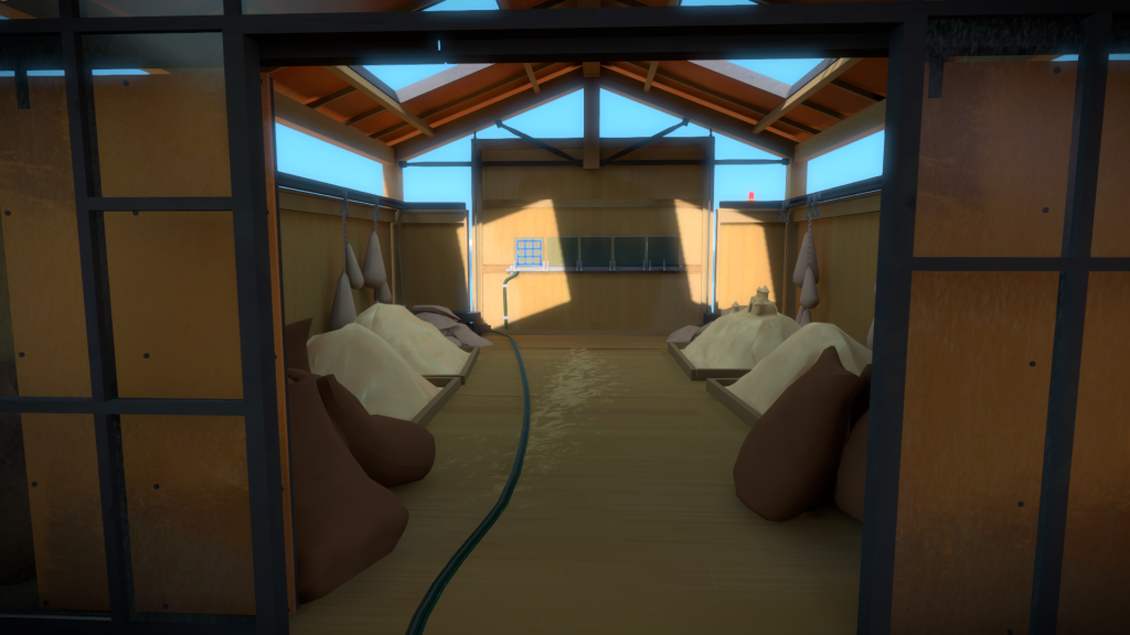
At this stage, we were also trying to figure out what was the right amount of detail for the props. Jonathan wanted the player to be able to understand the fiction of the place and have some narrative cues, but without distracting you from the important gameplay elements. I did quite a few proposals in the Glass Factory as well as the Bunker but unfortunately wasn’t able to find any screenshots of that time. Below is the final result: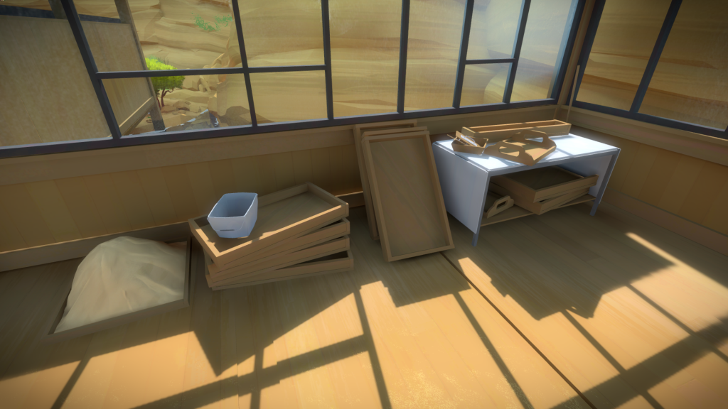
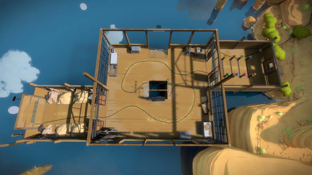
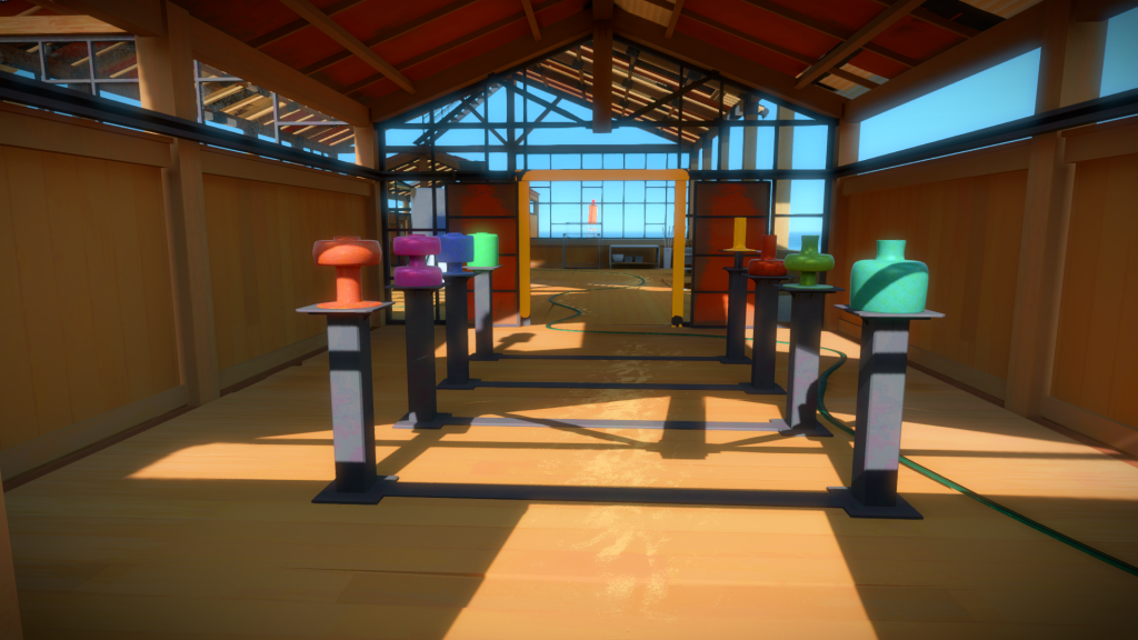
On the image below, you can see how all the building and interior decoration was used to convey different types of symmetry:
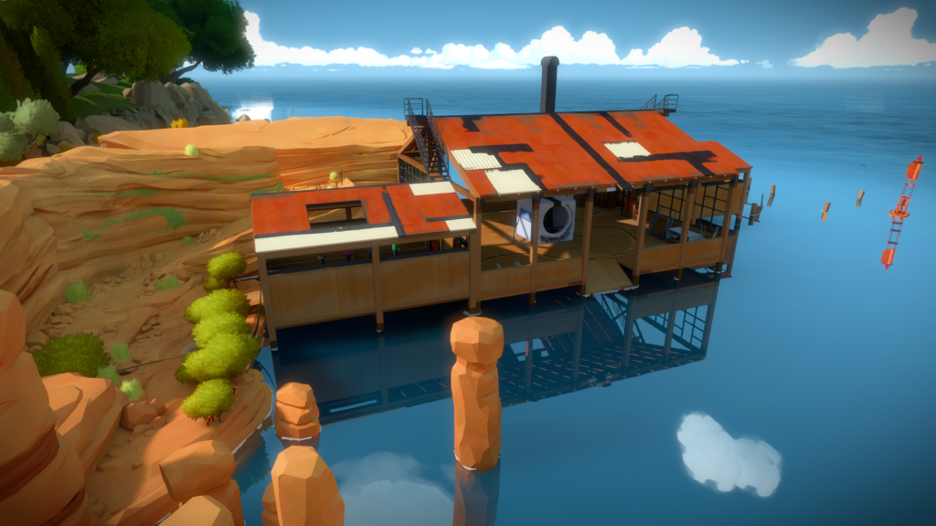
From the outside:
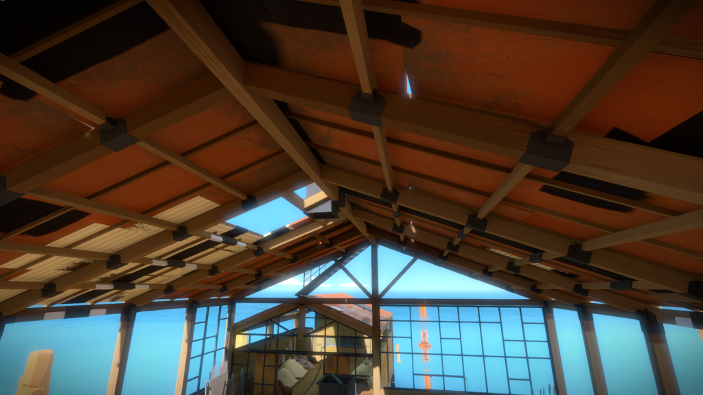
Finally, it cannot be overstated how important the Architects were in the process. For the Glass Factory in particular, they provided very precise assembly details for the wood structure, weight distribution, roof design , doors, etc. It would have been impossible, even with a lot of research on our side, to arrive at this level of detail. Looking back at all my previous projects, I cringe at how bad the architecture was. And the same applies to costume and character design. Game developers should always try when possible to consult with specialists in the areas they are trying to work in! On that note, check out the awesome roof details below:
Cliff Path
The peninsula had many iterations, evolving as we figured out the art style. The overall shape and navigation were already defined before the art style:
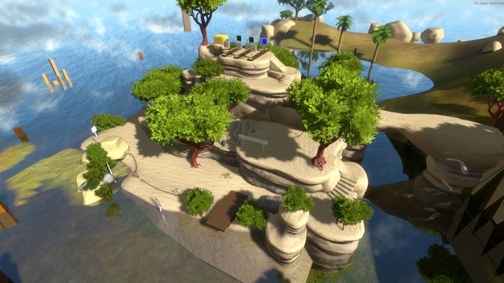
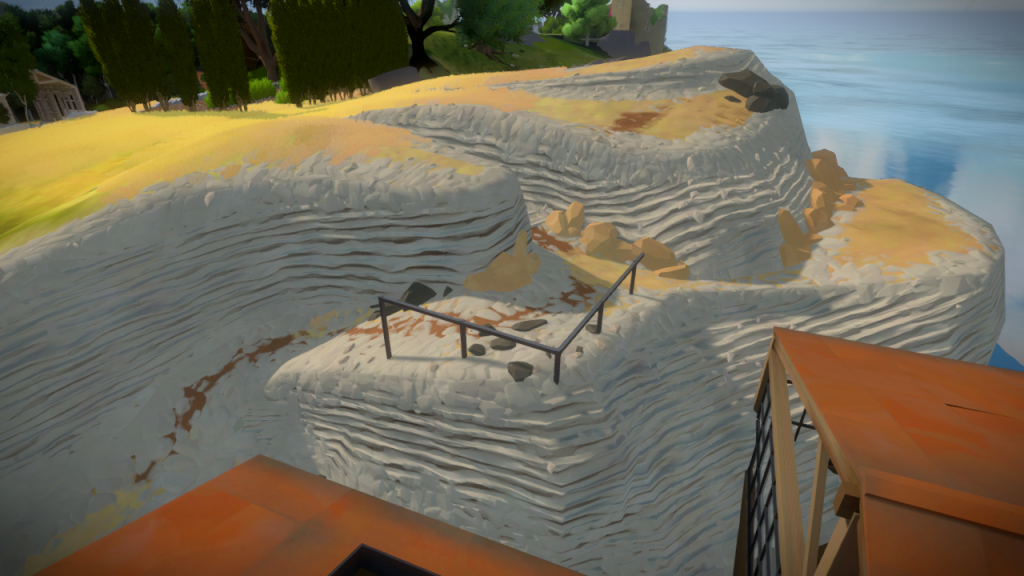
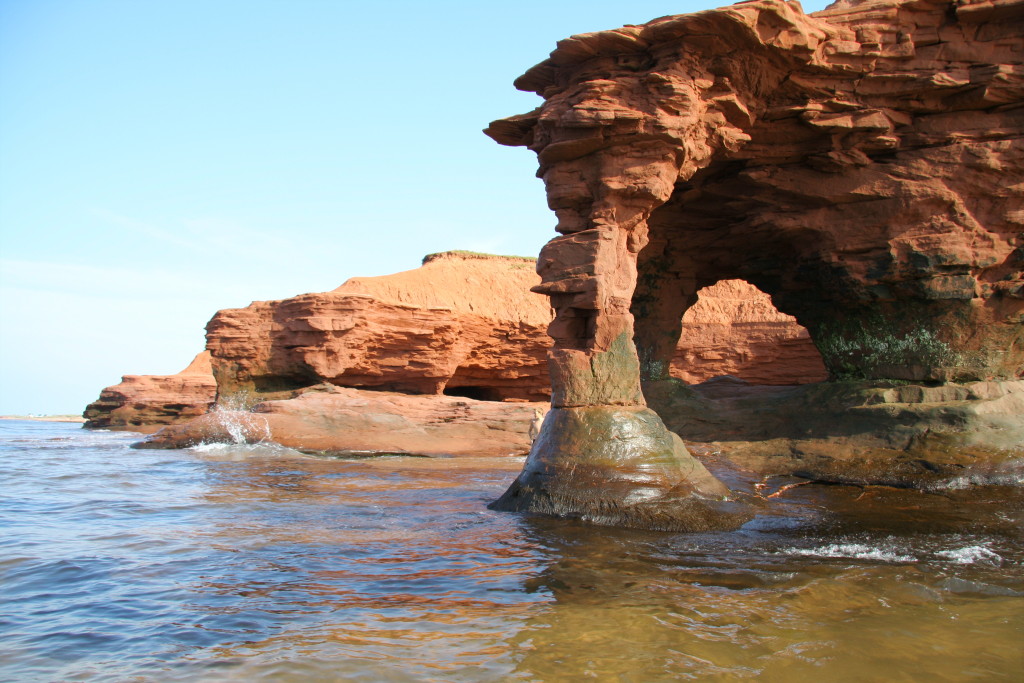
But we didn’t know yet what we wanted this area to look like. We turned to landscape for help, and after some art meetings and lots of references we found what we settled with sandstone cliffs:
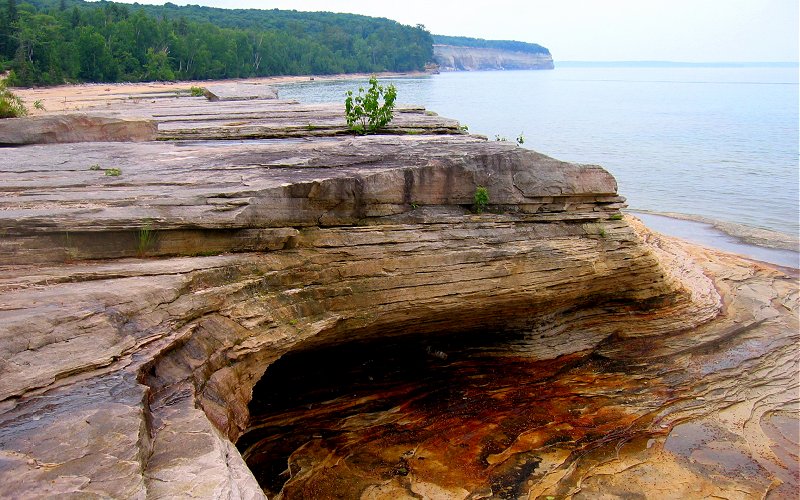
With that defined, I tried to see the best way to tackle this, working on the path between the Glass Factory and the Symmetry Island. At the start I tried to get away with tillable textures, with terrible results:
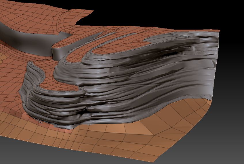
I then went to Zbrush, and decided to just carve out those shapes, focusing on the rock flow from the references
Symmetry Island
You can see on the background of the previous images that the sym island had already changed slightly. Eric did a pass long before I started to work on the cliff side, but at the time, we didn’t know we were going for the sandstone look.
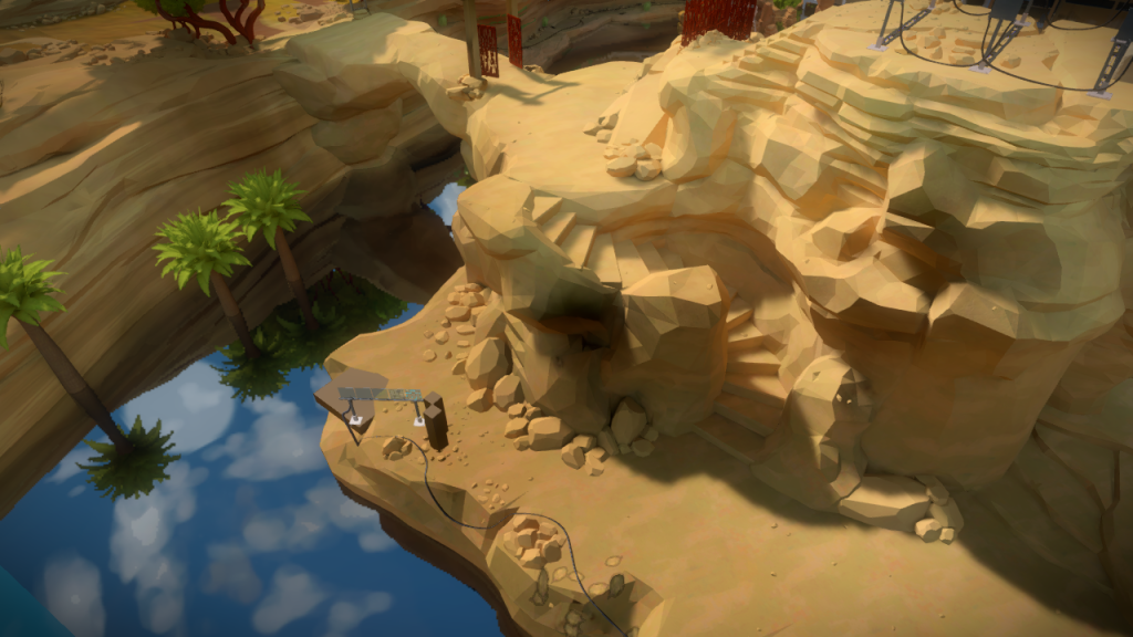
Jonathan had a few improvement requirements for this area, and Eric was busy in another area of the island, and since I had worked on the cliffs, I took over the task of redesigning this space to match the rest. I went back to Zbrush and applied the same techniques I had previously on the cliffs:
After decimating and cleaning up, ended at this result. (Vegetation was removed for the image, can’t remember why):
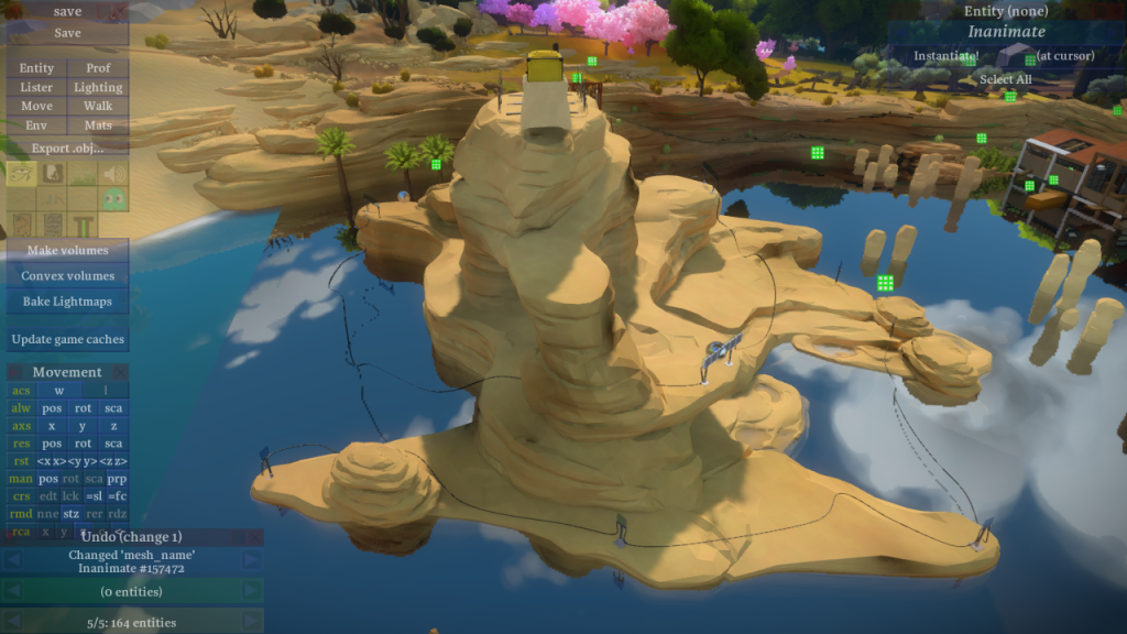
This area was left untouched for a while, and as we got more comfortable with the art style, it became clear that it was not quite there yet. Ignacio had also added support for LUTs, which are per area color tables that allow us to change the look of a specific area, kinda like color filters in movies.
I did another pass to this area, adding a texture to increase the detail on the horizontal stripes, and added LUTs to push the warm red to contrast against the blue sky. Here is the final result:
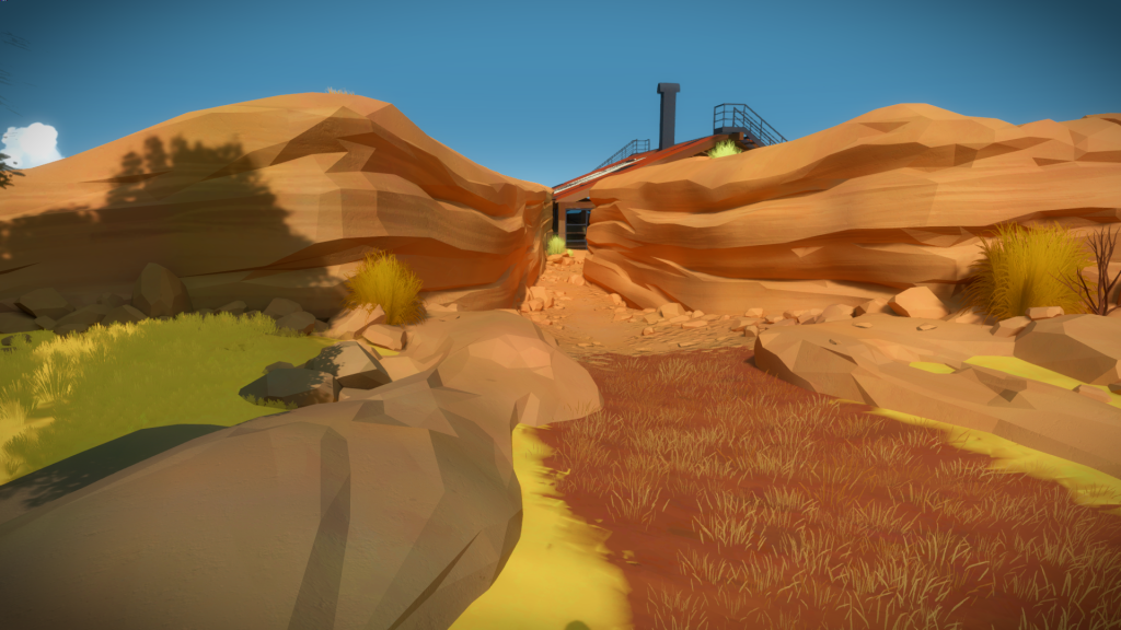
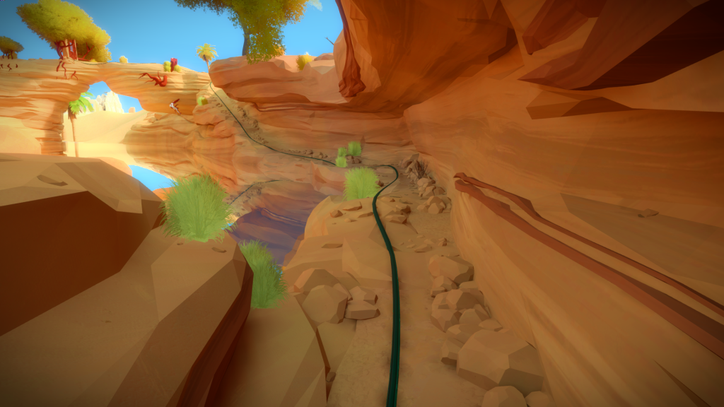
Here is a shot that shows the symmetry in the environment:
I also made a couple of modular pieces that were spread out in the agricultural area, to create a smooth transition towards the desert: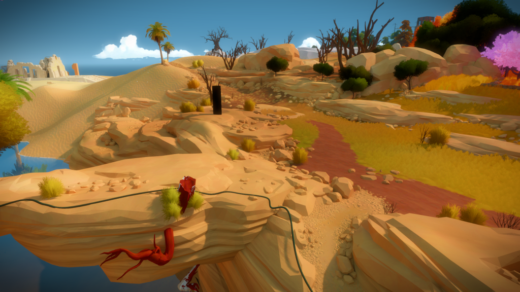
The Siren
If you check the rest of my website, my ‘main’ skill has always been character art. Working on The Witness was an awesome challenge, and I was always in the mode of “I can’t wait until I get a chance to make all these statues!”.
But as the island grew in complexity, so did the number of statues, and it became clear I wouldn’t have the time to do them all.
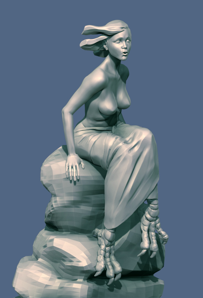
Before we hired someone for that task (the crazy talented Andrea Blasich), so we could figure out in-house how we wanted them to look and feel, I had a shot at two of them One of them was in this area, the Siren, which you can see below, the other was part of the Hub. Modeled and decimated in Zbrush, you can see the high res version below: