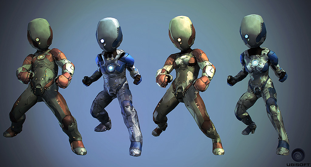
Just got another image showing one of the suits variations. Besides creating the main version of the suits we also had to make a female version and a texture alternative (since its a fighting game 2 players might choose the same character).

The characters had to fit with the Microsoft Avatar regulations, that meant we only had about 4000 polys and lots of restrictions in proportions and silhouette, as usual its a great challenge to try and work around these restrictions to create a unique character.
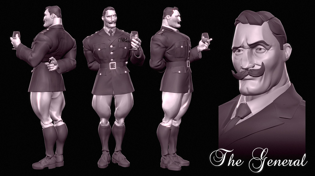
The other image is a concept for a character. Its a “General”. I wanted to reinforce strong shapes and just key details. The idea is that he should be clearly readable and his personality should be conveyed by his visual details.
I’ve shown it to some friends and got some great feedback so a new updated render will be here soon. Its mostly fixing his expression (the eyes are too sad for someone who is smiling), adding some pockets to the jacket and polishing the folds and changing the glass of wine to a whisky one, more fitting with his personality.


Ahahaa that general has some bulged muscles on his leg
Haha, they are are Breeches, the WWII classical general pants for horse riding! Does it really look like his muscles?