The puzzles for this area were already designed as well as the camouflaged panel theme but the area was still using the generic trees and didn’t feel unique.
The Landscape Architects suggested that this area should be a ‘Amazon style’ jungle. Before I could try to convey that,, I cleaned up the area and tried to define a navigation that would take into account the puzzle design. Notice that at this time there was no Bamboo Forest or the rock outcrops near the Monastery.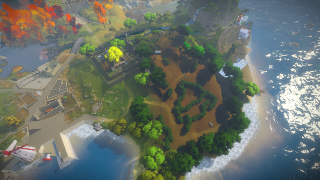
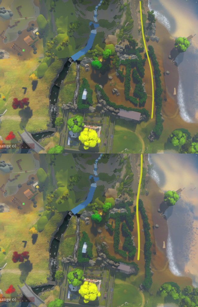
After we added the beach, we wanted to have a clear line towards the Colored Lights building, so I had to trim the forest by a LOT. This was an email image I sent showing the changes in the path.
Once that layout was approved, I created a set of extremely simple assets to see how dense I could get with the forest.
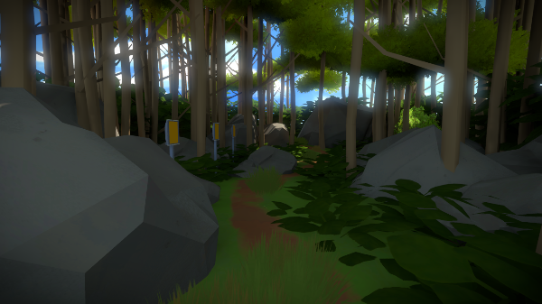
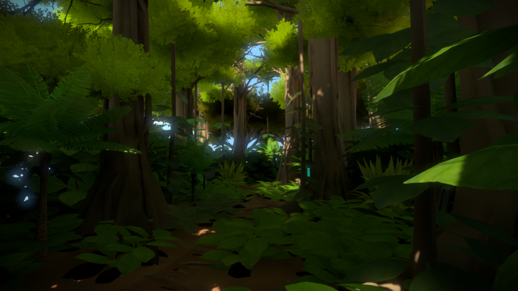
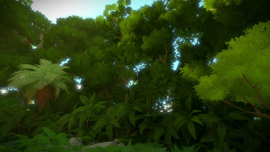
I wanted to create something that would make you feel immersed from all sides, forgetting the rest of the island.
Salvador implemented fog volumes so I had a go at seeing if they would help further.
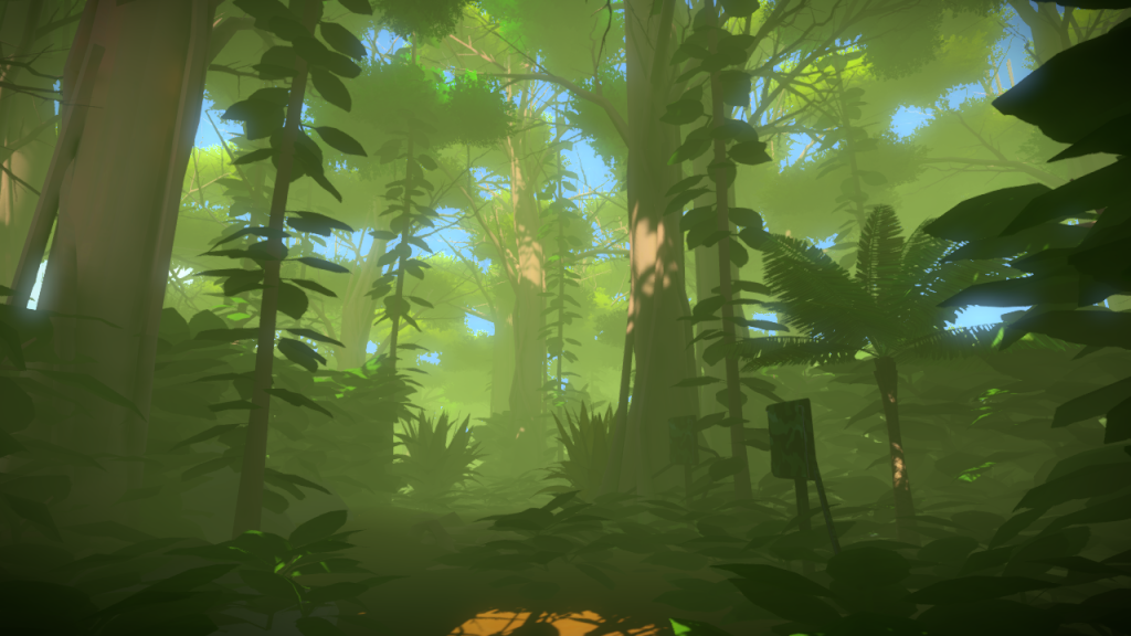 We were all quite happy with the results. Even if the island is such an artificially compressed space, it was still possible to sell the idea of deep jungle.
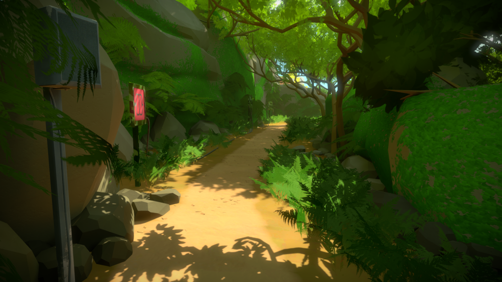
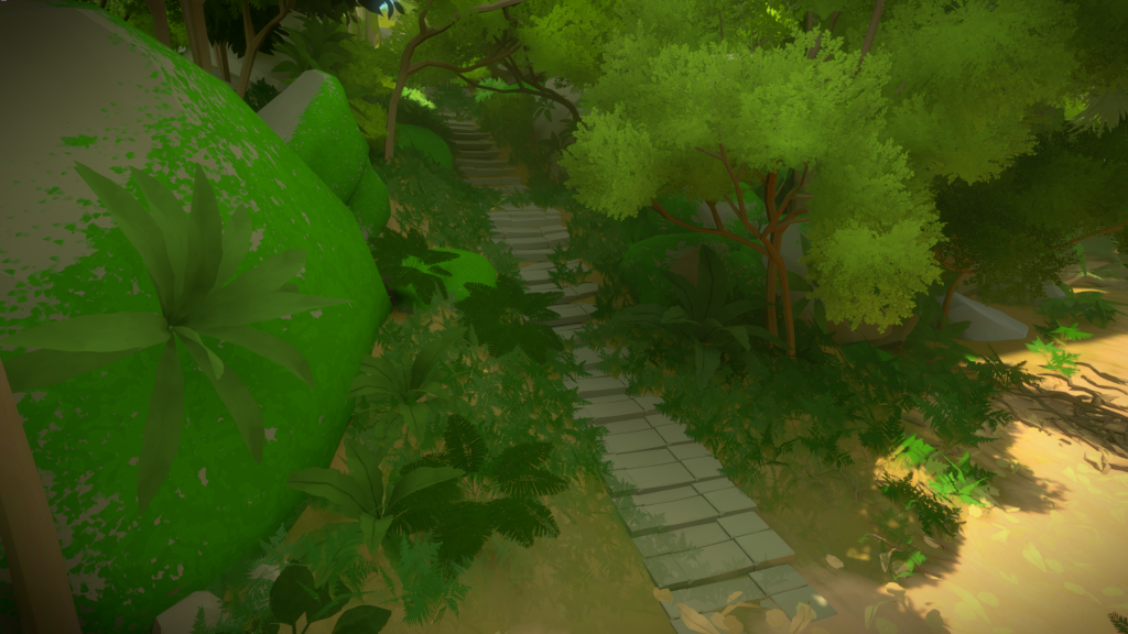
The next step was to define clear navigation landmarks so you would not get lost and frustrated. So when you enter the forest, you have a clear set of stairs on your left:
 While to the right you have a vertical fallen log path:
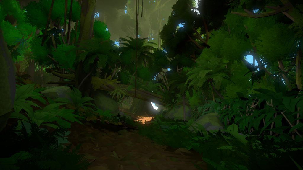
Followed by massive central tree. Both these two images are older versions, when I was still trying to figure out the framing and mood (see how the tree and foliage are different):
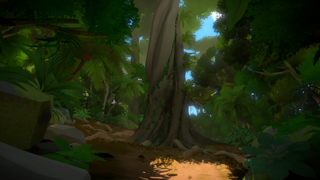
And how it ended up looking like:
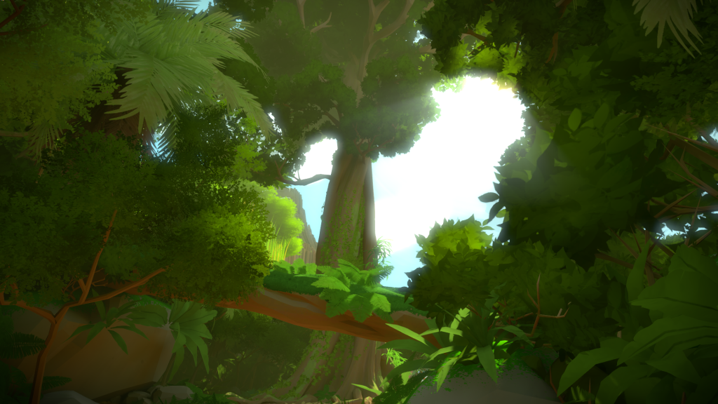
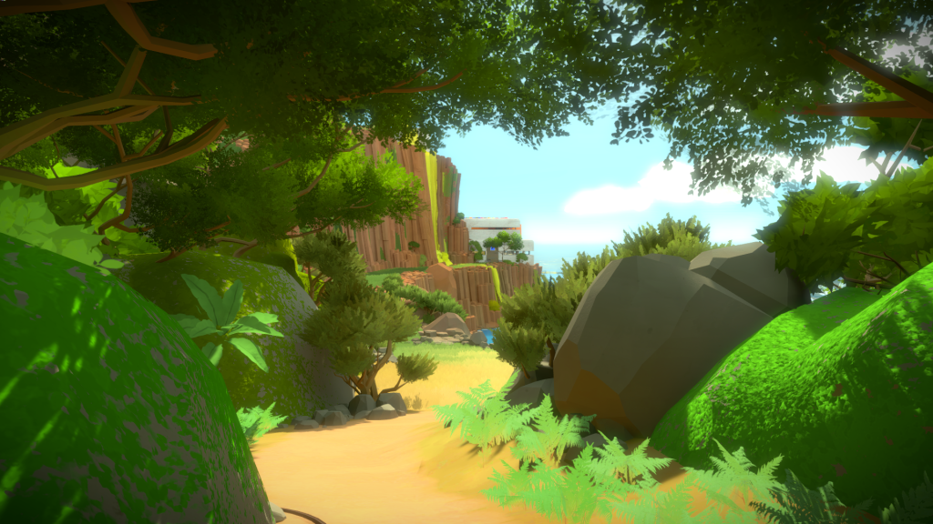
Another important element, was that as you walk through this main path, you have clear idea of what lies ahead. So as you move forward I framed the mountain: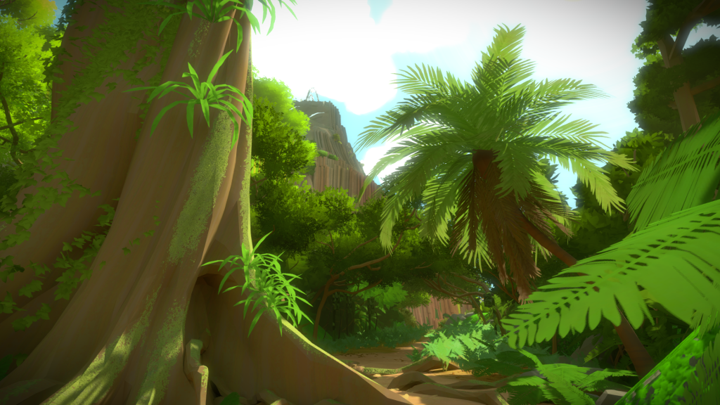 And a few steps further, the Colored Lights Building:
The only way I was able to create this amount of complexity in such a short time was by having a lot of precise modularity, something I also did for the Keep. The Landscape architects help me breakdown the important parts of a jungle, with images similar to this:
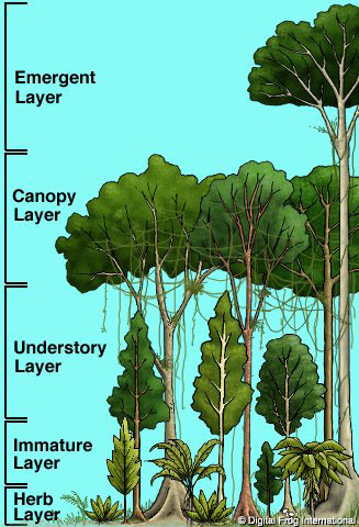
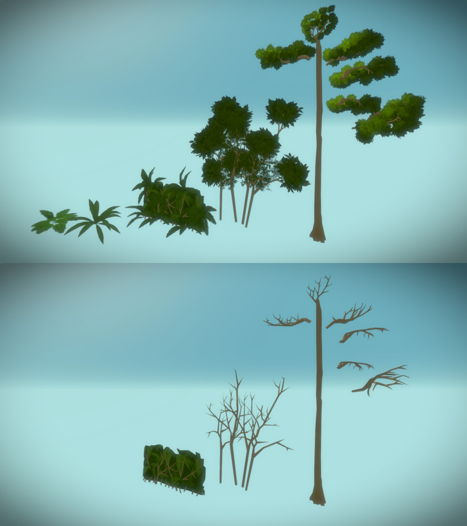
Allowing me to recreate the same principles with game geometry, with four types of assets to create the dense forest walls:
- Ground vegetation,
- Vegetation Walls that completely block you from seeing through
- A mid size pack of different trees and foliage that blocked slightly higher than the Vegetation Walls
- A trunk with modular branches that I could use to layout a much more detailed top cover
You can see them on the image below. The second image is the same models but without foliage, so you can clearly see the fake painted wall.
And how they look in game:
Hidden Cliff Path
For the hidden path, I wanted to create something that felt distinct from the rest, but still in the same area. If you look at the original layout image again, you will notice there was a steady terrain elevation. This mean that you always had a uneven terrain when walking, and that felt weird. So I decided to flatten into two distinct areas, separated by a cliff. The stairs on the left lead you to the ‘second floor’, where you can access the Bamboo Forest. This change allowed me to have the secondary path on the ‘first floor’ area with a cliff wall. I played with some ideas of having flowing water on the cliffs:
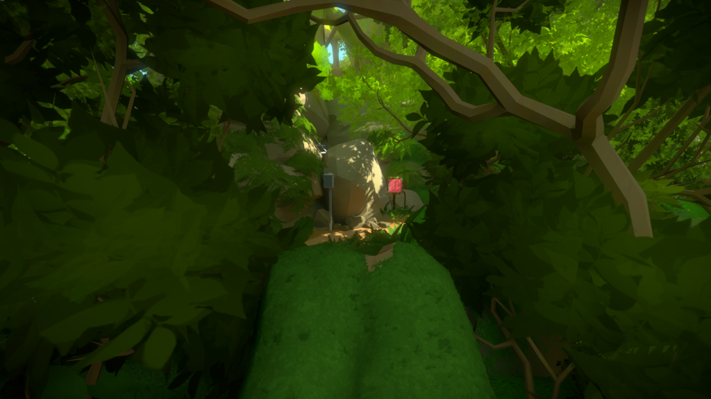
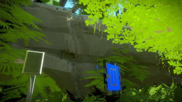 But they didn’t read very well. In the end it became a mossy cliff, with a kind of roof ceiling made out of trees:
Similarly to the main forest path, there were some important vistas we wanted to convey. The first one, if you figure out how to walk over the fallen log from the beach, you will have a perfectly framed panel with speaker:
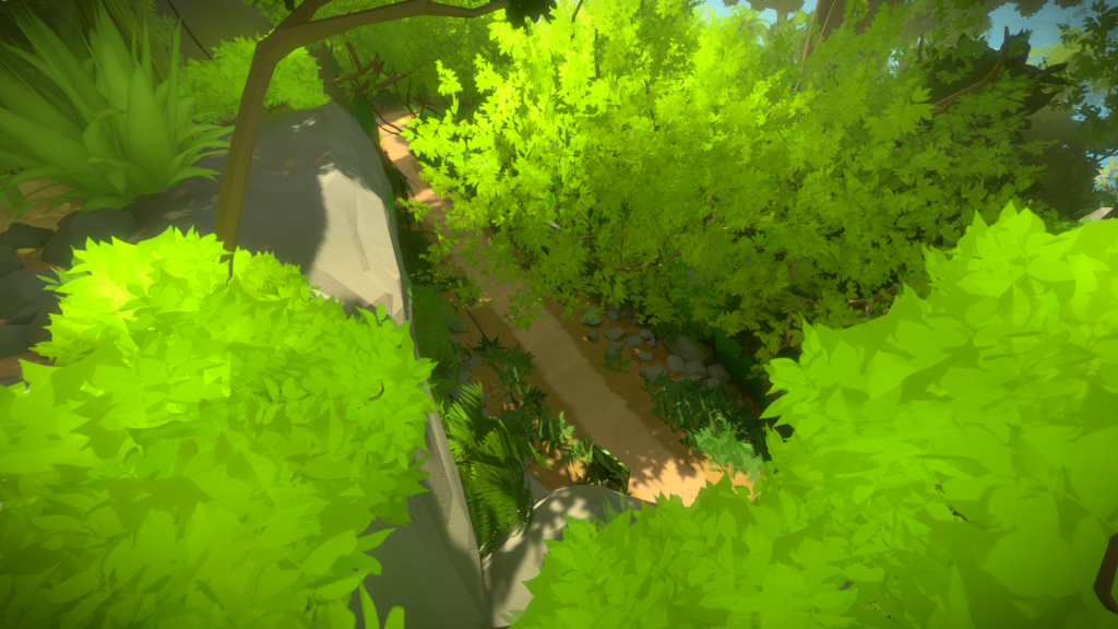
And if you look down from the cliff, you will see a suspicious path, hopefully hinting at what you are missing:
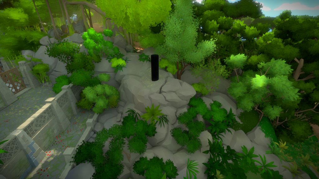
The other added areas, as the forest became more detailed, where the rock formations further up, hiding the Vault and shielding the Forest from the Monastery:
And a curved rock formation that helps define the river shape: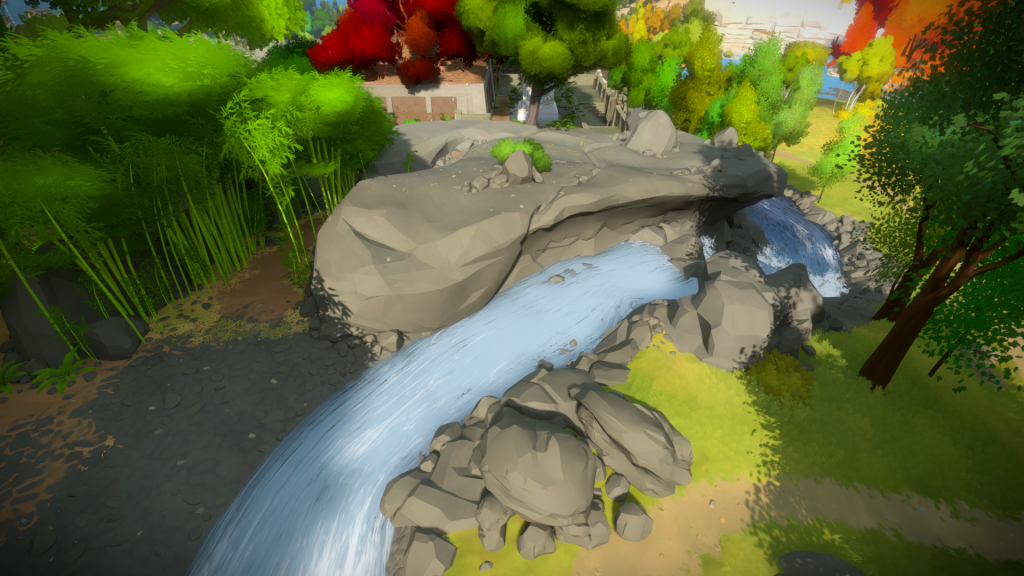
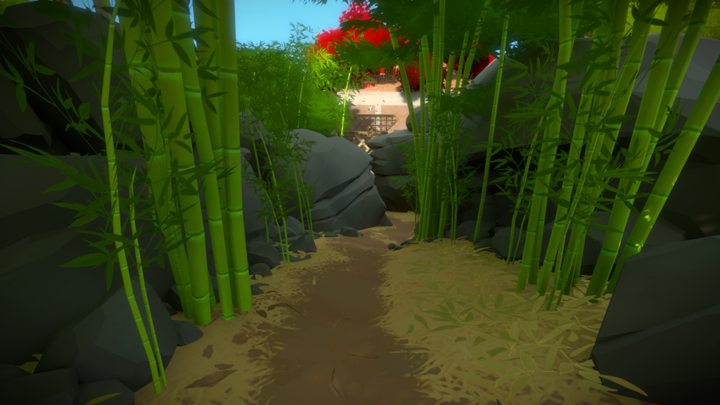
Walking through the ‘second floor’ leads you to the back of the Monastery. This was super fun to do since we had all the assets at this point and it was mostly a matter of placement. Orsi was responsible for all the bamboo props and they look amazing. Also sculpting those far away rocks was good fun.
Forest Vault
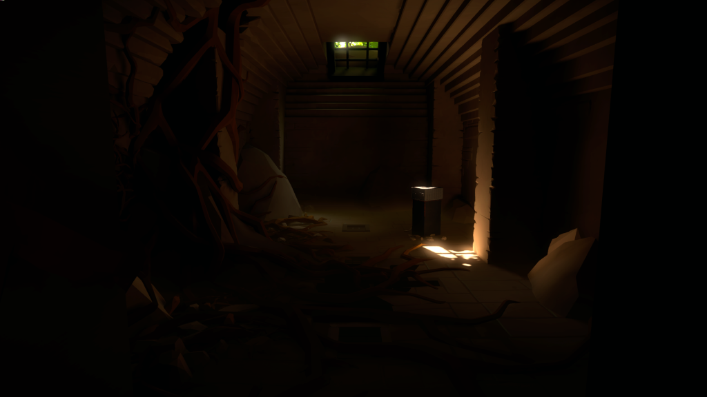
I was also responsible for creating the journey down into the Monastery Vault. The concept is that it’s a variation on the initial one, near the Entry Yard, but with the ‘vegetation took over’ vibe.
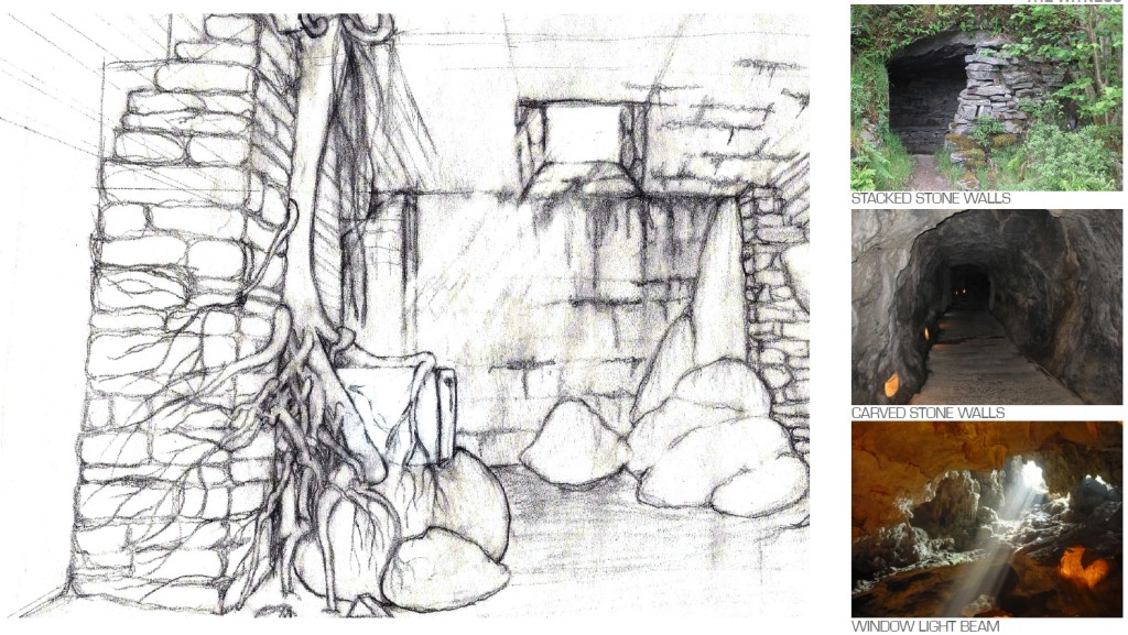
Having the original assets from Eric’s initial Entry Path Vault to work from sped up the process a lot. Here is one of the awesome sketches and references from the Landscape Architects:
Beach
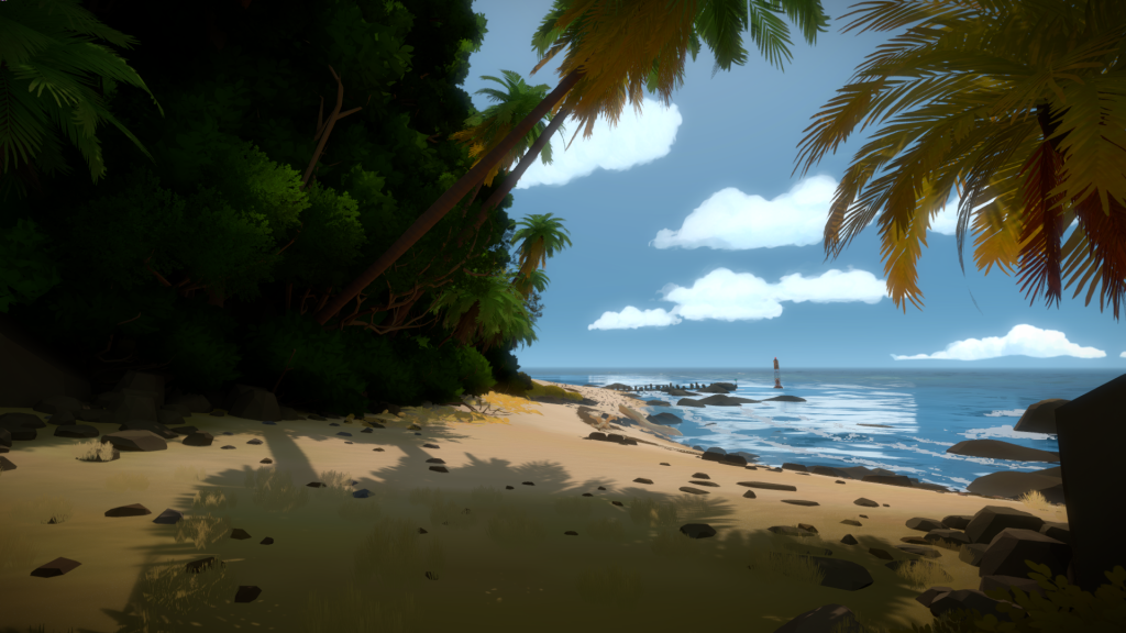
There isn’t much to say about the beach. It didn’t change that much from the first implementation. For a long time it had a set of tide pools but they served no purpose and didn’t look that good, so ended up being removed.
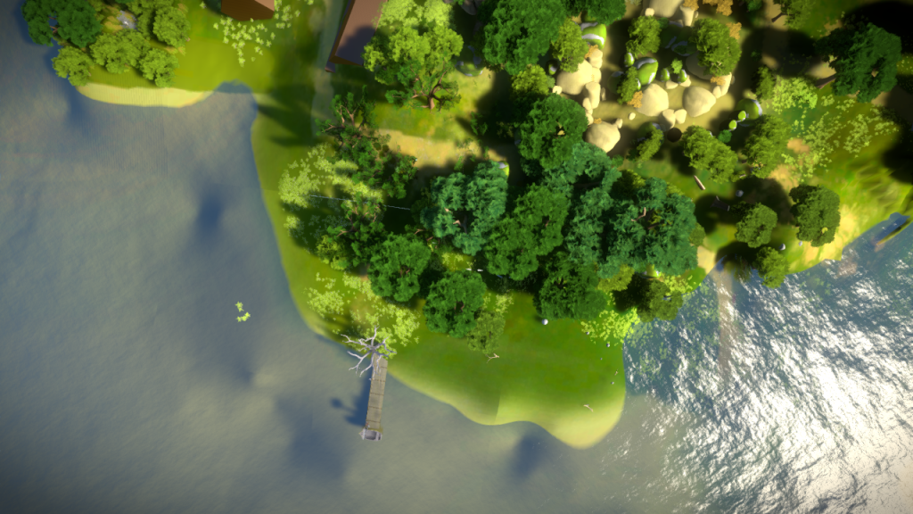
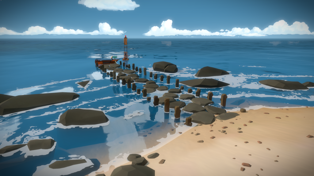
I like how the dock ended up as a very natural construction, compared to all the others:
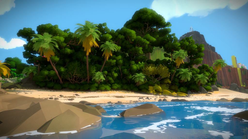
And I learned quite a bit from the Landscape Architects, like how palm trees are supposed to have dry leafs at the bottom if they aren’t artificially removed, or the way vegetation grows at the edges of beaches in order to maximize the sun exposure.
