The hub wasn’t really a concept when I joined. There was a key feature, the windmill and it was just a natural connection between the different puzzle areas.
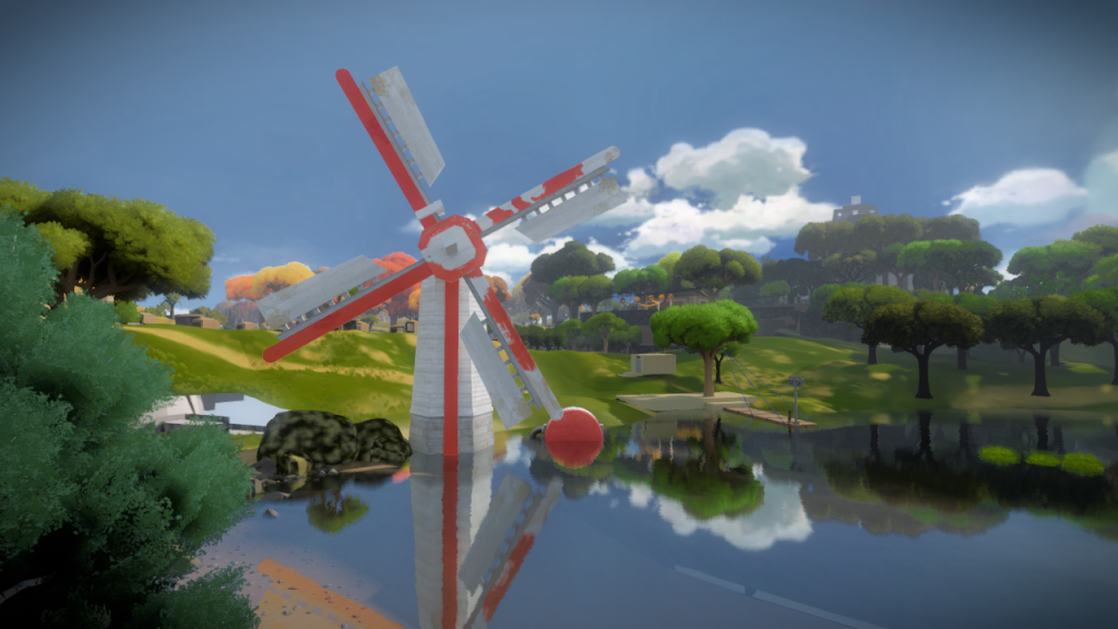
As the detail and scale got figured, the windmill size reduced and the narrative of the island story solidified, it made sense to have a developed center in the middle of the island with a dock for loading and unloading cargo.
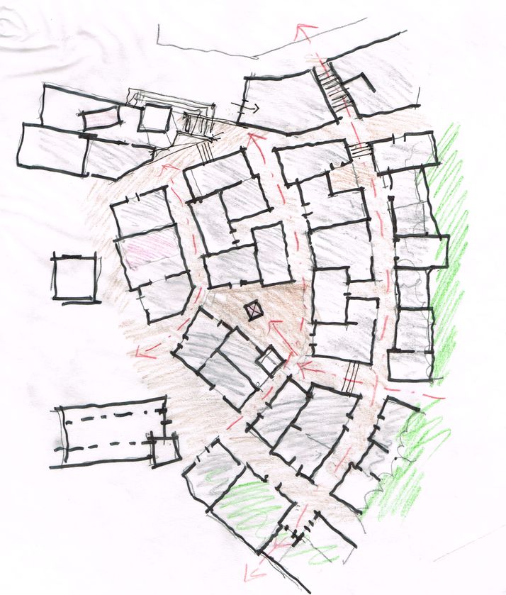
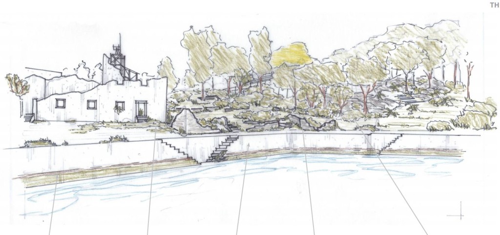
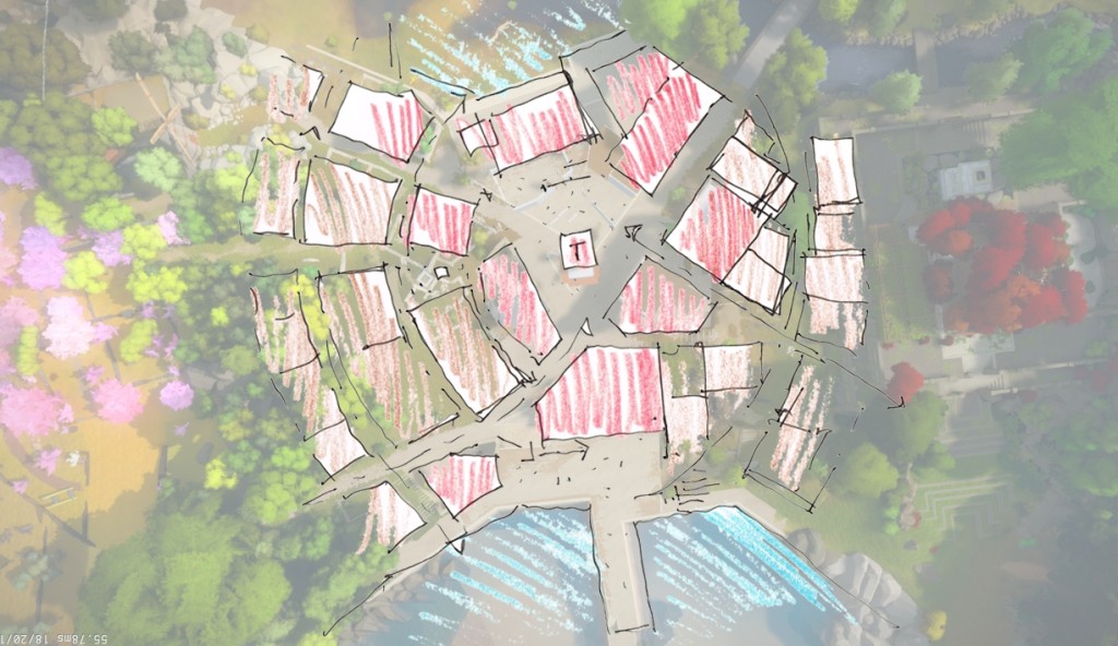
As the puzzles in this area got richer, it became it’s own section with a laser. Architects and Landscape Architects started figuring out the story for this place, the layers of history and how it came to look the way it does. Here are a couple of their mockups, from the many awesome ones they provided:
Once again, I have to stress how crazy useful these were. Along with the drawings, we got several folders of references, studies, and a deep understanding of how these structures came to be, taking into account the terrain, resources on the island and technological development of the civilizations. The amount of detail, that for them is just natural, brought a layer of realism that is rare in games. How was cargo transported from the docks, how people moved around the streets, the cultural importance of the buildings, etc.
As you can see from the drawings, the area is massive with a lot of detail. We also knew that each building would end up having it’s own unique properties, so to get a solid base for this, I was responsible for the first stage, figuring out how it all fits.
The first step was modeling out all structures in relation to the terrain, figuring out every single building, their entries, wall thickness, room structure, connection with the street, paths and roads. It took ages, but it was all architecturally correct, and even if boring to do, it allowed us to have a solid layout to build from.
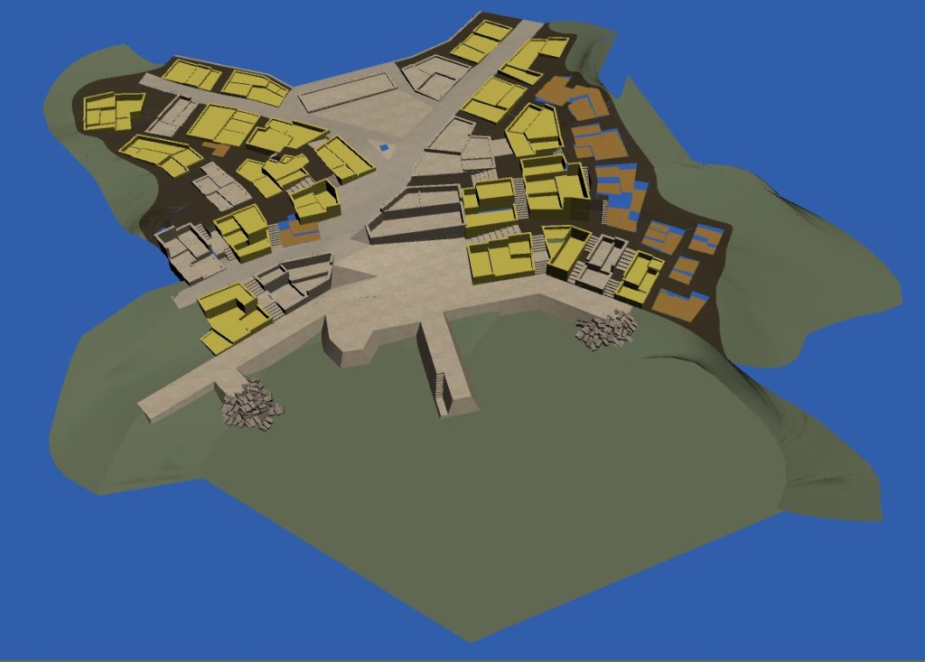
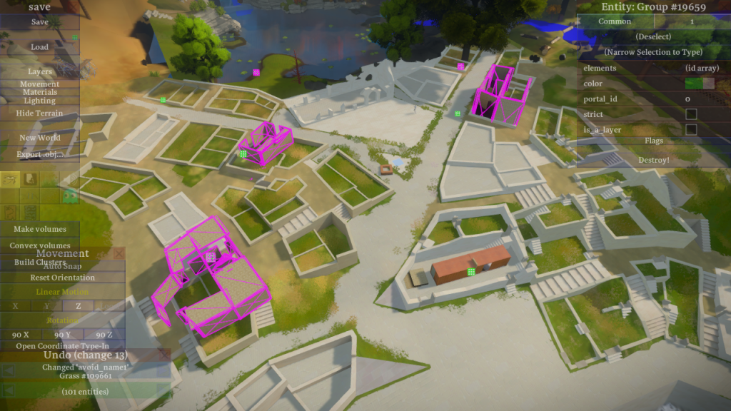
The next step was figuring out the dock design and to slowly work on the ruined state of each structure. We wanted the center to be more intact and as you go outwards more and more ruined.
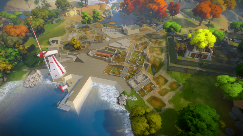
Halfway through this process, we had to shoot the first gameplay trailer, and we wanted one of the shots to be over the Hub….but the area was incomplete!
So I focused a few days making sure it would look good just for these shots. It was an interesting way to force us to figure out how to solve some visual issues.
Here is the result and notice there was no center tower and the church was just a concept:
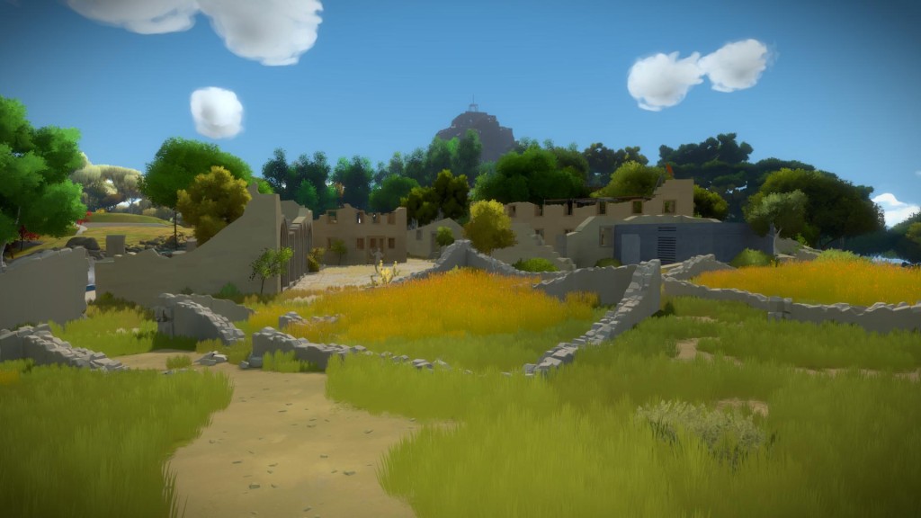
Now that we could walk in this area and ‘feel it’, we realized it was easy to get lost. After being inside one of the buildings, the moment you went back out it was hard to get your bearings. This would be alleviated once the buildings were detailed but it had to be fixed in the core of the layout.
The architects suggested a more organic and concentric design, where there is a clear center point and everything grows around it, which meant you would kind always know your direction:
I also tried some ideas, like having more saturated colors for each building, to better differentiate them: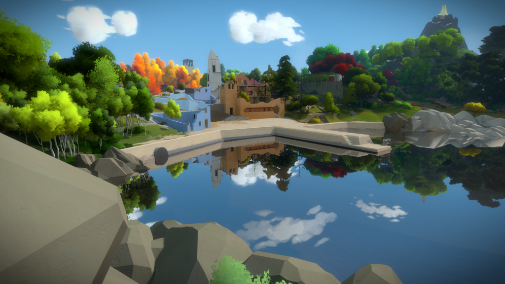
Once this concentric design was approved, and as the hub became more detailed, we split the work between all the art team. My responsibility, since I had defined the layout, was to bring all the roads and plaza to final, get the ruined walls to look right and finish the docks.
The docks had a LOT of different iterations, but it all happened during the architect’s back and forth with the team, so when it came the time to model it was pretty straightforward. I made a clean mesh in 3Ds Max, added detail in Zbrush and then decimated it. One of the cool details of the collaboration (that I would never have thought about) is that since it was build using poured cement, you can’t just have one solid gigantic slab of concrete, so we added lines to represent the separation of each part.
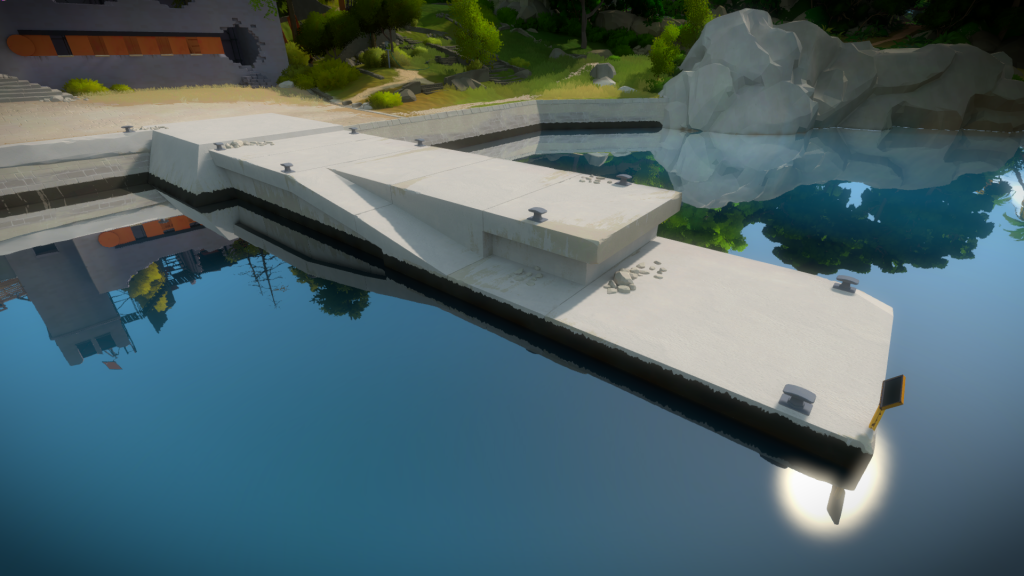
It was also nice to create a poured cement texture texture, one of the last ones I had to do.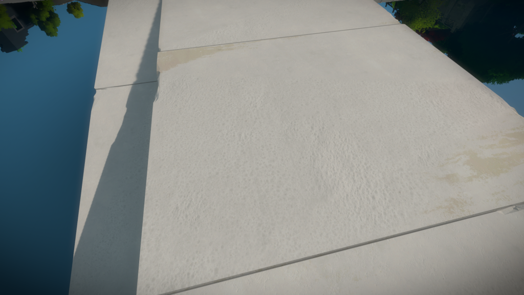
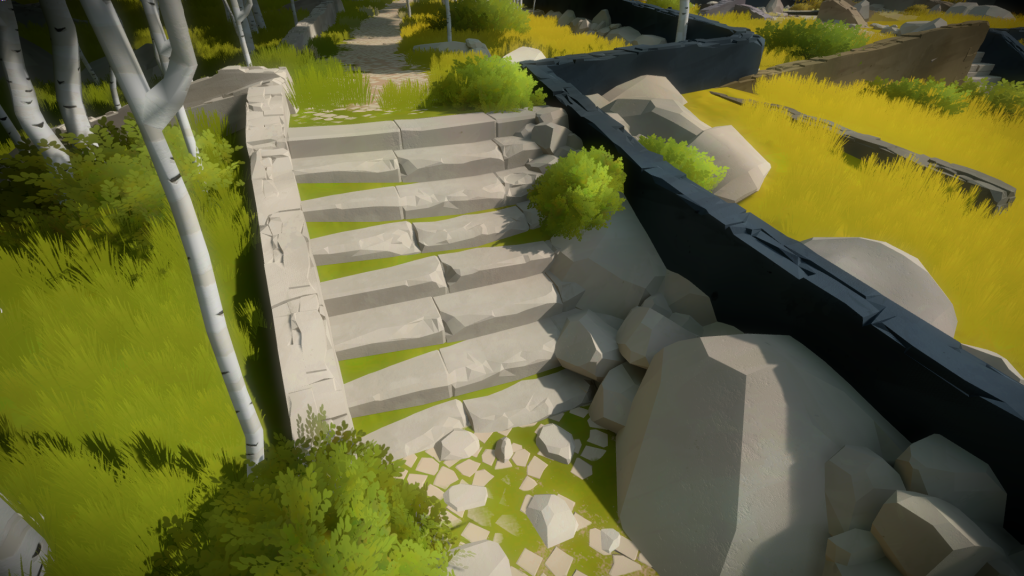
As for the paths and roads, I tried to get some variation, from a more ruined outside to a more pristine center. Paths that are taken by the vegetation:
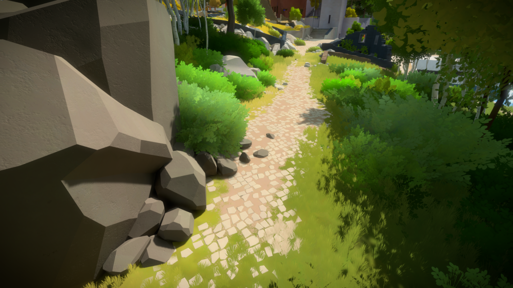
That get more refined as we approach the middle:
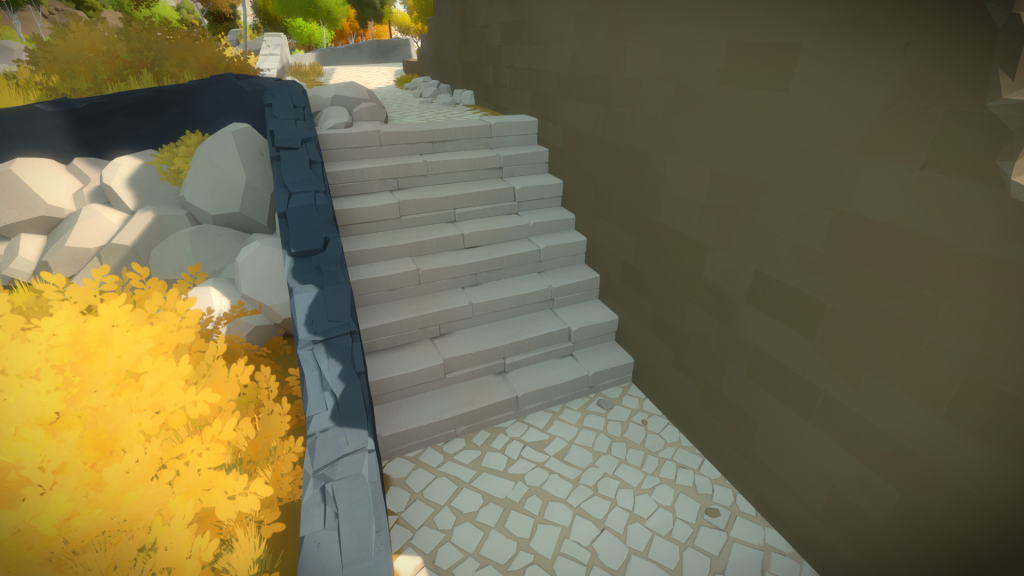
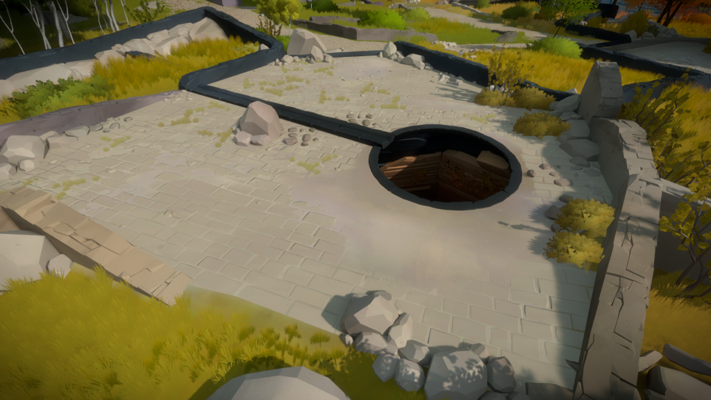
A secondary broken down plaza, with a much rougher style of floor pattern:
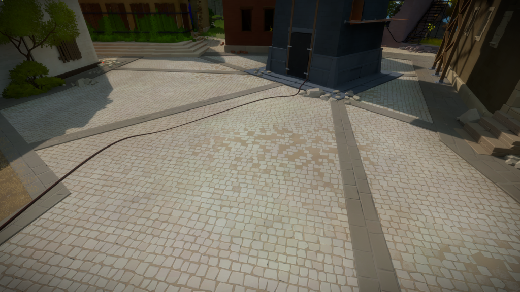
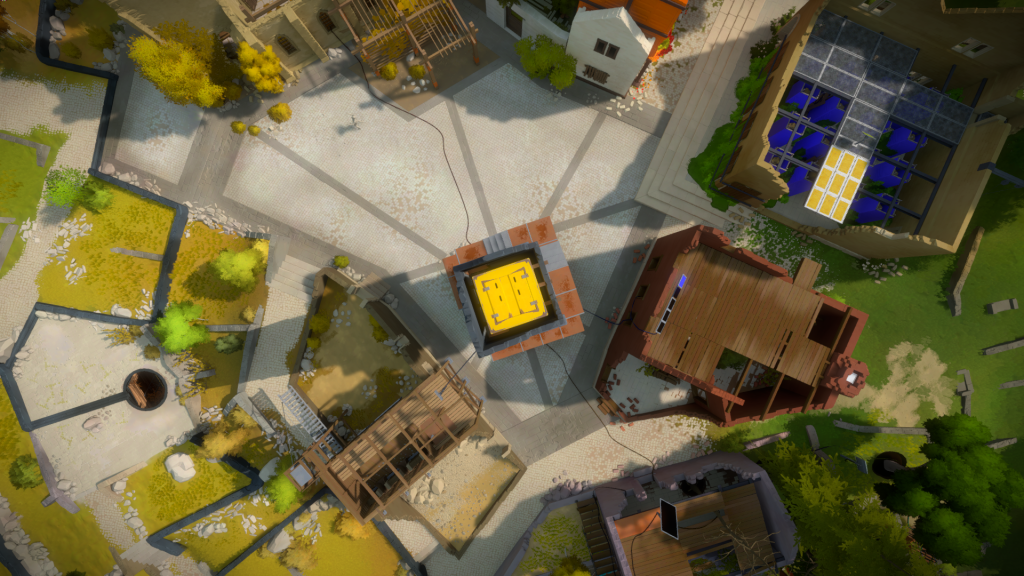
And the main plaza, with lines an floor pattern reinforcing the radial design. You can learn about the workflow for creating these textures here.
Ruined Walls
Finding a style for these ruined walls was much harder than I thought. I had planned to use modular pieces, similar to what is done in the agricultural area, but the way these buildings are constructed is different, it’s closer to brick walls, but more primitive. My initial proposal was super rough with tons of noise:
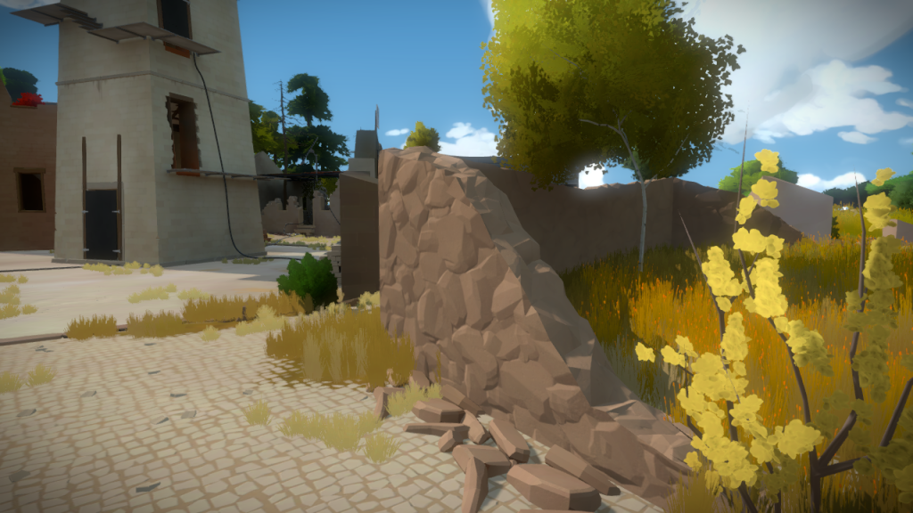 Until I realized that removing any vertical detail and focusing on the silhouette would give the same result:
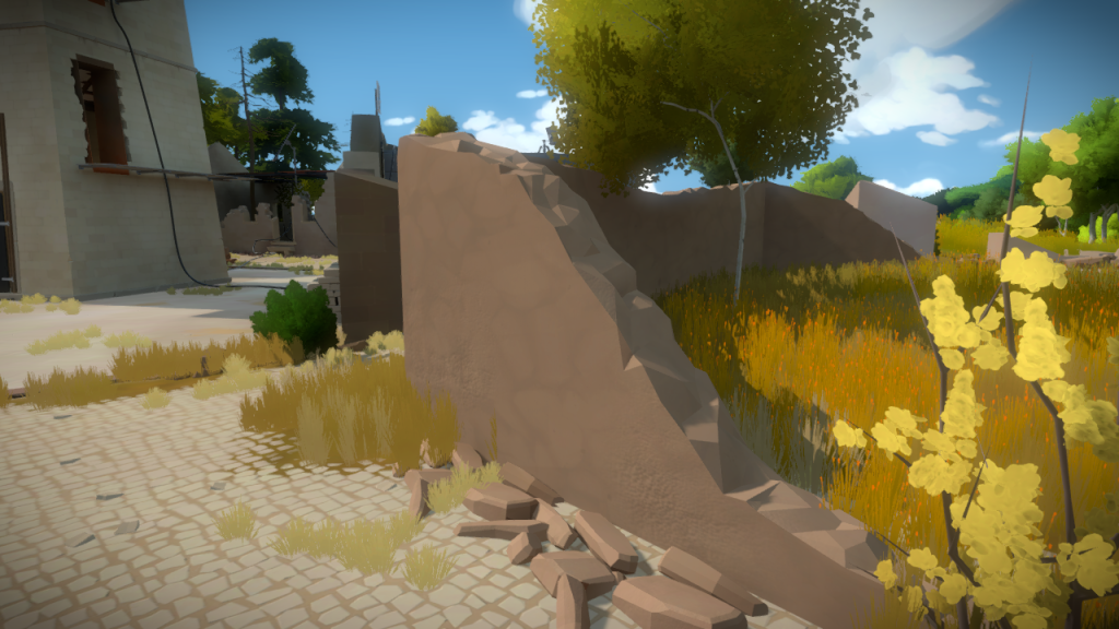
The issue is that the surface noise is just random triangles, it’s not saying anything about the construction of these buildings:
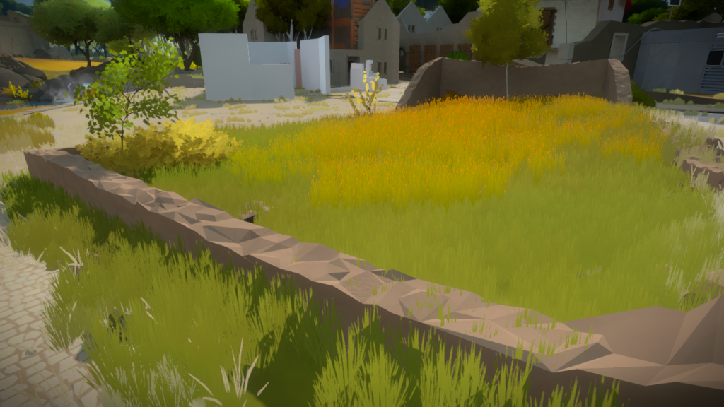
And since these could not be modular due to design constraints, I had to try a different approach. I created a custom brush in Zbrush, using a blend map made in 3DsMax from actual geometry, that I could paint on top of the surface to displace it:
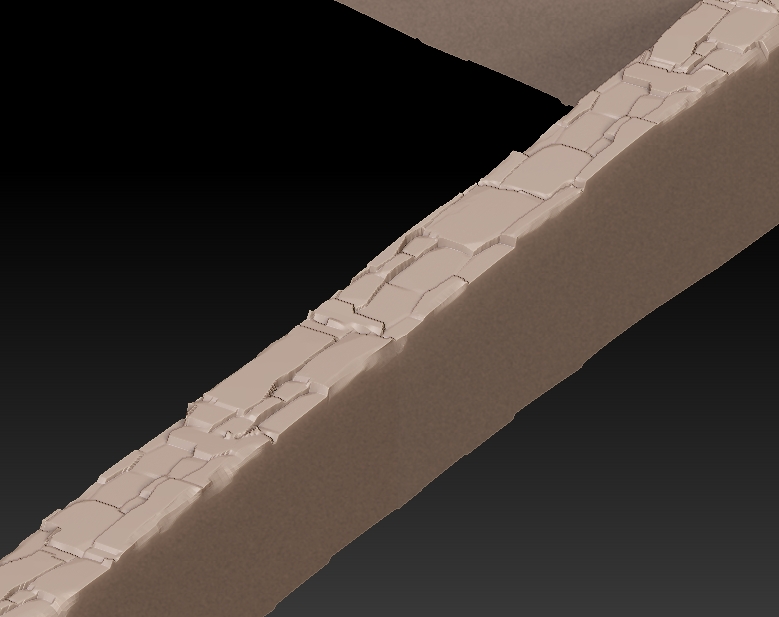
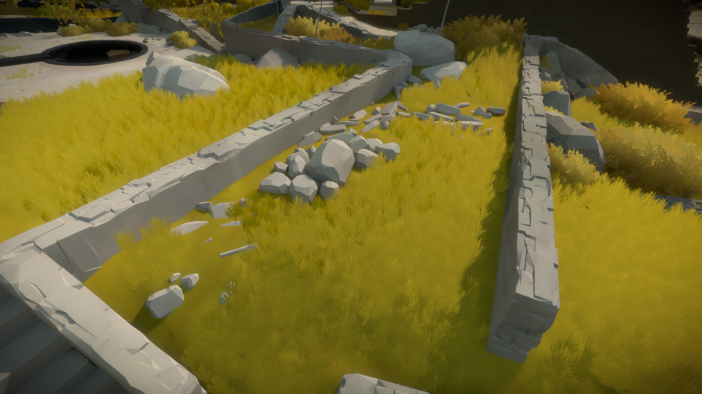
And when decimated, it retained the main shapes, no longer looking like generic triangle noise, but actual ruined wall detail:
Juggler Statue
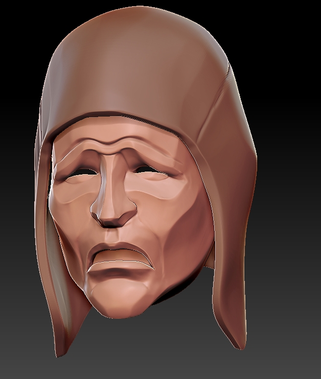
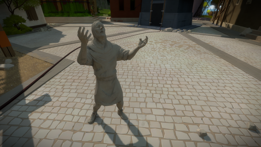
This is the only other statue I did for the game, the other one being the Siren in the Symmetry Island area. This was the first statue we did to figure out how it could fit with the art style and it had a few variations. Here is one of the early head sketches:
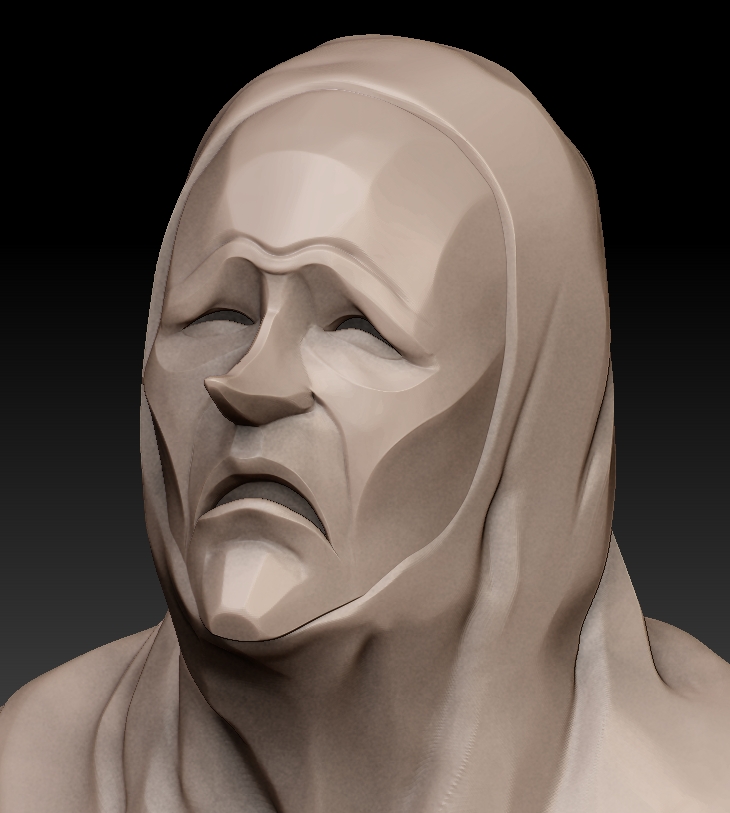
And the final version, cleaner and with a more accentuated expression:

