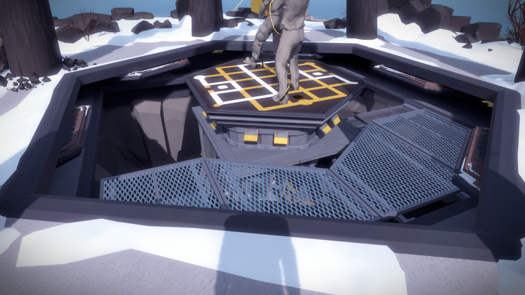
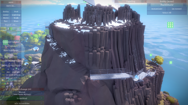
The mountain, due to its size and geographical importance, changed quite a lot. Jonathan would regularly take a screenshot of the island from the same viewpoint to show progress, and the mountain was right in the center, allowing for a nice catalog of the evolution that you can see below (click on the image for bigger size):

Here is how the north side looked liked: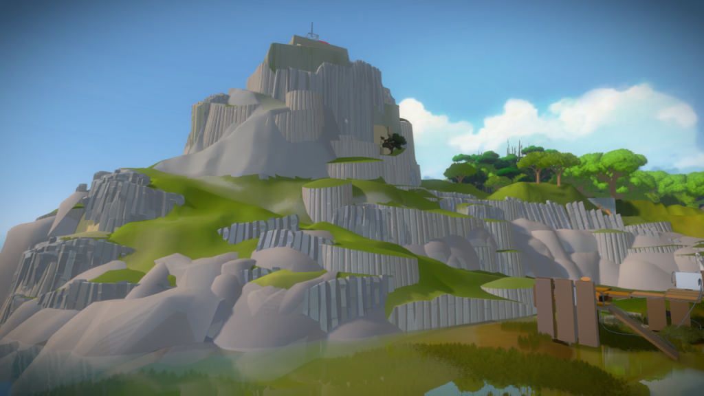
My goal was to redesign the mountain, trying to fix the ‘super mario platform’ look we were starting to have, making it more grounded and realistic, with a more interesting journey as you navigate through it.
Mountain South Side
The biggest issue with the previous version was how artificial it felt. I went back to look at references and understand how much columnar basalt is able to curve:
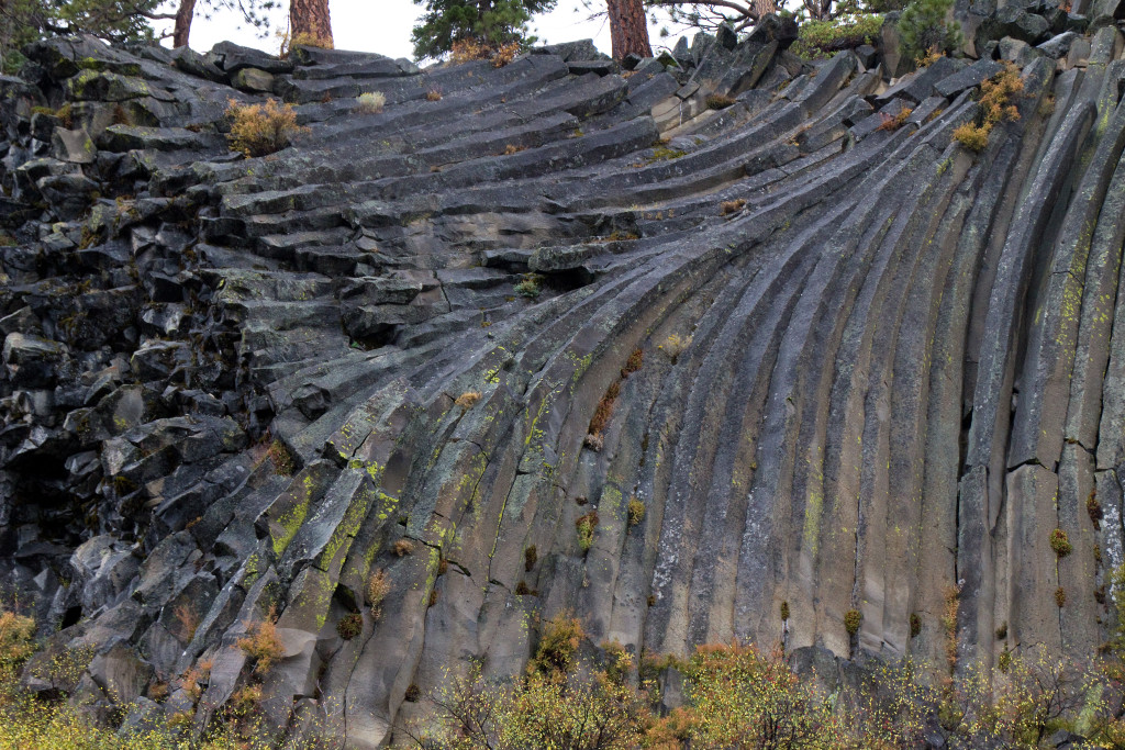
And what kind of textures it can have:
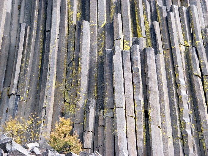
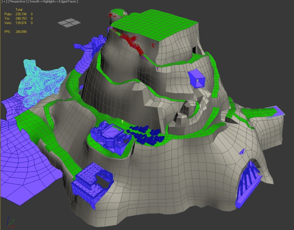
Before trying to apply this to the mountain, I took a step back and cleaned up the previous geometry. We already had clear defined paths with too many dependencies so I had some limitations I needed to take into account but this process allowed me to understand what I was working with. Here is the clean version, before I started to add detail:
Eric had already done some amazing work on the columnar basalt in the waterfall area, so I started from his meshes, elongating the shapes.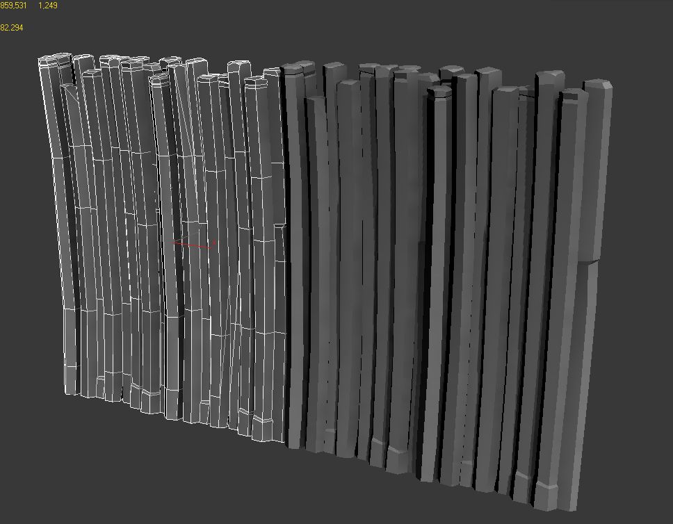
And then stitching them together and deleting the back faces. I made sure the edge loops were all at the same height (you can see it on the mesh selected on the right) so I could distort them as a whole and make it flow along the shape of the mountain:
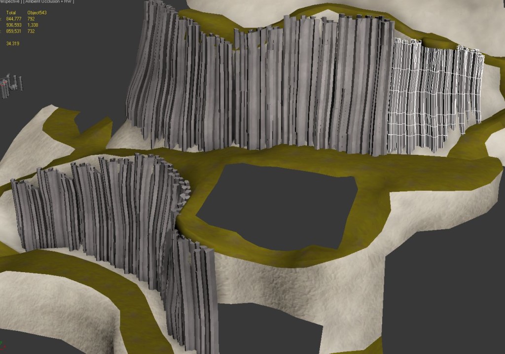
I got the result I was looking for, the lines pointing towards the top and accentuating the shape. You could now feel the size of the mountain, but it was still not quite there.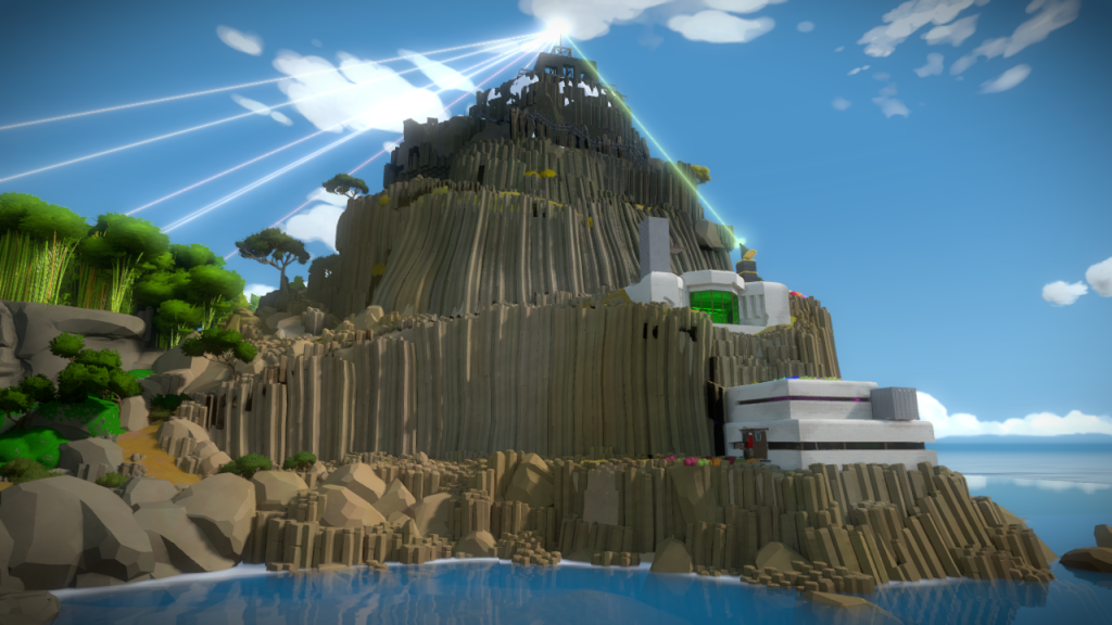
Looking again at references, Orsi found some great examples of instances where you get a really strong red color and the moss pops out beautifully: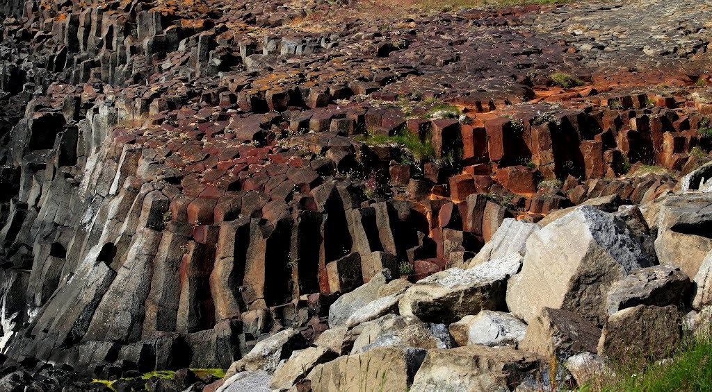
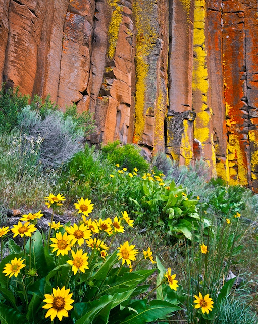
And that worked great, I added a strong red tint to this side, making it immediately distinct, and it helped me justify the colored green and yellow moss:
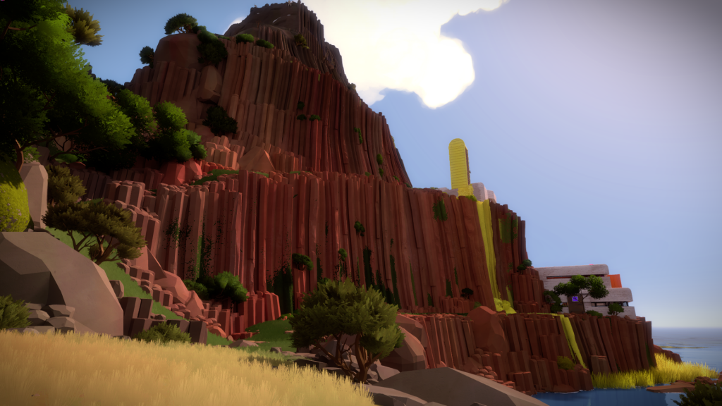 So now you had a distinct journey, starting with red cliffs and lush green grass:
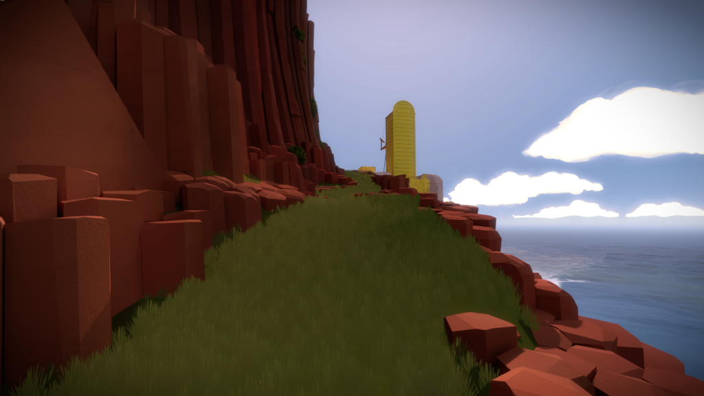
That start to slowly dry out as you go up:
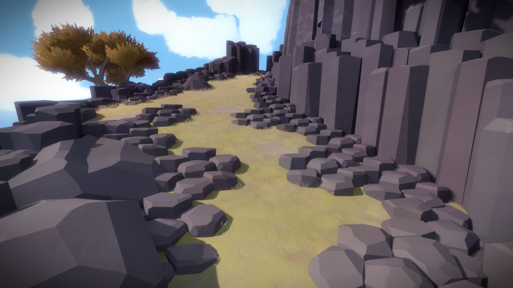
Changing into a blueish grey, signaling the cold above: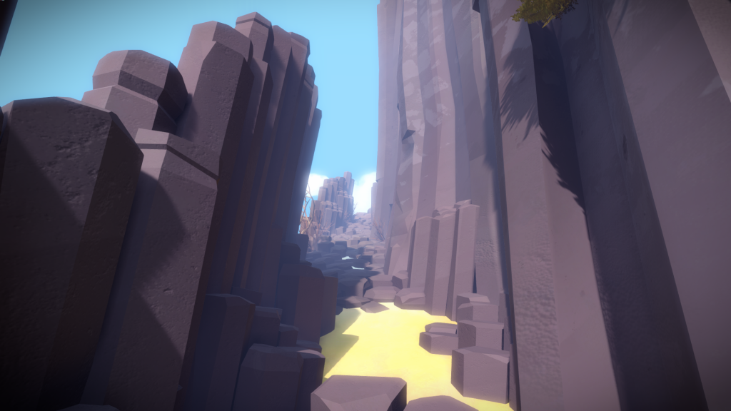
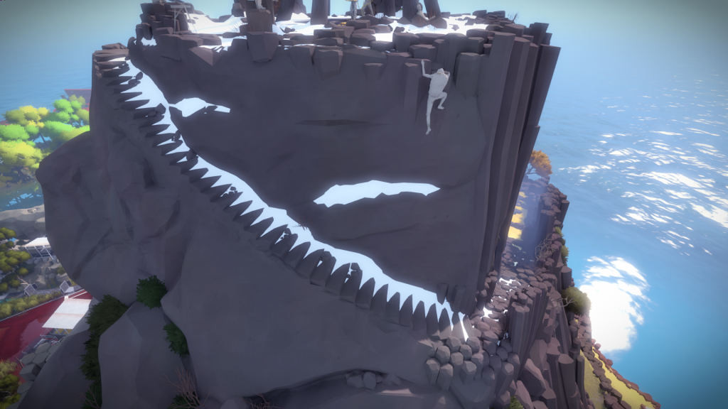
We also had the idea of having snow at the top of the mountain to make it more unique. Originally the architects had suggested a metal structure, similar to the keep back stairs, that would hint at what you will be seeing inside:
But it felt unnecessary and we ended up removing it and going with more natural carved steps:
Mountain North Side
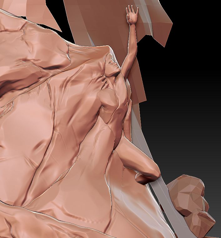
The north side of the mountain was mostly just one big Zbrush sculpt. Originally it was supposed to have a statue of a man, here is a version I did for it:
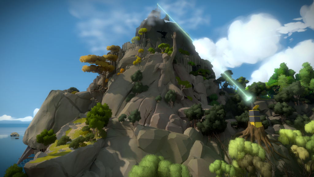
 And how it used to look ingame. (Also notice my poor attempts at creating some kind of ‘hazy cloud condition’ near the top of the mountain, as well as the old laser design.)
It was fun sculpting the big exterior cliff that shows a bit of the end section: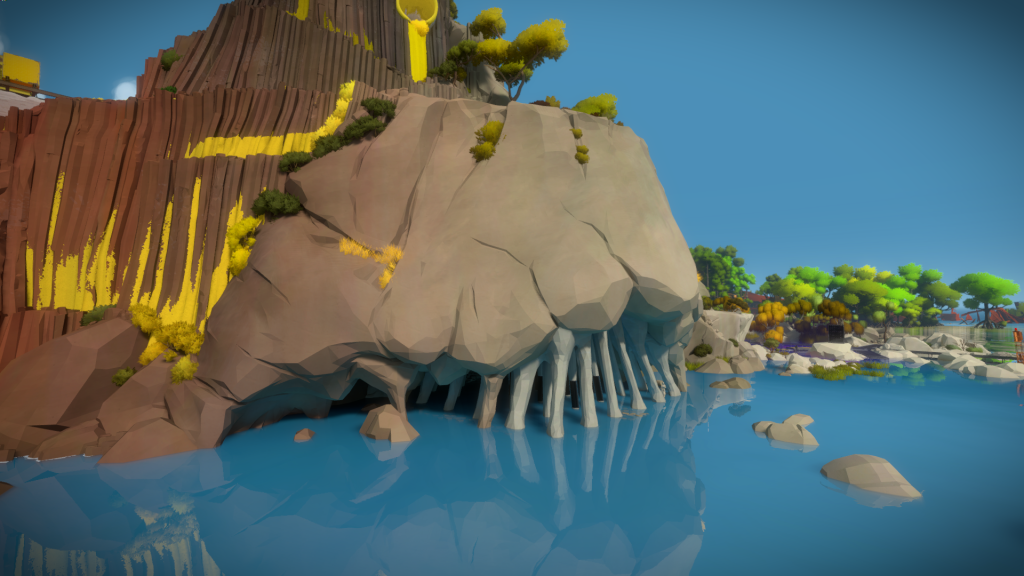
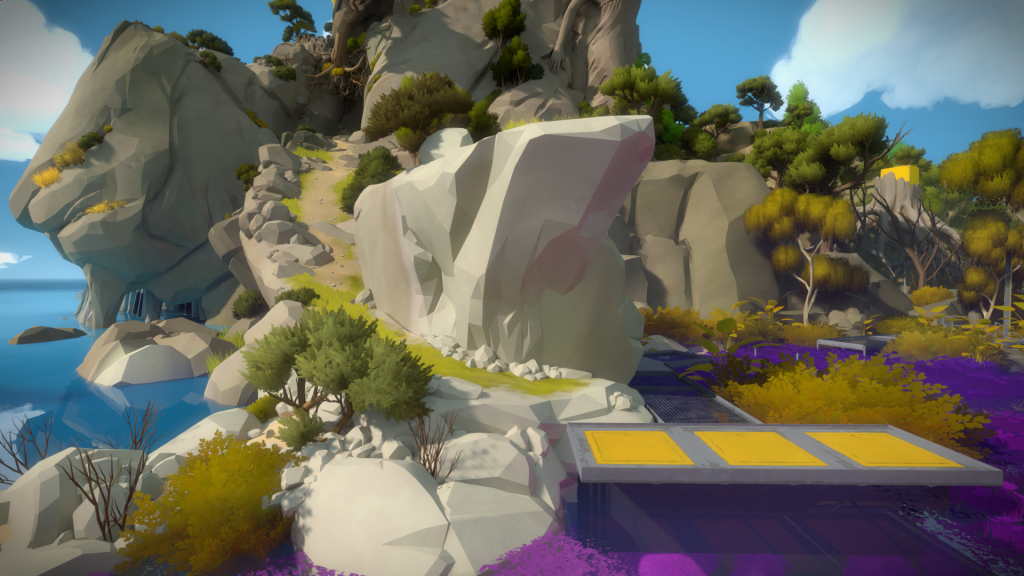
And this rocky outcrop, connecting with the Marsh:
 Keeping in mind the interesting journey as you walk through the mountain, we created a big crack that separates 2 regions of this side, allowing for a huge tree whose roots create a natural bridge:
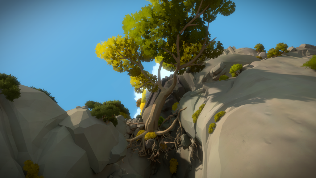 Allowing you to experience it in two distinct ways, when you walk below it:
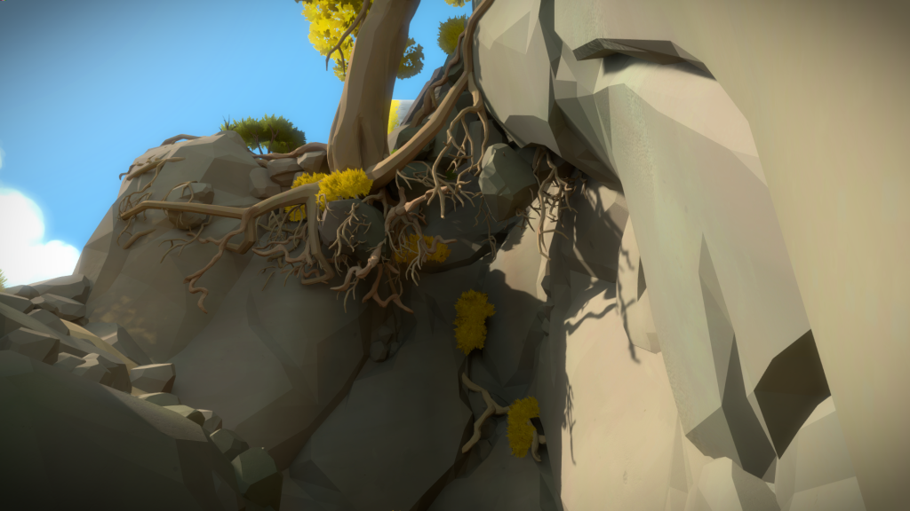
And another when you walk above:
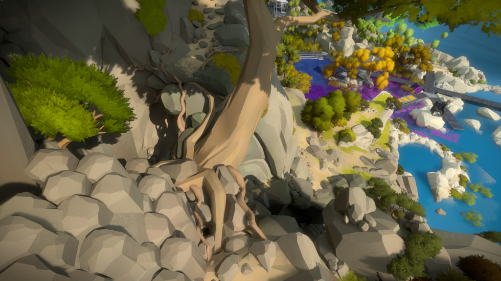
Mountain Top
The mountain top has a lot of importance thematically. The original version had the top tiered in two levels. A giant locked gate below that allows access to the interior (you can see the gate in motion near the end on the first trailer we released):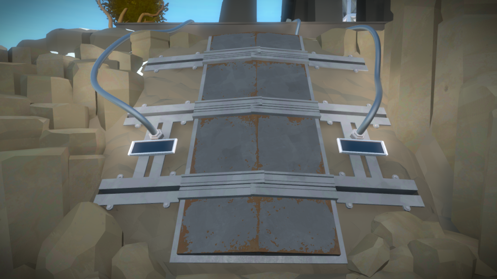
And a structure at the top, with a panel in the middle that you had to solve to open the gate. In this Zbrush mockup I was trying to figure out a natural way to connect these two areas: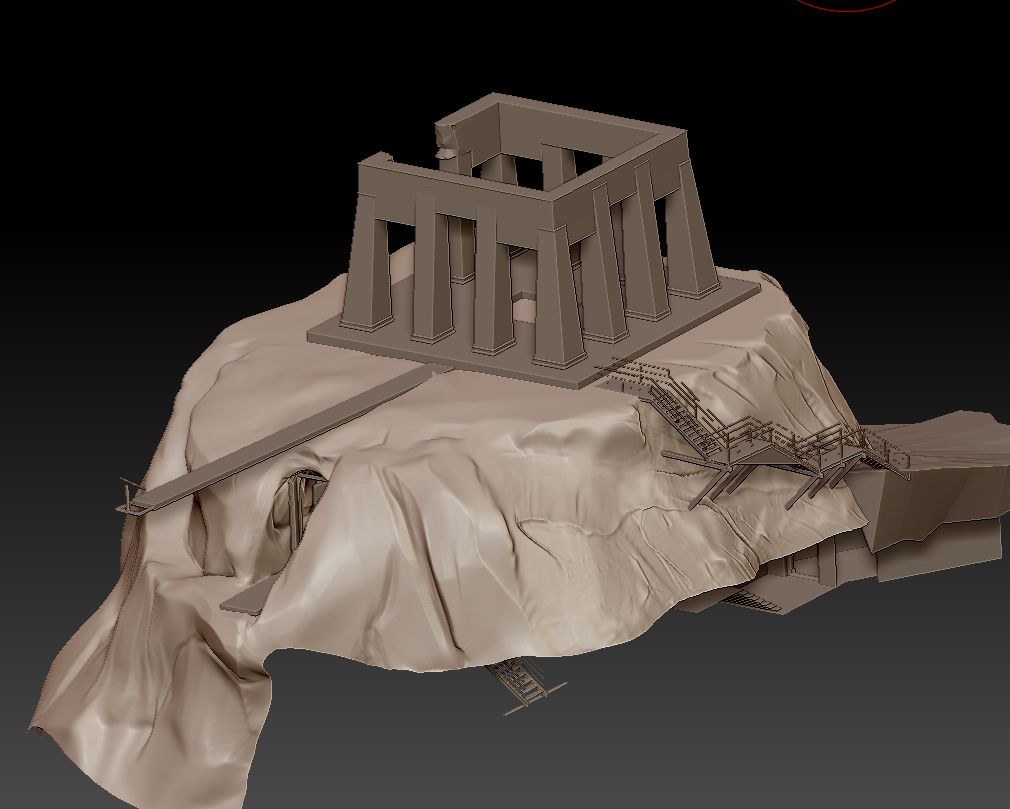
The structure changed quite a few times and we ended up ditching the bottom door, having the gate and panel be one unique object.
Here is another proposal from the architects that I implemented and we kept for a while. It was kind of a structure assembled around ruins of an old temple made out of columnar basalt:
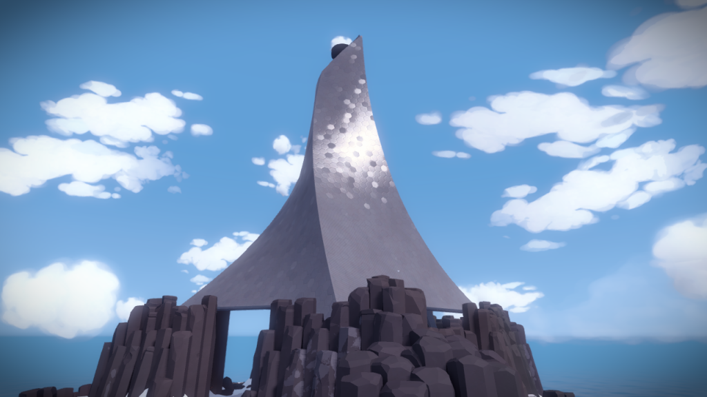
And here is an early concept for the unified top gate:
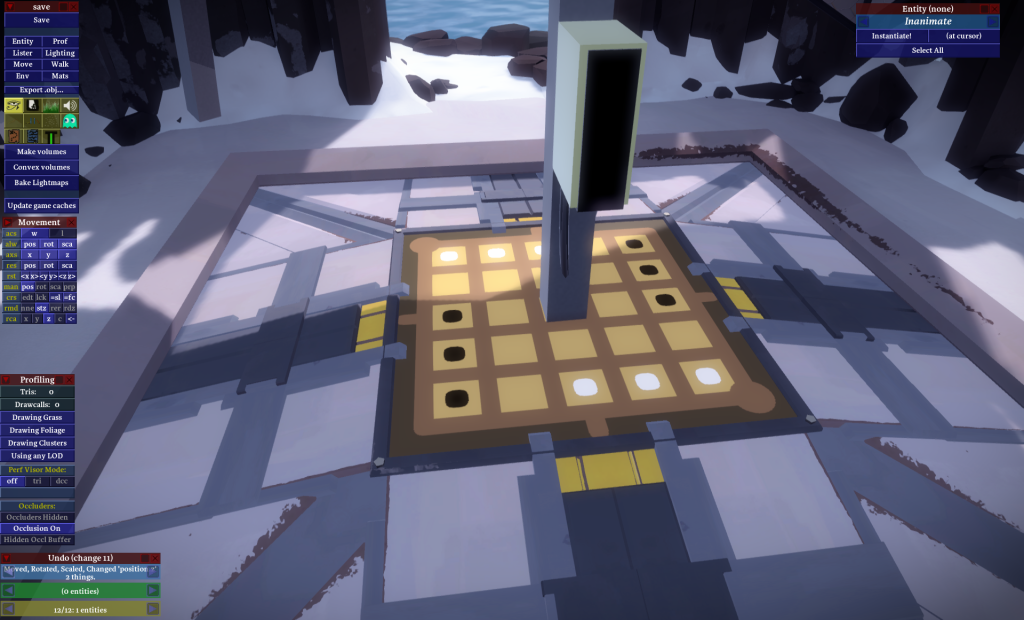
As the island grew, and I went to work on other areas, we finally figured out what the structure should be. We ended up splitting the work, Orsi worked on the arches while I focused on the panel and gates, ending up with this result:
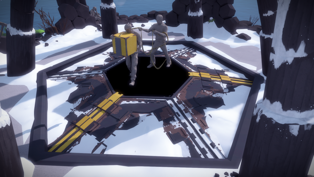
The panel has 3 separate doors with yellow stripes allowing you to understand how many ways you need to solve the puzzle to unlock it. Once solved it opens allowing you to go inside:
