Boat
The original boat, made by another artist before I joined, was probably one of the more detailed items we had for a long time, and we always thought it would be very close to the final version.
As everything else got more detailed, it started to feel out of place. The scale was slightly off, and now that we had the architect’s input, the structure felt cartoony, contrasting with the realism of everything else. It was also designed for the old non-panel interface, where you could press buttons in the world.
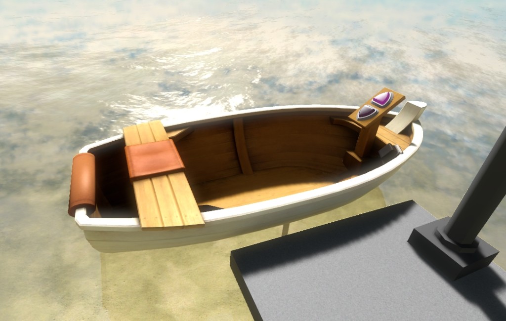
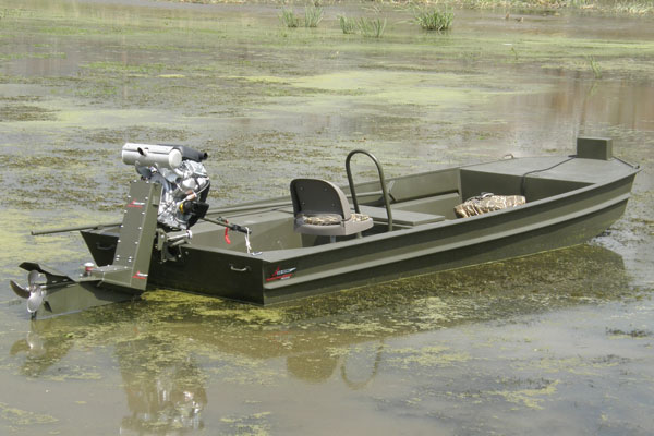
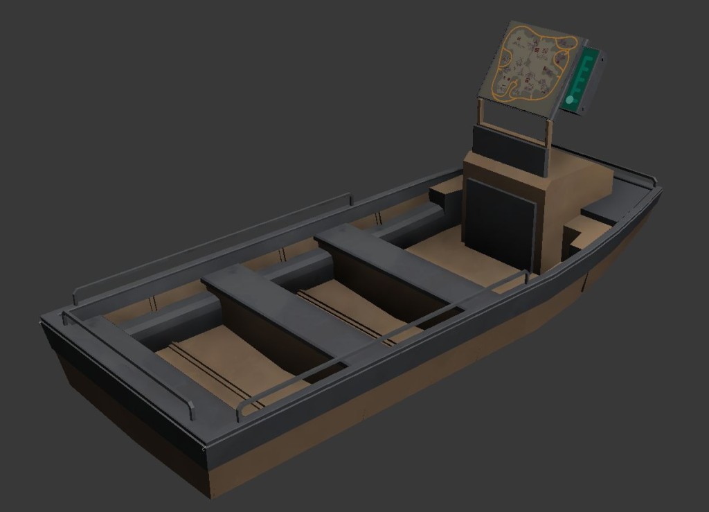
We waited as long as possible before working on it, to make sure we knew all the constraints. If you’ve played the game you will know there are a LOT of dependencies on the boat path, shape and size. For the first attempt at the redesign I tried to be practical and just take into account what the boat has to do, be ‘on rails’ and accommodate the panel design interface in the front. I proposed something made out of aluminium and fiberglass, inspired on the fishing style Jon boat:
Here is one of the first proposals
And another one, trying something less heavy: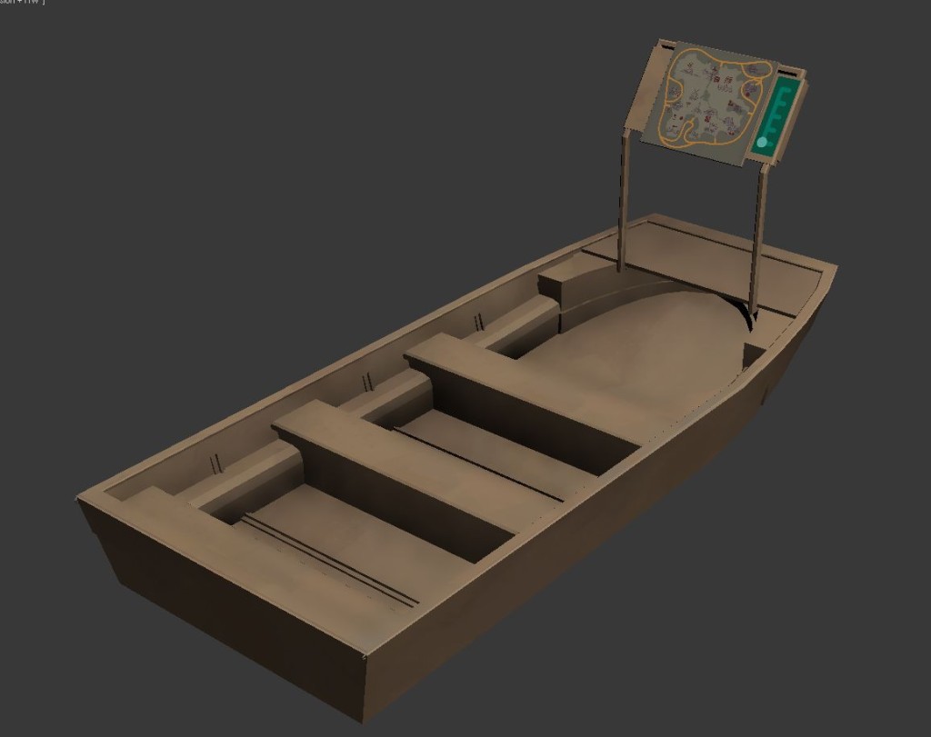 You can probably tell that they didn’t feel part of The Witness world at all. They read as utilitarian, cold, and above all ugly!
But these iterations were useful for me to understand the anatomy of a boat and be comfortable enough to design a new one from scratch. After some back and forth, Jonathan say the words that made it click for me; ‘Is slightly whimsical and has style. It’s a cool thing that as the player you are glad you found.’
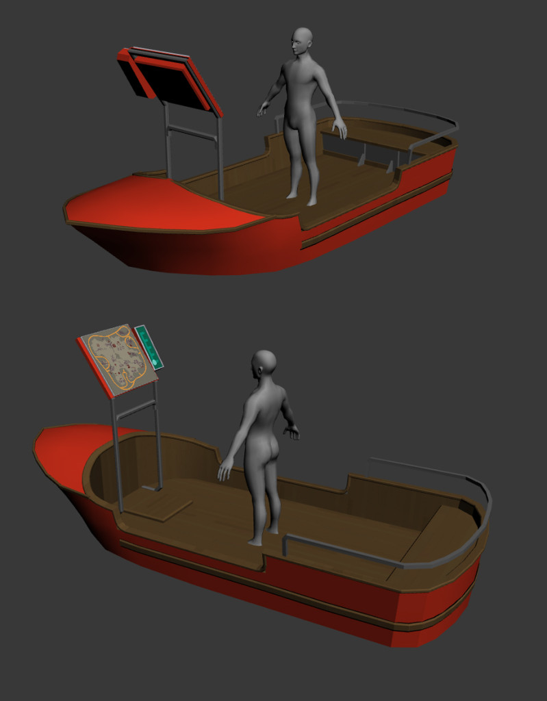
I focused on a theme parks boat rides and came up with this version(male dude is used for scale purposes):
Each version was getting there, but they still read as heavy and cumbersome boat rides. Something made out of metal that is painted pretending to be wood.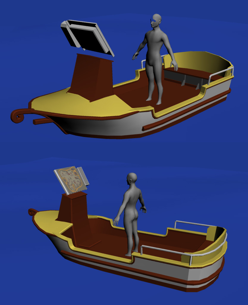
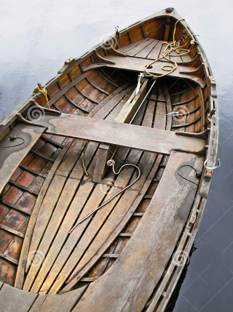
After a few days banging my head on the wall, Eric showed me these two references:
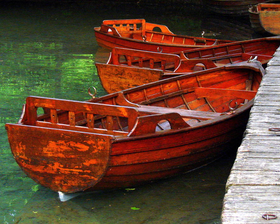
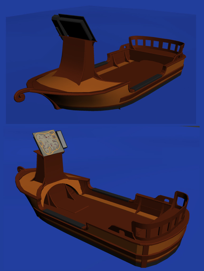
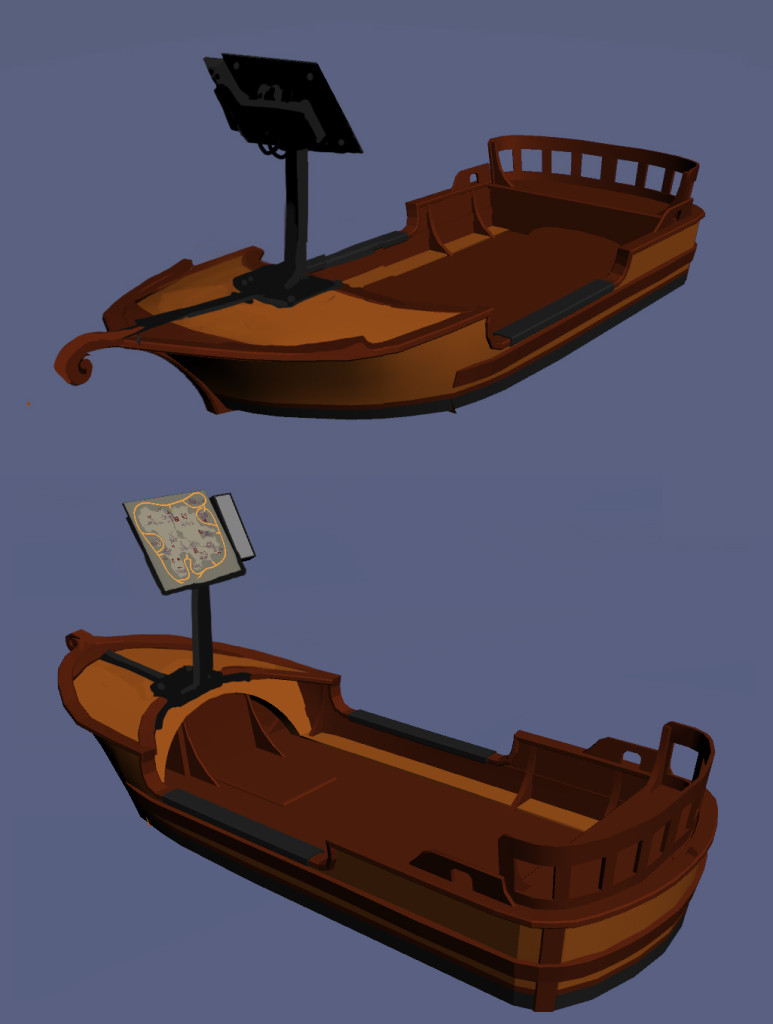
And everything clicked! I should focus on the beauty of the wood and make something classy and ornamented. I ditched the painted metal style, going for a full on wood design with a lot more detail. I still wasn’t happy with was the ‘altar’ style of the panel area since it unbalanced the rest of the boat:
So I started some paintovers since it’s faster than doing new geometry. It allowed for very fast iteration times and a more loose way of experimenting.
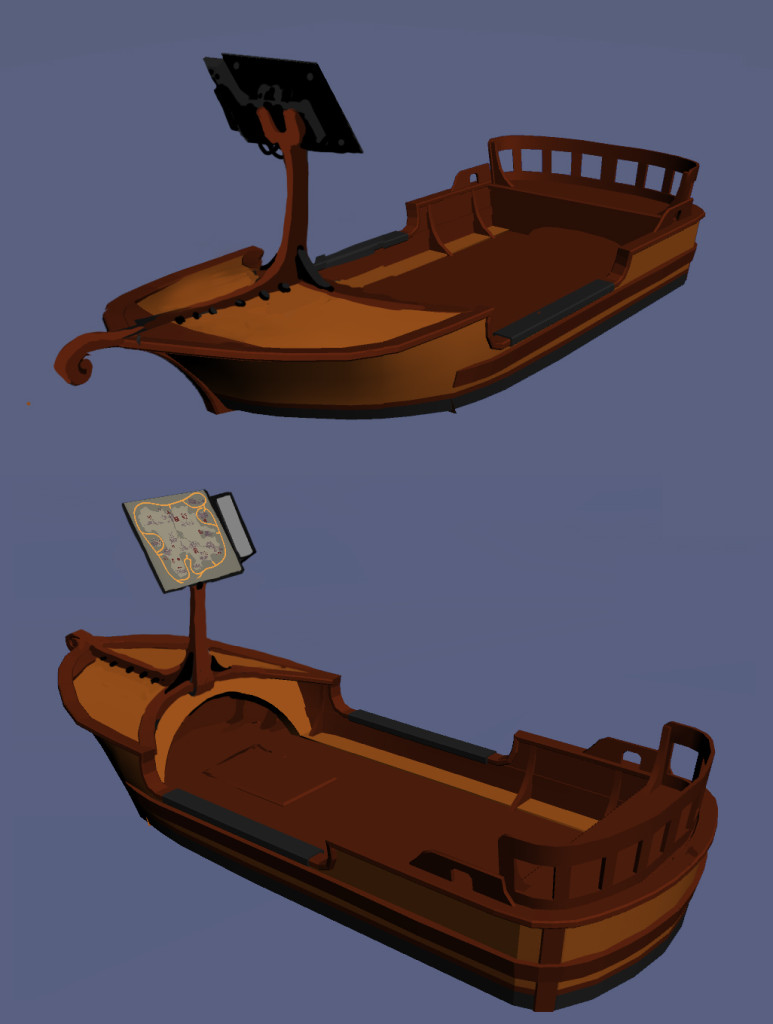
Here are two proposals I did:
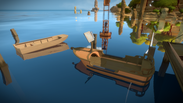
I ended up going with the second one, that you can see below (Jon boat model on the left):
Now that I knew I had the right shapes, I focused on improving the wood texture and smaller details, getting the richness of the original references and since I couldn’t get rid of the metal for the panel, make it part of the design: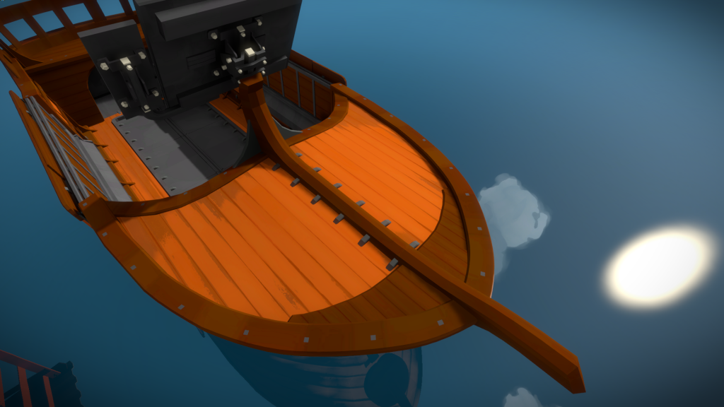
The last step was figuring out the technical aspects; how the boat gets out of the water or how the panel is protected from being submerged.
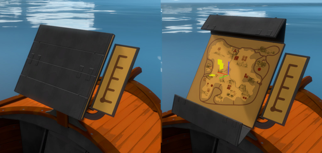
We tried a few ideas, both on art and programming, and ended up with a bottom metal door that opens to let water flow, and a panel protection that is closed until the boat is fully out:
Near the end we added a door that would create a bridge, allowing us to have the boat further from the dock, fixing a lot of issues when changing direction. Here is the final version:
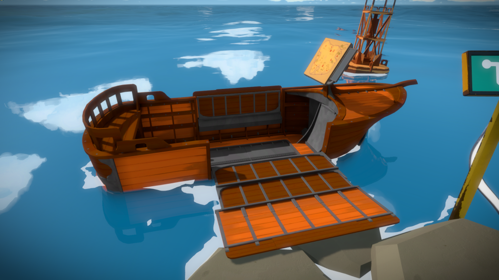
There is also a sunken version of the boat which was fun to do, trying to imagine what would happen after many years of being there, drying out in the sun:
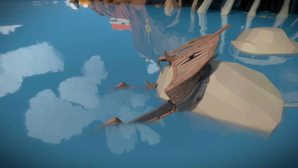
Boat Panel
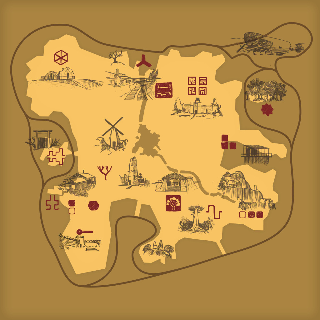
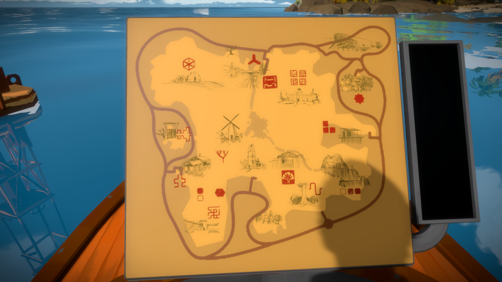
Once we got away from having buttons and using panels for everything, Jonathan designed a unique panel that represented the boat path, with end caps for each dock. He asked me to design a map that would overlay with that path representing the island. I tried to go minimalist and proposed this version (notice at this time it was still the old boat):
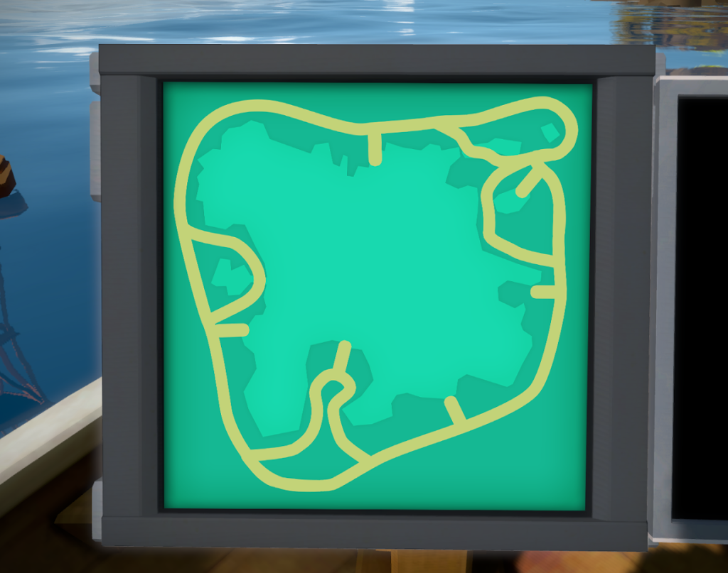 To which he said he wasn’t looking for something minimalist, but informative, that would help guide the player around the island.
I decided to try more a painting design for each area, but it came out too noisy and out of place with all the other panels:
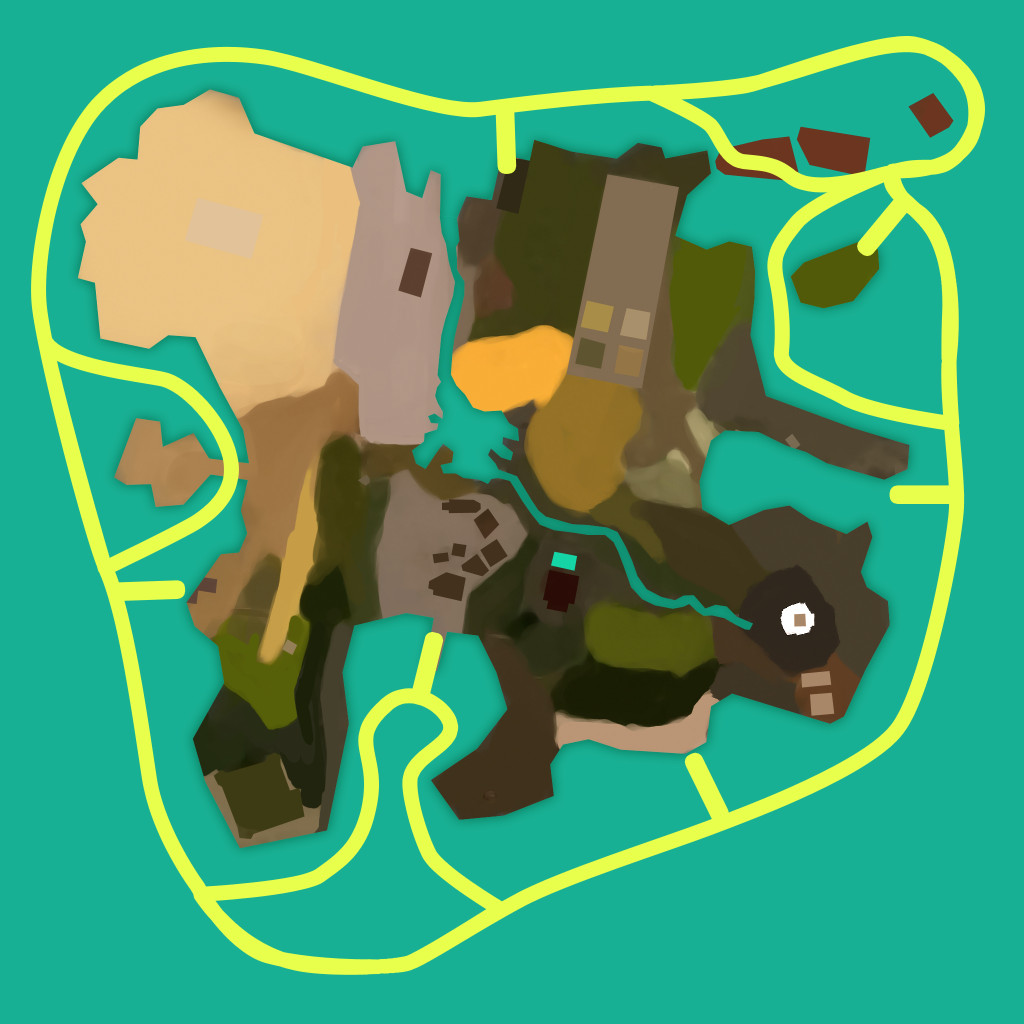
Jonathan also mentioned that we should have symbols to represent each puzzle type, so I first tried to highlight the layout of the island with color variation and then add those symbols like if they were part of the panel.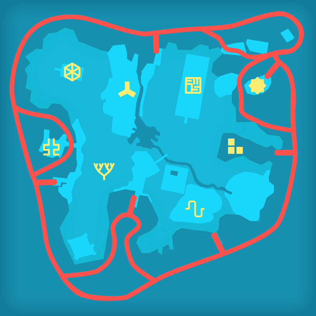
To which he said he wanted something more personal, like sketches of each area as if someone had been etching them on the panel as he explored the island in the boat. It was a great idea and lead me to this new version. I was also always playing with colors, trying to see what would fit with the boat colors and the island:
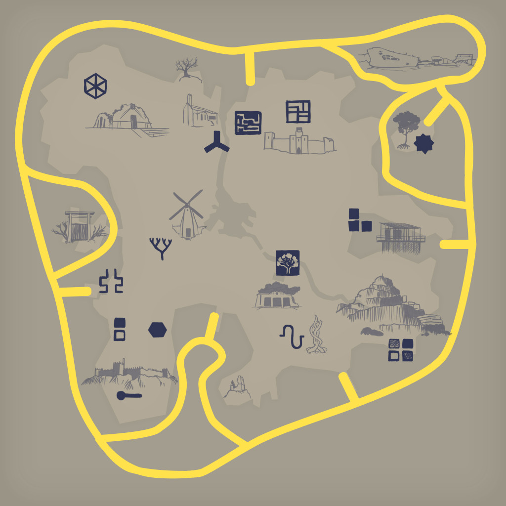
Those sketches still felt too shy, some more detailed then others, so I went ahead and did newer versions. I also did a pass on the symbols, making them feel more sketchy to live in the same world as the drawings.
The final step was to make the boat path have more pleasant curves. This was quite tricky since we were a few months from shipping, which meant a lot of the boat path was crucial for gameplay and could not be changed. Here is the final high-res mock up:

